Events and probability
Sample space : the set of outcomes of some experiment (denoted with \(\Omega\) ).
Event : a subset of the sample space ( \(A \subseteq \Omega\) ).
Probability : a probability function \(P\) on a finite sample space assigns to each event \(A \subseteq \Omega\) a number \(P(A)\) in \([0,1]\) such that
\(P(\Omega) = 1\) ,\(P(A \cup B) = P(A) + P(B)\) if \(A\) and \(B\) are disjoint .
Example: coin tosses \(\Omega = \{H, T\}\)
Example: dice roll \(\Omega = \{1,2,3,4,5,6\}\)
Example: 2 coin tosses \(\Omega = \{(H, H), (H, T), (T, H), (T, T)\}\)
Discrete random variables
Let \(\Omega\) be a sample space. A discrete random variable is a function
\[\begin{equation}
X : \Omega \to \mathbb{R}
\end{equation}\]
that takes on a (possibly infinite) discrete set of values \(a_1, a_2, \dots\)
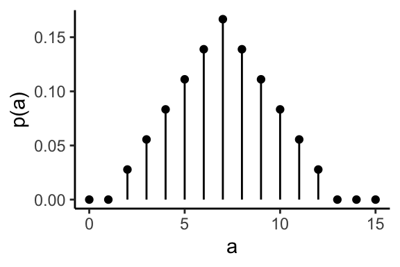
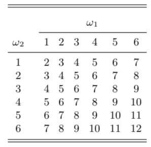
Example: throwing two dices and add them.
Probability mass function
The probability mass function \(p\) of a discrete random variable \(X\) is the function
\[\begin{equation}
p(a) = P(X = a) \quad \text{for} -\infty < a < \infty
\end{equation}\]
The probability mass of the sum of two dice.
Discrete random variables
Discrete random variables make it easier to reason about complex events by mapping them to numbers on the real line, to which we then assign probabilities.
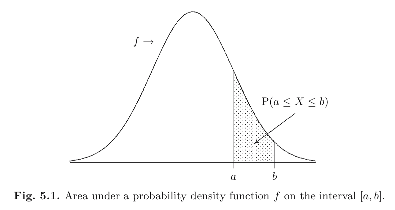
Continuous random variables
A random variable \(X\) is continuous if
for some function \(f : \mathbb{R} \to \mathbb{R}\) and for any numbers \(a\) and \(b\) with \(a < b\) ,
\[\begin{equation}
P(a \le X \le b) = \int_a^b f(x) d x
\end{equation}\]
and \(f(x) \ge 0~\forall x\in \mathbb{R}\) and \(\int_{-\infty}^{\infty} f(x) d x = 1\) .
The function \(f\) is the probability density function .
Continuous random variables
Expectation (aka Mean)
Intuitively, it is the average of a large number of independent realizations of the random variable.
More formally, it’s the weighted average of all the values taken by the random variable.
Discrete RV
\[\begin{equation}
E[X] = \sum_{i} a_i P(a_i)
\end{equation}\]
Continuous RV
\[\begin{equation}
E[X] = \int_{-\infty}^{\infty} x f(x)~dx
\end{equation}\]
Variance and standard deviation
The variance represents the spread of a random variable around its mean.
\[\begin{equation}
Var(X) = E[(X - E[X])^2]
\end{equation}\]
“Expected squared deviation from the mean.”
The standard deviation is the square root of the variance: \(\sqrt{Var(X)}\) .
Quantiles
Let \(X\) be a continuous random variable and let \(p \in [0,1]\) .
The \(p\) -th quantile is the smallest \(q\) such that:
\[\begin{equation}
P[X \le q] = p
\end{equation}\]
The \(0.5\) -quantile is called the median .
What is the \(1.0\) -quantile?
Percentiles
In many contexts we will use the term percentile instead of quantile . Just multiply \(p\) by 100.
\(0.3\) -quantile \(\rightarrow\) 30th percentile\(0.75\) -quantile \(\rightarrow\) 75th percentilemedian \(\rightarrow\) 50th percentile
Can you rephrase the concept of quantile/percentile?
Definition: The \(p\) -th quantile is the smallest \(q\) such that \(P[X \le q] = p\) .
Rephrasing: The \(p\) -th quantile is the smallest \(q\) such that \(100p\%\) of the distribution is below \(q\) .
Order statistics
Consider a dataset \(x_1, x_2, \dots, x_n\) .
The \(k\) -th order statistic is the \(k\) -th smallest element, which is denoted with \(x_{(k)}\) .
Order statistics and empirical quantiles
We assume that the \(i\) th order statistic is the \(i/(n+1)\) quantile (ordered).
To compute empirical quantiles you linearly interpolate between order statistics.
We want to compute the \(p\) th empirical quantile, \(q(p)\) , for a dataset \(x_1,x_2,\ldots,x_n\) .
We denote the integer part of \(a\) by \(\lfloor a \rfloor\) .
Let \(k = \lfloor p . (n+1) \rfloor\) and \(\alpha = p . (n+1) - k\)
\[\begin{equation}
q(p) = x_{(k)} + \alpha . (x_{(k+1)} - x_{(k)})
\end{equation}\]
Exercise: 41 41 41 41 41 42 43 43 43 58 58
Compute the 55-empirical percentile.
Order statistics and quantiles example
<- tibble (orig = c (0.9646149 , - 0.2354952 , 0.2329556 ,- 1.0007305 , - 0.3093600 , - 0.4983927 , 0.8507451 , 0.7387761 ))
0.9646149
-0.2354952
0.2329556
-1.0007305
-0.3093600
-0.4983927
0.8507451
0.7387761
Order statistics and quantiles example
# A tibble: 8 × 1
    orig
   <dbl>
1 -1.00
2 -0.498
3 -0.309
4 -0.235
5  0.233
6  0.739
7  0.851
8  0.965
Order statistics and quantiles example
%>% arrange (orig) %>% mutate (order_statistic = rank (orig))
# A tibble: 8 × 2
    orig order_statistic
   <dbl>           <dbl>
1 -1.00                1
2 -0.498               2
3 -0.309               3
4 -0.235               4
5  0.233               5
6  0.739               6
7  0.851               7
8  0.965               8
Order statistics and quantiles example
# A tibble: 8 × 1
    orig
   <dbl>
1 -1.00
2 -0.498
3 -0.309
4 -0.235
5  0.233
6  0.739
7  0.851
8  0.965
%>% summarise (q25 = quantile (orig, .25 ),median = quantile (orig, .5 ),q75 = quantile (orig, .75 )
# A tibble: 1 × 3
     q25   median   q75
   <dbl>    <dbl> <dbl>
1 -0.357 -0.00127 0.767
Random sample
A random sample is a collection of \(n\) random variables
\[\begin{equation}
X_1, X_2, \dots, X_n
\end{equation}\]
that have the same distribution and are mutually independent.
We can use random sampling to model a repeated measurement of some unknown quantity.
The actual instantiation of a random sample is called a realization .
Dealing with random samples
When you measure something, you usually don’t know the underlying distribution.
Your random sample is a realization of this unknown distribution.
You want to derive conclusions about the true distribution.
However, you can perform computations only on values in your data.
It’s like trying to assess some facts about the world looking at an imperfect mirror.
Many datasets can be modeled as realizations of random samples.
Estimators
An estimate is a value that only depends on the dataset \(x_1, \dots, x_n\) , i.e., it is some function of the dataset only.
The mean is:
\[\begin{equation}
\bar{x} = \frac{\sum_i x_i}{n}
\end{equation}\]
In R: mean
The variance is:
\[\begin{equation}
\bar{s} = \frac{\sum_i (x_i - \bar{x})^2}{n-1}
\end{equation}\]
In R: var.
The standard deviation in R is sd.
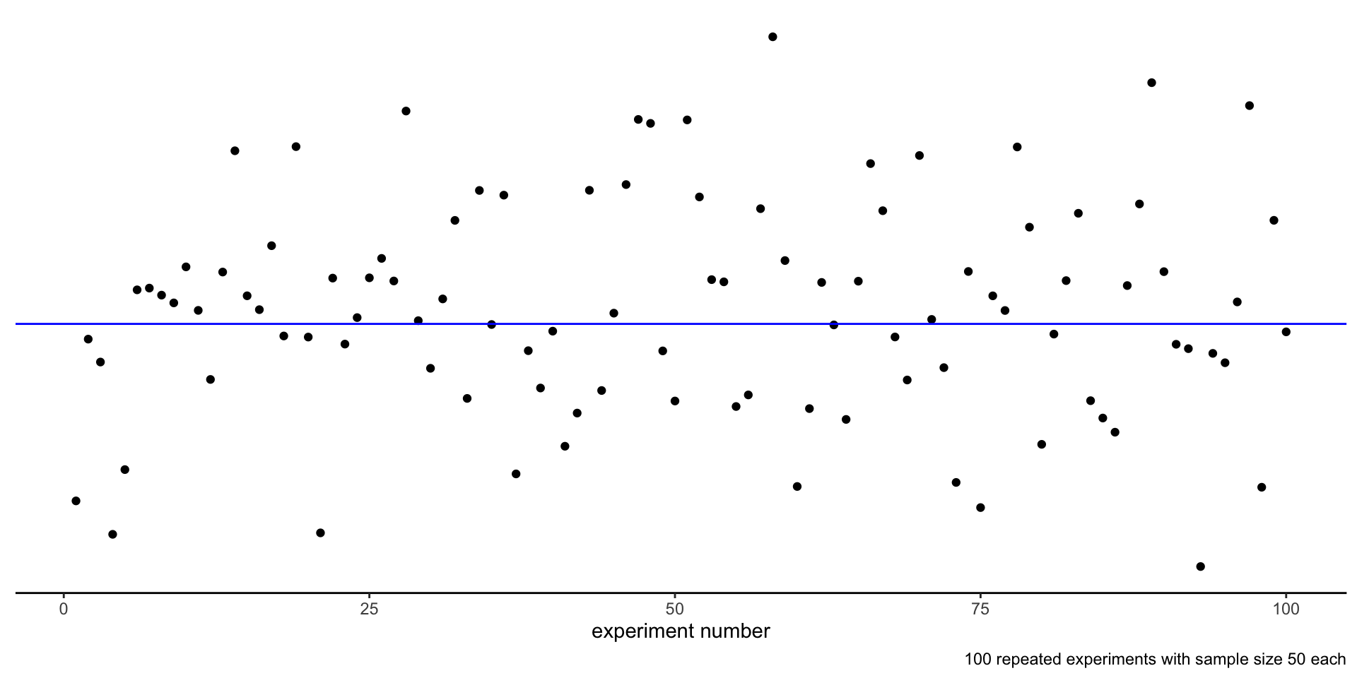
The law of large numbers
If \(\bar{X}\) is the average of \(n\) independent random variables with expectation \(\mu\) , then for any \(\varepsilon > 0\) : \[\begin{equation}
\lim_{n \to \infty} P(|\bar{X} - \mu| > \varepsilon) = 0
\end{equation}\]
This means that when we take a very large random sample, the arithmetic average is a good estimator of the value of the mean \(\mu\) .
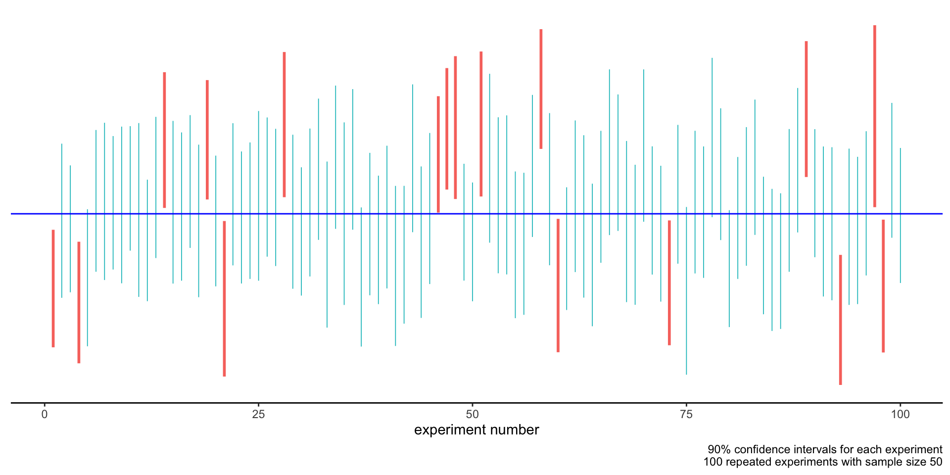
Repeated experiments
We are going to make statements about taking a random sample of size \(n\) repeatedly.
This is equivalent to running an experiment, defined as a batch of measurements, several times, getting every time different outcomes.
Repeated experiments
Example: consider 6 datasets of size \(n=4\) , taken as realizations of the same random sample.
0.393, 0.581, -1.231, 0.661
0.773, -1.422, -0.673, -0.070
0.758, 1.041, 0.200, -1.208
0.849, 0.878, -1.260, -0.114
-0.740, 1.037, 2.064, 0.697
-3.326, 0.499, -1.006, -0.534
Estimating the mean
The sample mean of each dataset is an estimate of the true mean \(\mu\) of the random sample.
0.393, 0.581, -1.231, 0.661
0.10100
0.773, -1.422, -0.673, -0.070
-0.34800
0.758, 1.041, 0.200, -1.208
0.19775
0.849, 0.878, -1.260, -0.114
0.08825
-0.740, 1.037, 2.064, 0.697
0.76450
-3.326, 0.499, -1.006, -0.534
-1.09175
Estimating the mean
How confident are we in our estimates?
Instead of just relying on a single number (the sample mean) we might want to derive an interval .
Consider a dataset \(x_1, \dots, x_n\) , modeled as realization of random variables \(X_1, \dots, X_n\) with mean \(\mu\) .
Let \(\gamma \in [0,1]\) .
If there exists \(L_n = g(X_1, \dots, X_n)\) and \(U_n = h(X_1, \dots, X_n)\) such that:
\[\begin{equation}
P( L_n \le \mu \le U_n ) \ge \gamma
\end{equation}\]
then the interval \((l_n, u_n)\)
with \(l_n = g(x_1, \dots, x_n)\) and \(u_n=h(x_1, \dots, x_n)\) is a
\(100\gamma\) % confidence interval for \(\mu\) .
\(\gamma\) is called the confidence level.
An example
Observation : each time we run the experiment, we derive a different confidence interval.
0.393, 0.581, -1.231, 0.661
-0.75800
0.64100
0.773, -1.422, -0.673, -0.070
-1.08400
0.41150
0.758, 1.041, 0.200, -1.208
-0.71650
0.89950
0.849, 0.878, -1.260, -0.114
-0.73275
0.86350
-0.740, 1.037, 2.064, 0.697
-0.29575
1.72225
-3.326, 0.499, -1.006, -0.534
-2.62800
0.12275
An example
Building confidence intervals
In the general case confidence intervals are built using a technique called bootstrapping .
\[\begin{equation}
\left(
\bar{x} - c^*_u\frac{s_n}{\sqrt{n}},\quad
\bar{x} + c^*_l\frac{s_n}{\sqrt{n}}
\right)
\end{equation}\]
\(c^*_u\) and \(c^*_l\) are related to the confidence level \(\gamma\) .
\(\bar{x}\) is the sample mean.
\(s_n\) is the sample standard deviation.
\(n\) is the number of samples.
How does changing the size \(n\) of the sample change the confidence interval, for fixed \(\gamma\) ?
How does changing the confidence level \(\gamma\) change the confidence interval, for fixed \(n\) ?
For fixed \(\gamma\) , increasing \(n\) narrows the intervals.
For fixed \(n\) , increasing \(\gamma\) widens the intervals.
What does this all mean?
The confidence interval we derive from a dataset is itself the realization of a random variable.
Such a random interval has a probability \(\gamma\) of containing the population mean \(\mu\) .
The probability statement is on the random variable defining the interval, not on its realization!
What does this all mean?
For a fixed dataset we can build a confidence interval. Both are realizations of random variables.
We can say:
We are 90% confident that the interval contains \(\mu\) .
The confidence interval is generated by a random variable that 90% of the time gives an interval containing \(\mu\) .
We cannot say:
The interval contains \(\mu\) with probability 90%.
The interval either contains \(\mu\) or not: that’s a deterministic fact we cannot know.
How to build confidence intervals with R
Use the function mean_cl_boot(data, conf.int=..confidence level..)
In data pipelines
%>% summarise (mean_cl_boot (measure, conf.int= .9 )
the result will contain three new columns:
y (average),ymin (lower bound of confidence interval),ymax (upper bound of confidence interval).
In ggplot
stat_summary (fun.data = mean_cl_boot,fun.args = list (conf.int = .9 ),geom = 'pointrange' )
Example: measuring the speed of light
1
1
299850
1
2
299740
1
3
299900
1
4
300070
1
5
299930
1
6
299850
1
7
299950
1
8
299980
1
9
299980
1
10
299880
1
11
300000
1
12
299980
1
13
299930
1
14
299650
1
15
299760
1
16
299810
1
17
300000
1
18
300000
1
19
299960
1
20
299960
2
1
299960
2
2
299940
2
3
299960
2
4
299940
2
5
299880
2
6
299800
2
7
299850
2
8
299880
2
9
299900
2
10
299840
2
11
299830
2
12
299790
2
13
299810
2
14
299880
2
15
299880
2
16
299830
2
17
299800
2
18
299790
2
19
299760
2
20
299800
3
1
299880
3
2
299880
3
3
299880
3
4
299860
3
5
299720
3
6
299720
3
7
299620
3
8
299860
3
9
299970
3
10
299950
3
11
299880
3
12
299910
3
13
299850
3
14
299870
3
15
299840
3
16
299840
3
17
299850
3
18
299840
3
19
299840
3
20
299840
4
1
299890
4
2
299810
4
3
299810
4
4
299820
4
5
299800
4
6
299770
4
7
299760
4
8
299740
4
9
299750
4
10
299760
4
11
299910
4
12
299920
4
13
299890
4
14
299860
4
15
299880
4
16
299720
4
17
299840
4
18
299850
4
19
299850
4
20
299780
5
1
299890
5
2
299840
5
3
299780
5
4
299810
5
5
299760
5
6
299810
5
7
299790
5
8
299810
5
9
299820
5
10
299850
5
11
299870
5
12
299870
5
13
299810
5
14
299740
5
15
299810
5
16
299940
5
17
299950
5
18
299800
5
19
299810
5
20
299870
Let’s replicate the experiment of Michelson and Morley (1887).
Assumption: the measurements are a realization of a random sample.
<- as_tibble (morley) %>% mutate (Speed = Speed + 299000 )
summarise (light,mean (Speed), var (Speed), sd (Speed)
# A tibble: 1 × 3
  `mean(Speed)` `var(Speed)` `sd(Speed)`
          <dbl>        <dbl>       <dbl>
1       299852.        6243.        79.0
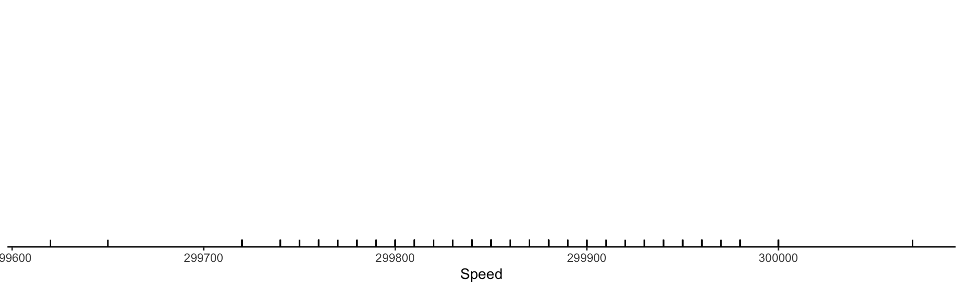
Visualizing the measurements: rug
ggplot (light, aes (x= Speed)) + geom_rug ()
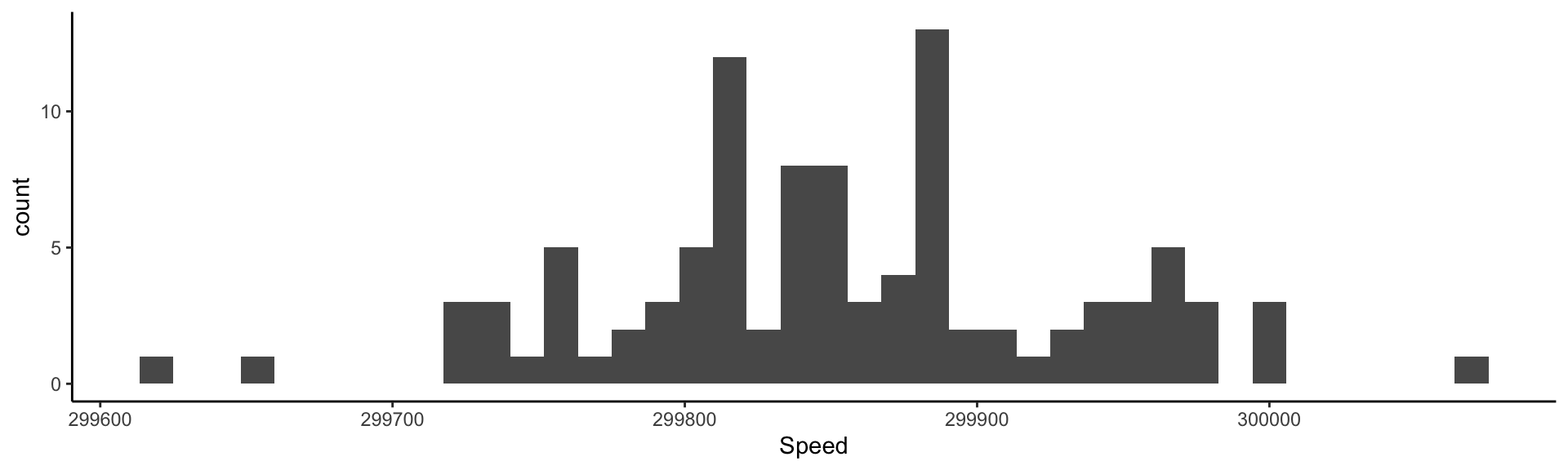
Visualizing the measurements: histogram
ggplot (light, aes (x= Speed)) + geom_histogram (bins = 40 )
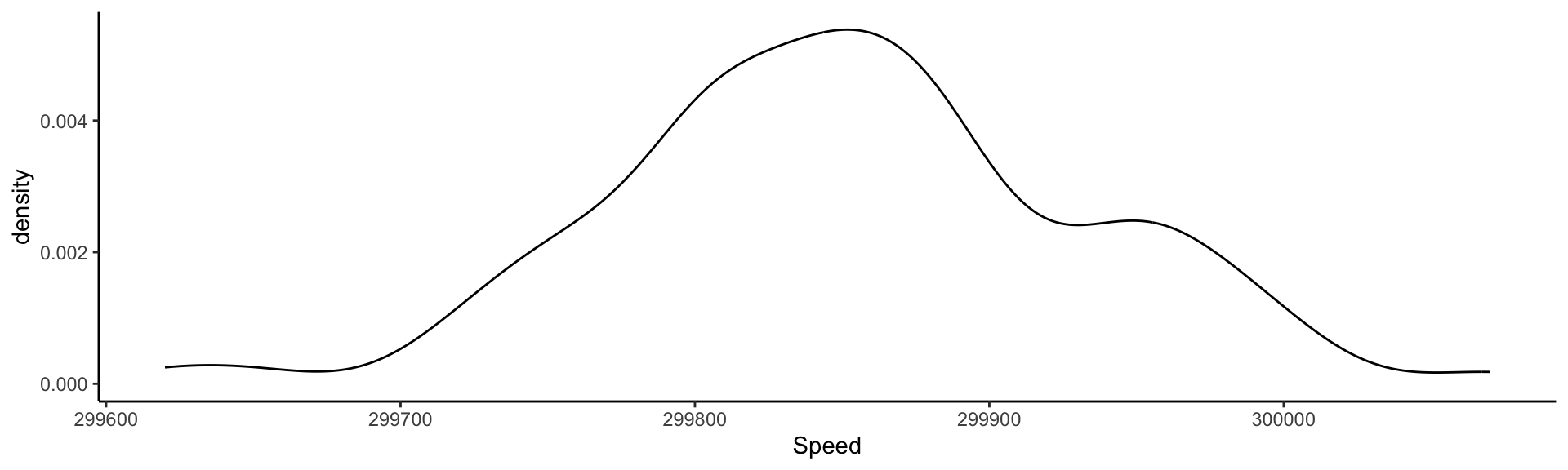
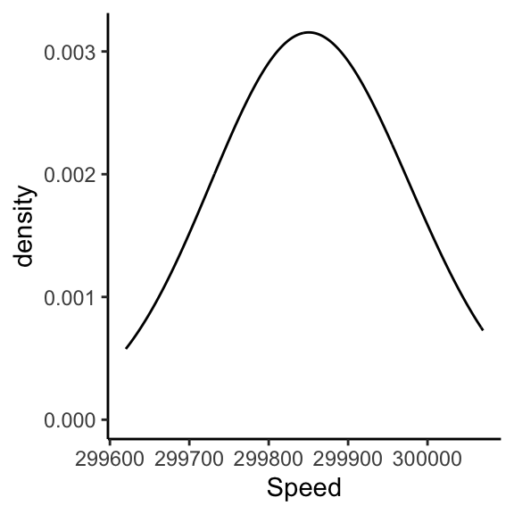
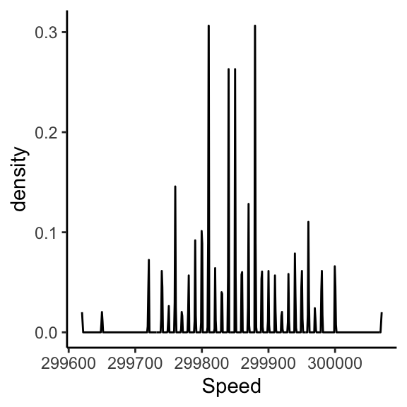
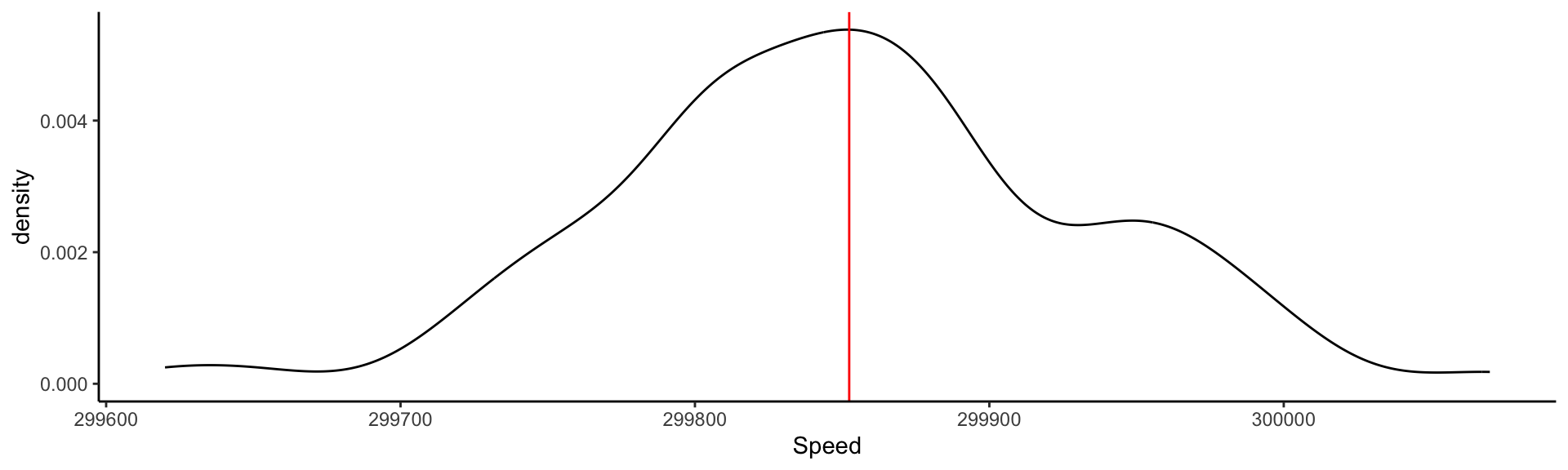
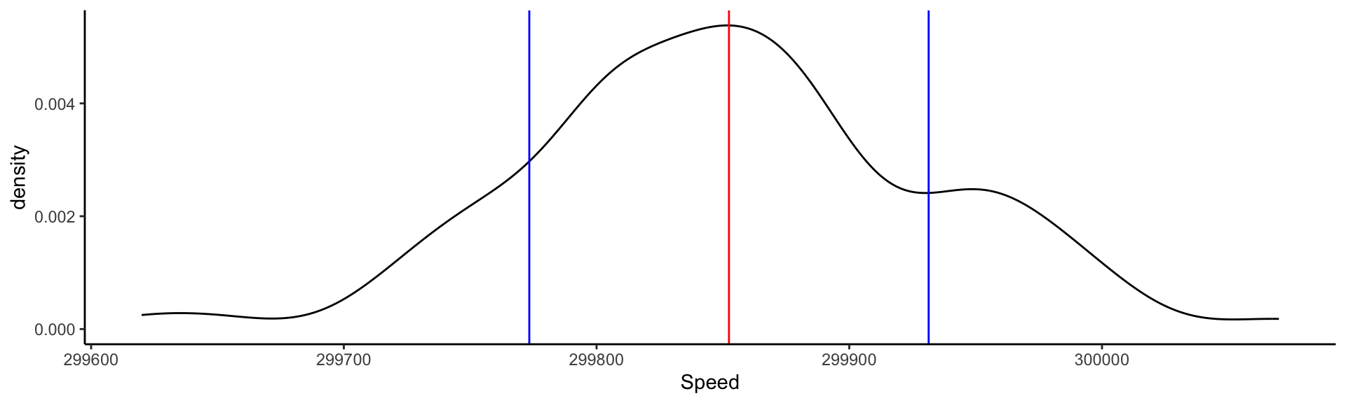
Visualizing the measurements: Kernel Density Estimate
ggplot (light, aes (x= Speed)) + geom_density ()
This is an estimate of the Probability Density Function derived from data.
Visualizing the measurements: Kernel Density Estimate
ggplot (light, aes (x= Speed)) + geom_density (bw= 100 )
ggplot (light, aes (x= Speed)) + geom_density (bw= .1 )
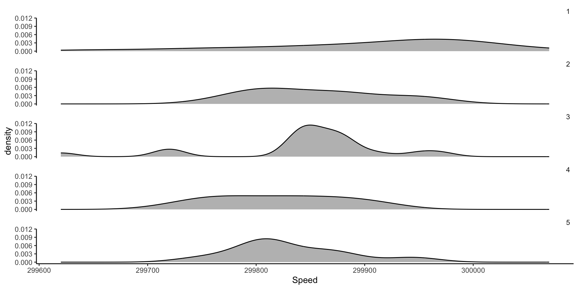
Comparing different experiments: faceting KDEs
ggplot (light, aes (x= Speed)) + geom_density (fill= 'gray' ) + facet_wrap (vars (factor (Expt)), ncol= 1 ) + theme (strip.background = element_blank (),strip.text.x = element_text (hjust = 1 ))
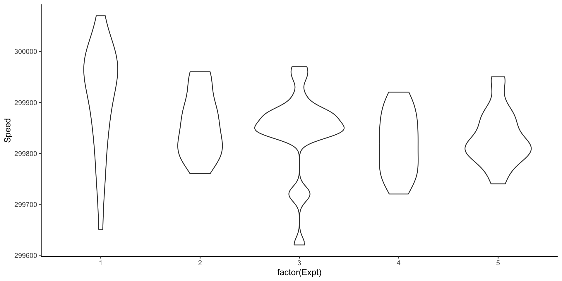
Comparing different experiments: violin plots
ggplot (light, aes (x= factor (Expt), y= Speed)) + geom_violin ()
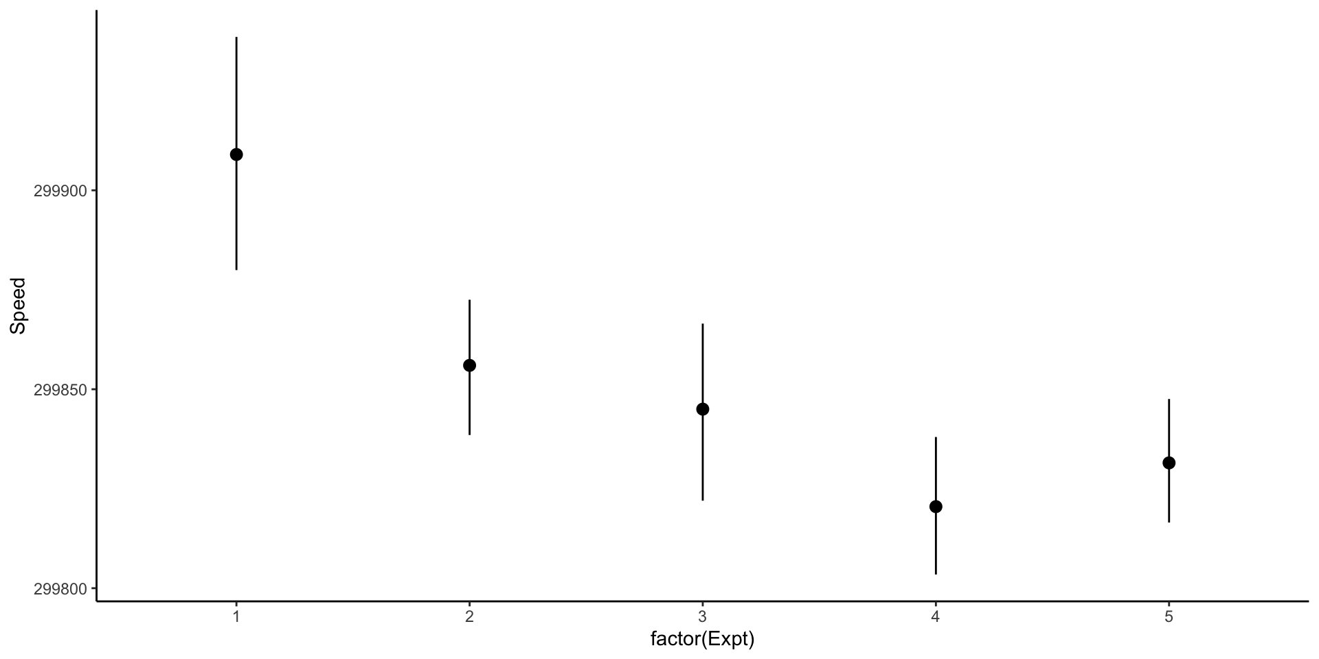
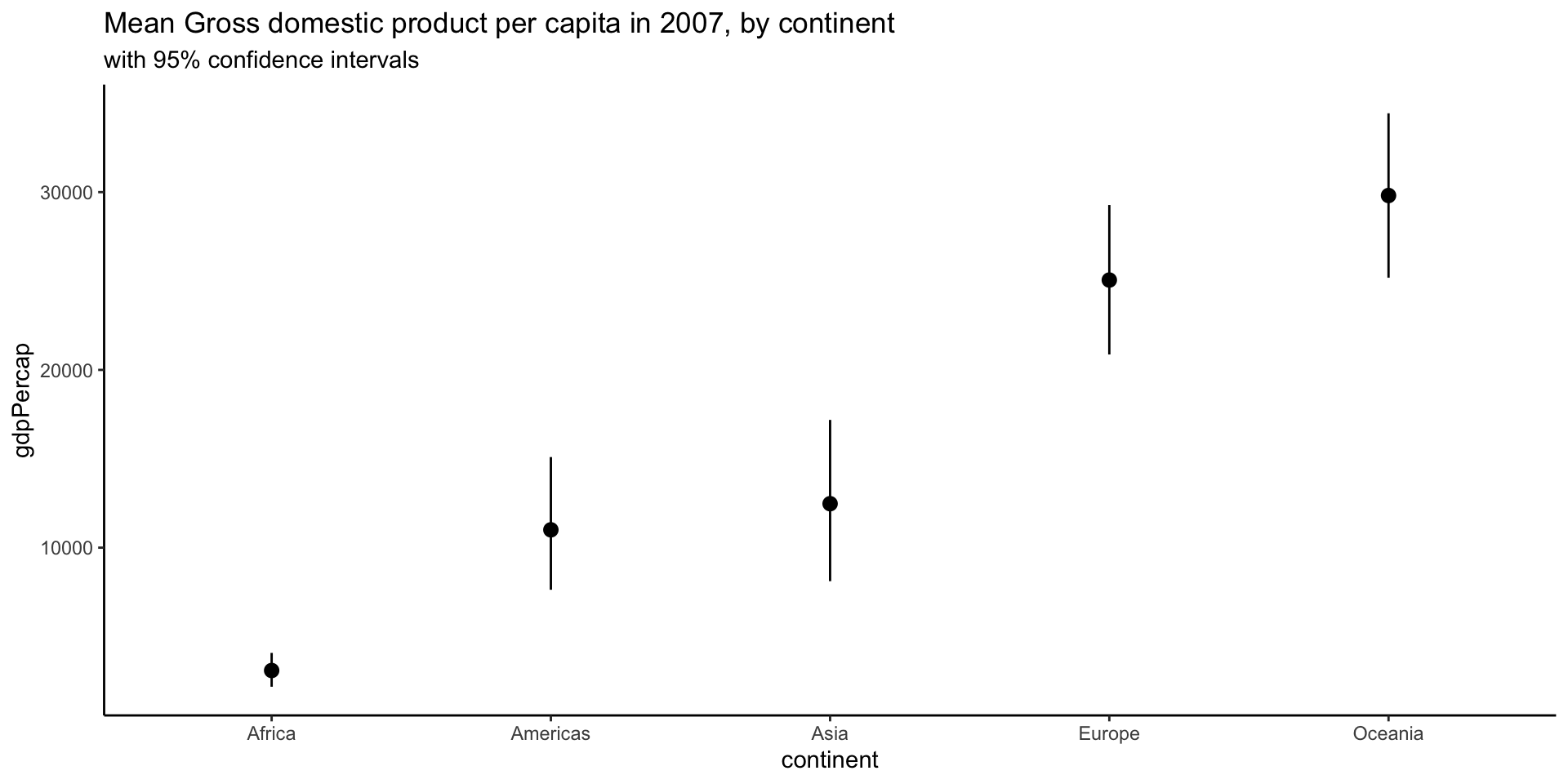
Comparing different experiments: pointrange with confidence intervals
ggplot (light, aes (x= factor (Expt), y= Speed)) + stat_summary (fun.data= mean_cl_boot,fun.args = list (conf.int= .8 ))
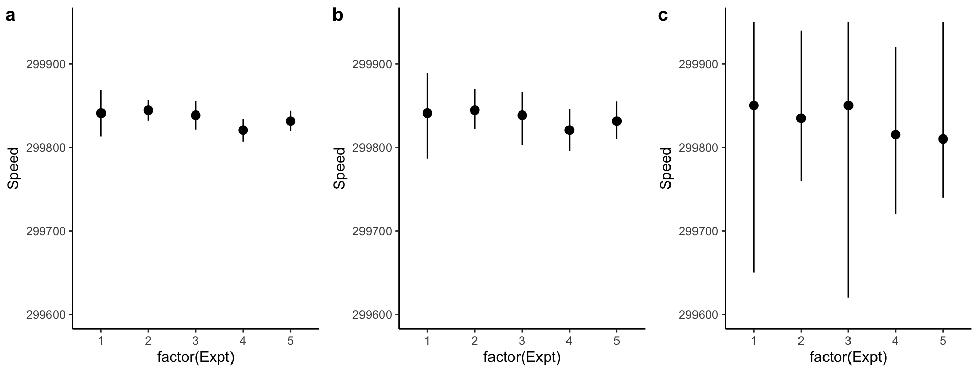
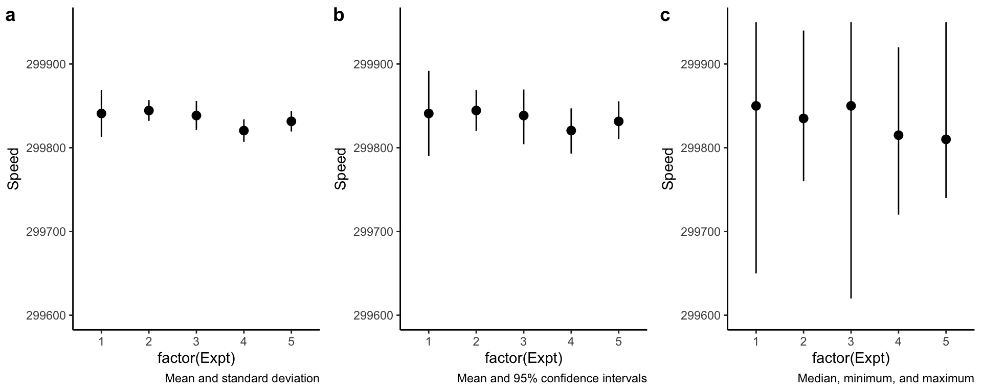
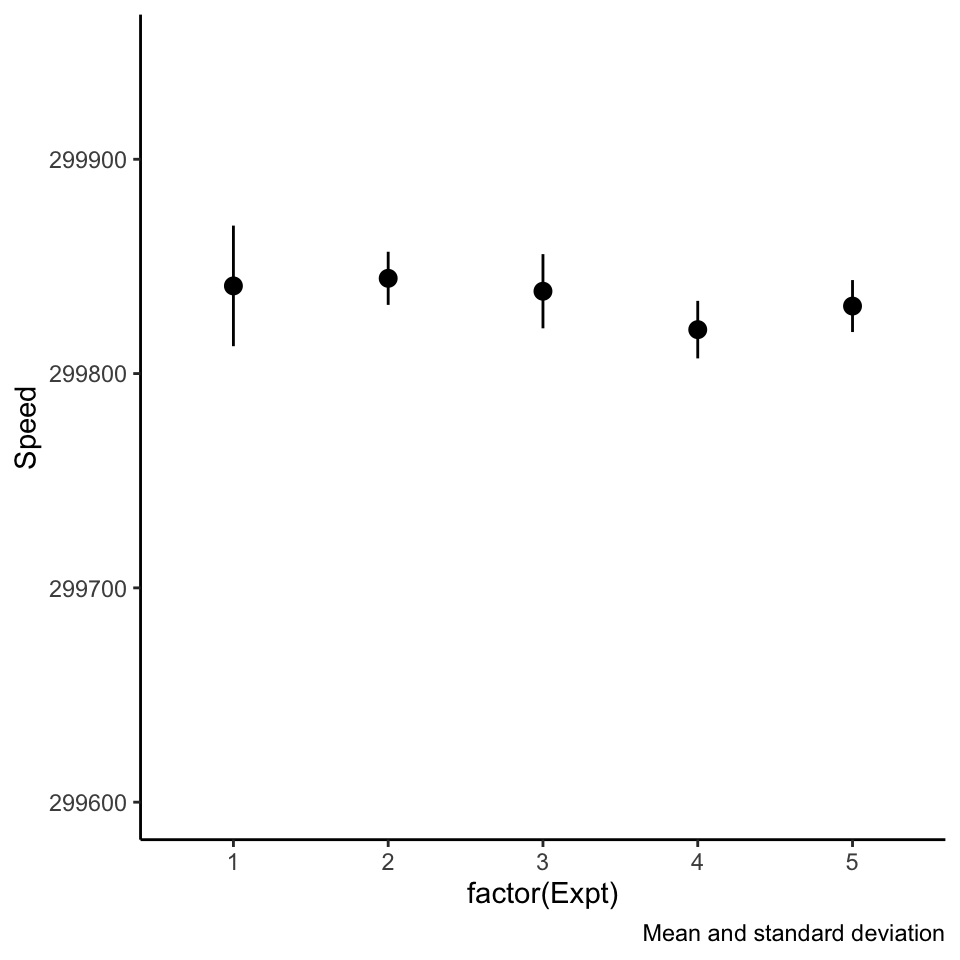
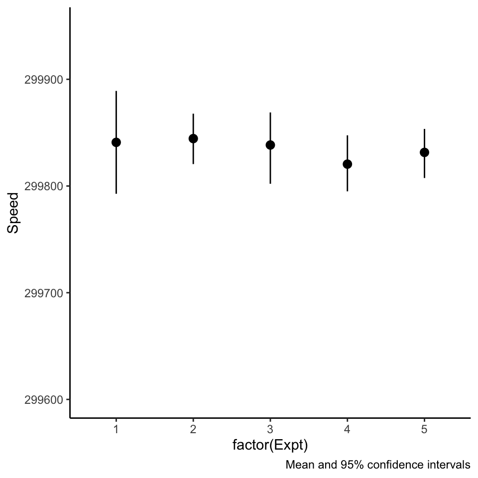
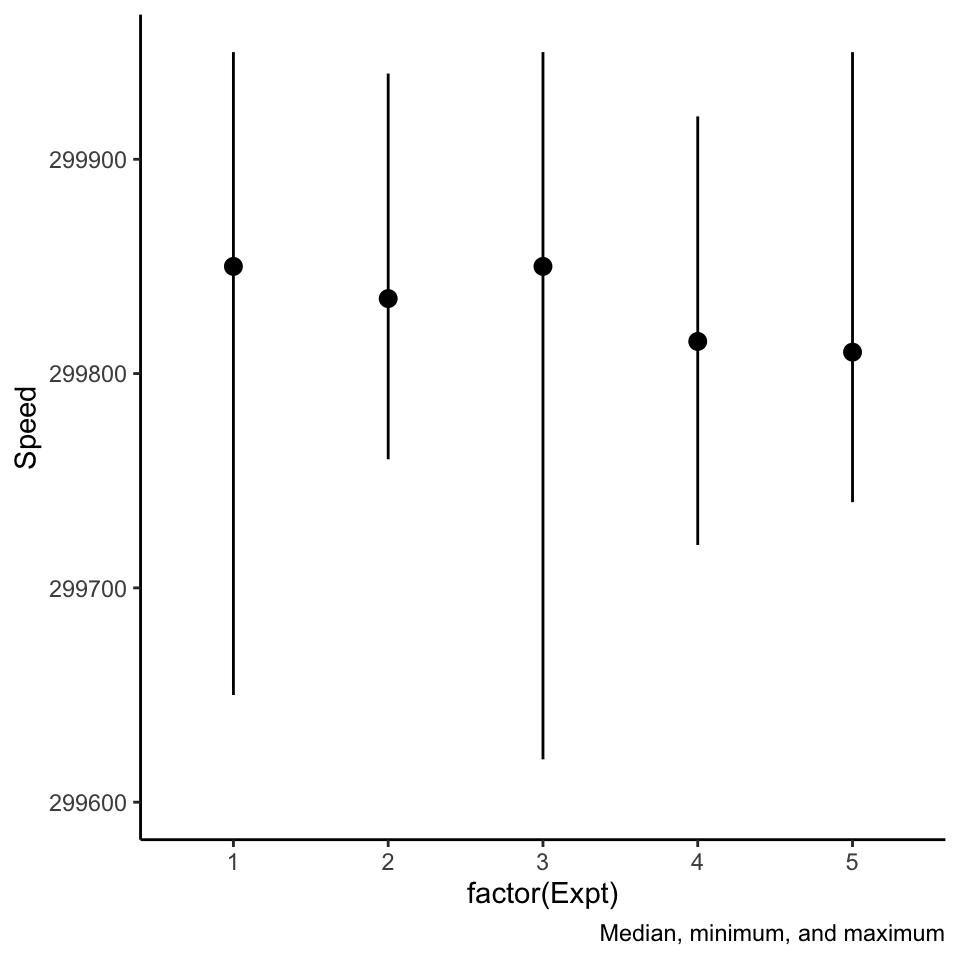
Beware of pointranges!
What is the difference between these three plots? They are derived from the same data.
Beware of pointranges!
What is the difference between these three plots? They are derived from the same data.
Beware of pointranges!
What is the difference between these three plots? They are derived from the same data.
ggplot (light, aes (x= factor (Expt), y= Speed), color= factor (Expt)) + scale_y_continuous (limits = c (299600 ,299950 )) + labs (caption= 'Mean and standard deviation' ) + stat_summary (fun.data= mean_se)
Beware of pointranges!
What is the difference between these three plots? They are derived from the same data.
ggplot (light, aes (x= factor (Expt), y= Speed), color= factor (Expt)) + scale_y_continuous (limits = c (299600 ,299950 )) + labs (caption= 'Mean and 95% confidence intervals' ) + stat_summary (fun.data= mean_cl_boot,fun.args= list (conf.int= .95 ))
Beware of pointranges!
What is the difference between these three plots? They are derived from the same data.
ggplot (light, aes (x= factor (Expt), y= Speed), color= factor (Expt)) + scale_y_continuous (limits = c (299600 ,299950 )) + labs (caption= 'Median, minimum, and maximum' ) + stat_summary (fun.y= median, fun.ymax = max, fun.ymin = min)
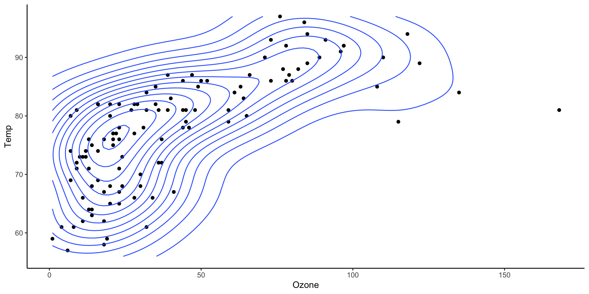
Two dimensional densities
ggplot (airquality, aes (x= Ozone, y= Temp)) + geom_point () + geom_density_2d ()
Two dimensional densities
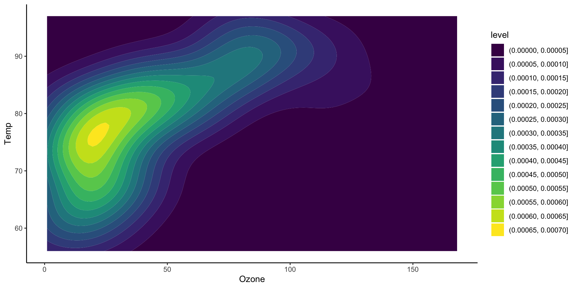
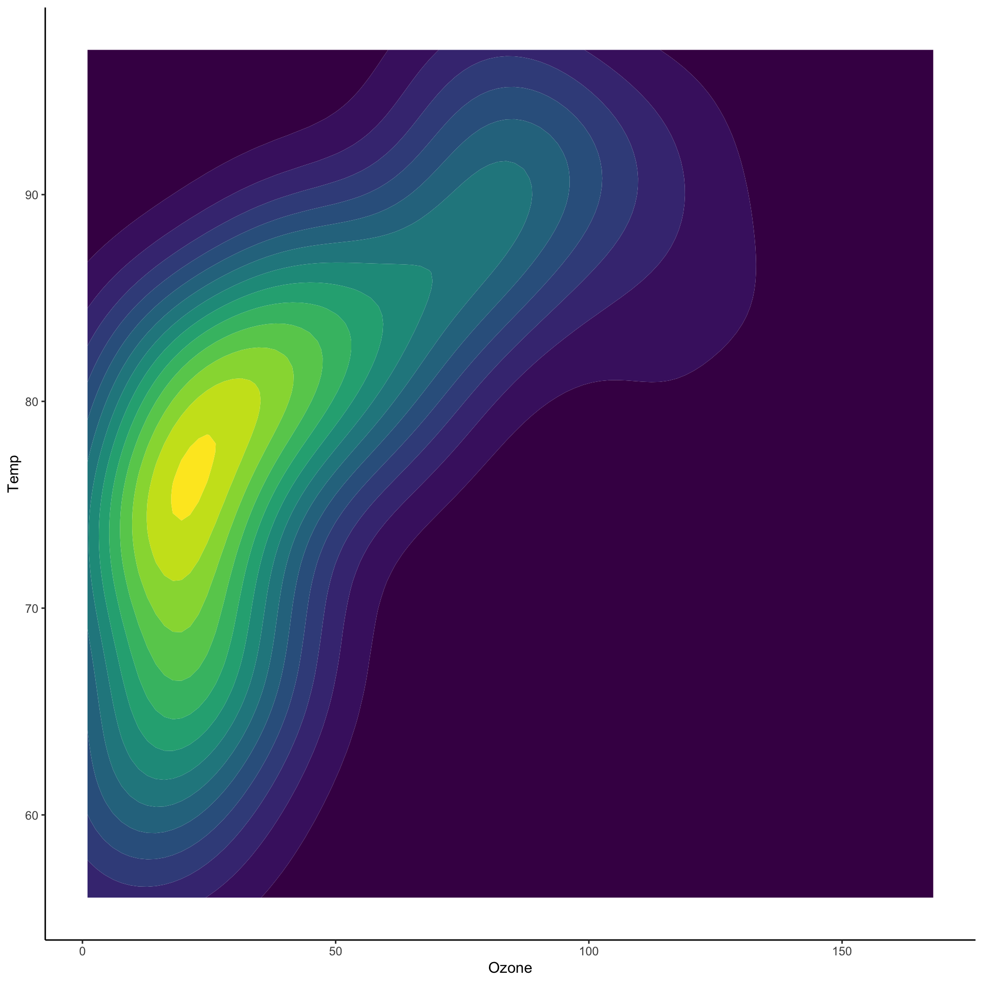
ggplot (airquality, aes (x= Ozone, y= Temp)) + stat_density_2d_filled ()
Two dimensional densities
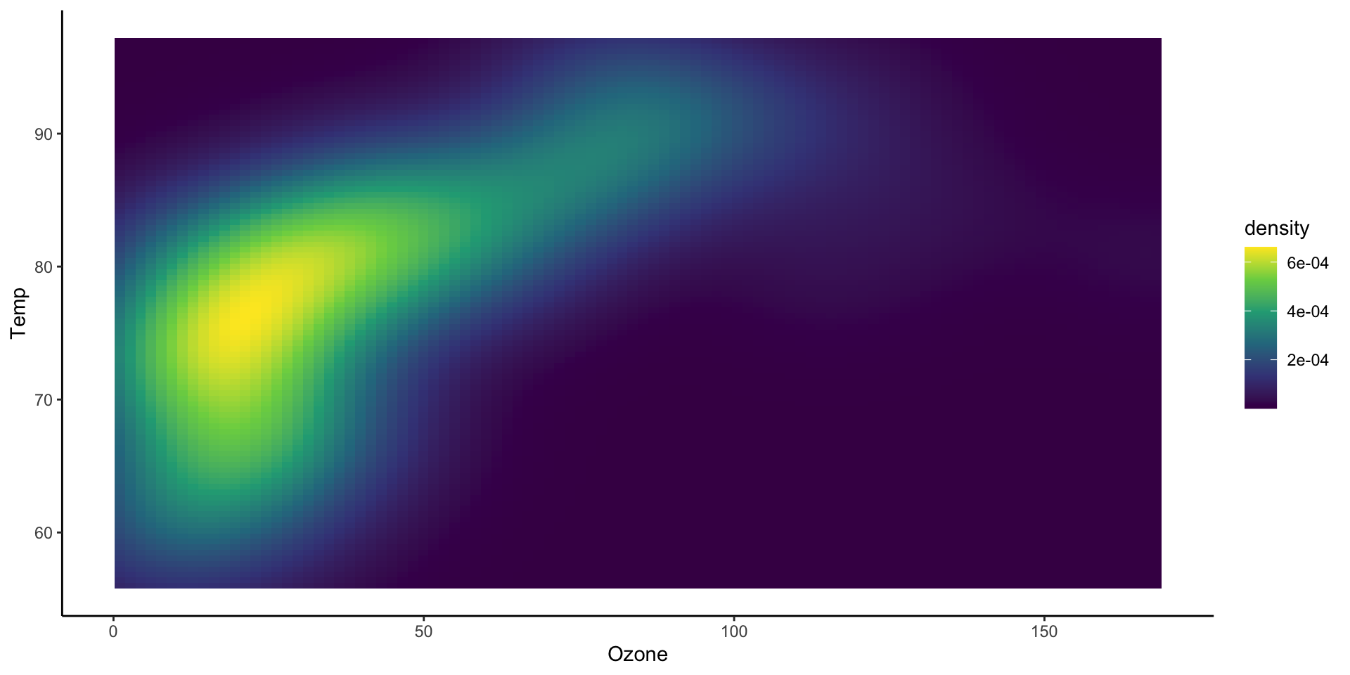
ggplot (airquality, aes (x= Ozone, y= Temp)) + stat_density_2d_filled (aes (fill = after_stat (density)),geom = "tile" ,contour = FALSE + scale_fill_viridis_c ()
Two dimensional histograms
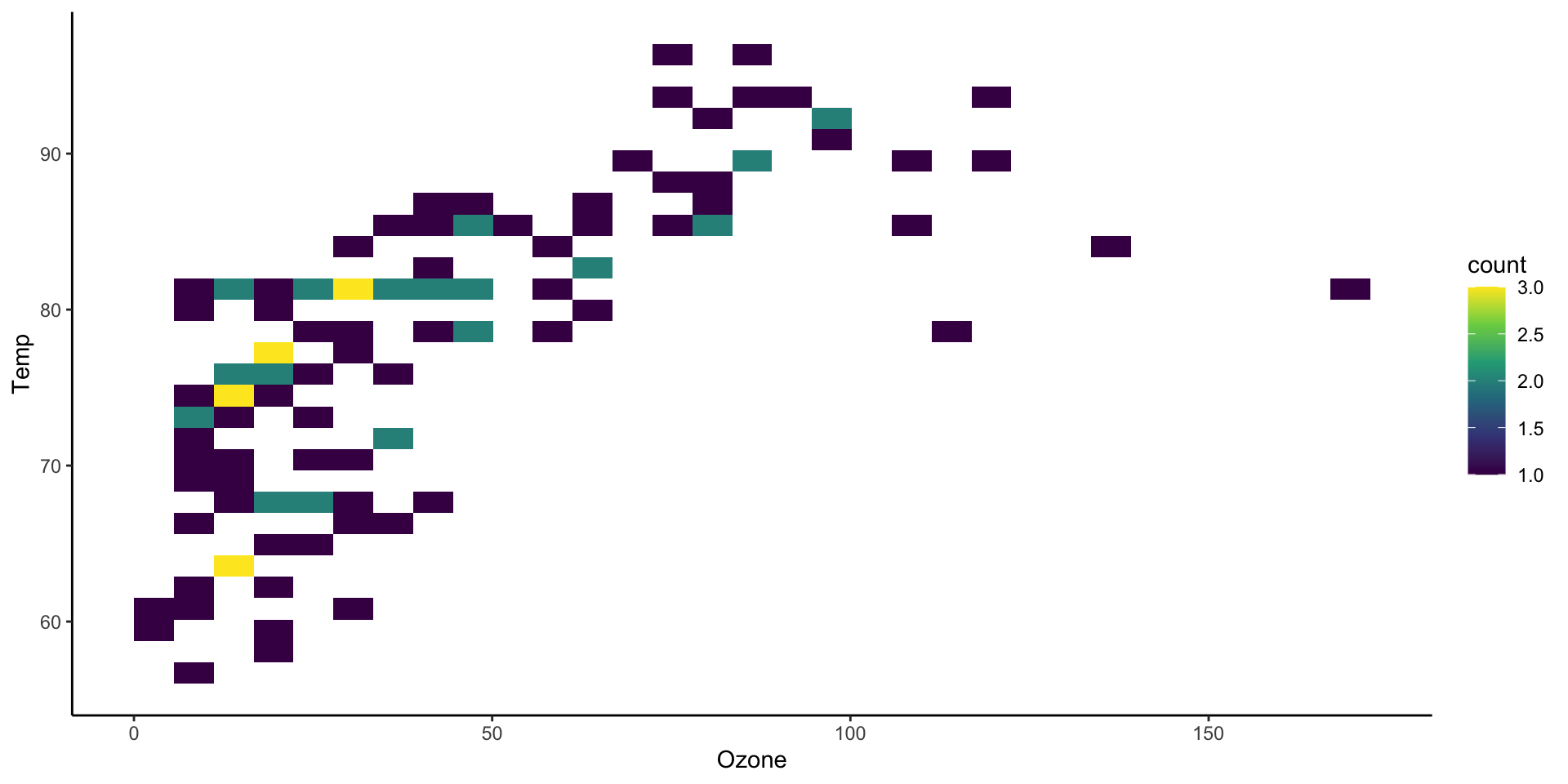
ggplot (airquality, aes (x= Ozone, y= Temp)) + stat_bin_2d () + scale_fill_viridis_c ()
Two dimensional histograms
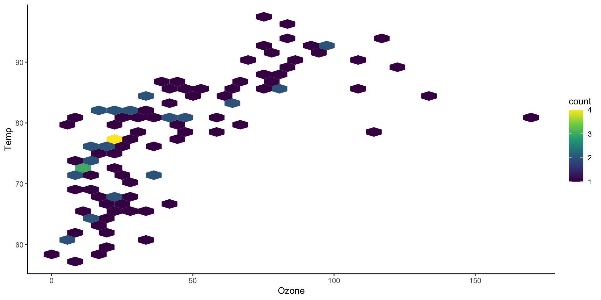
ggplot (airquality, aes (x= Ozone, y= Temp)) + stat_bin_hex () + scale_fill_viridis_c ()
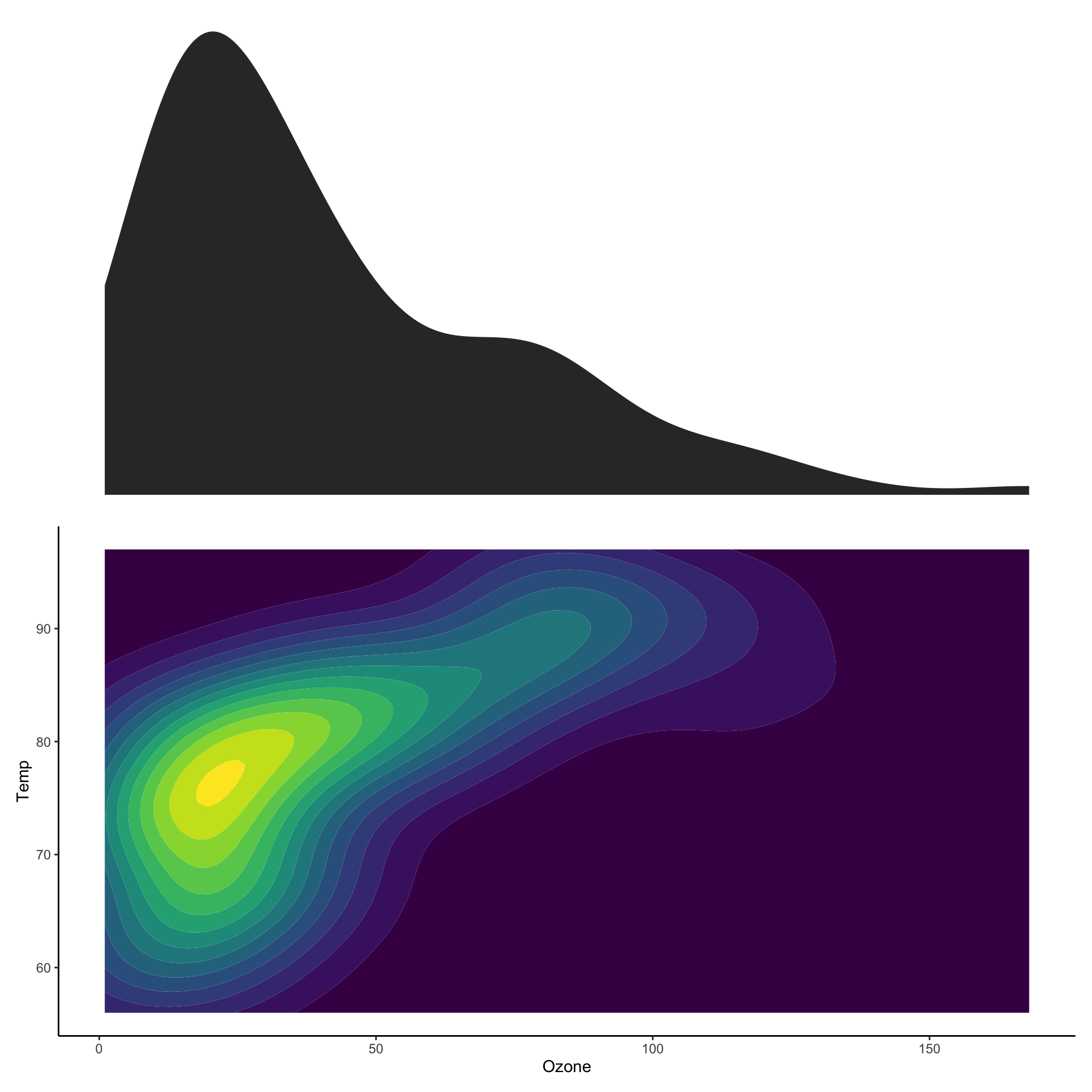
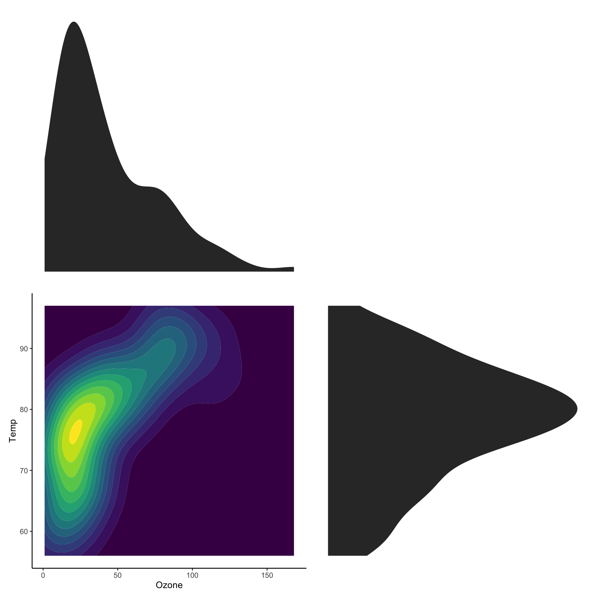
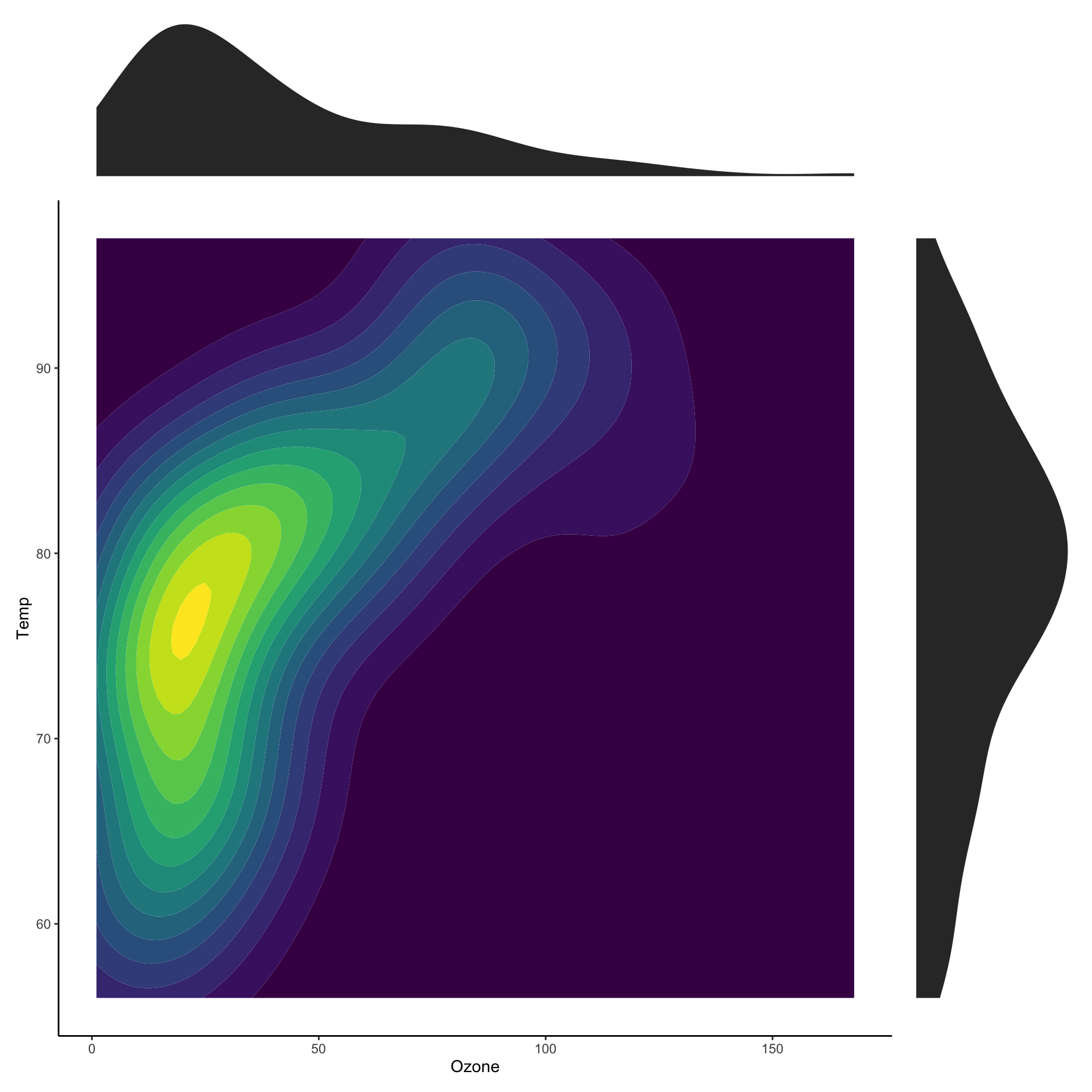
Showing marginal distributions
ggplot (airquality, aes (x= Ozone, y= Temp)) + stat_density_2d_filled () + theme (legend.position= "none" )
Showing marginal distributions
Showing marginal distributions
# https://patchwork.data-imaginist.com/ :: install ("patchwork" )
<- ggplot (airquality, aes (x= Ozone, y= Temp)) + stat_density2d_filled () + theme (legend.position= "none" )
Showing marginal distributions
# https://patchwork.data-imaginist.com/ :: install ("patchwork" )
<- ggplot (airquality, aes (x= Ozone, y= Temp)) + stat_density2d_filled () + theme (legend.position= "none" )<- ggplot (airquality, aes (x= Ozone)) + stat_density () + theme_void ()wrap_plots (p_ozone,nrow = 2
Showing marginal distributions
# https://patchwork.data-imaginist.com/ :: install ("patchwork" )
<- ggplot (airquality, aes (x= Ozone, y= Temp)) + stat_density2d_filled () + theme (legend.position= "none" )<- ggplot (airquality, aes (x= Ozone)) + stat_density () + theme_void ()<- ggplot (airquality, aes (x= Temp)) + stat_density () + coord_flip () + theme_void ()wrap_plots (p_ozone, plot_spacer (),nrow = 2
Showing marginal distributions
# https://patchwork.data-imaginist.com/ :: install ("patchwork" )
<- ggplot (airquality, aes (x= Ozone, y= Temp)) + stat_density2d_filled () + theme (legend.position= "none" )<- ggplot (airquality, aes (x= Ozone)) + stat_density () + theme_void ()<- ggplot (airquality, aes (x= Temp)) + stat_density () + coord_flip () + theme_void ()wrap_plots (p_ozone, plot_spacer (),nrow = 2 ,widths = c (1 , 0.2 ),heights = c (0.2 , 1 )
Representing large sets of values
Does this plot make sense?
We are modelling countries as realizations of a random sample.
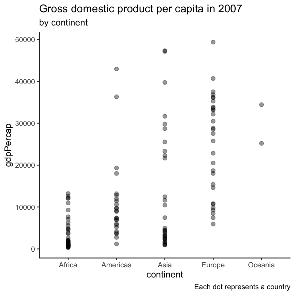
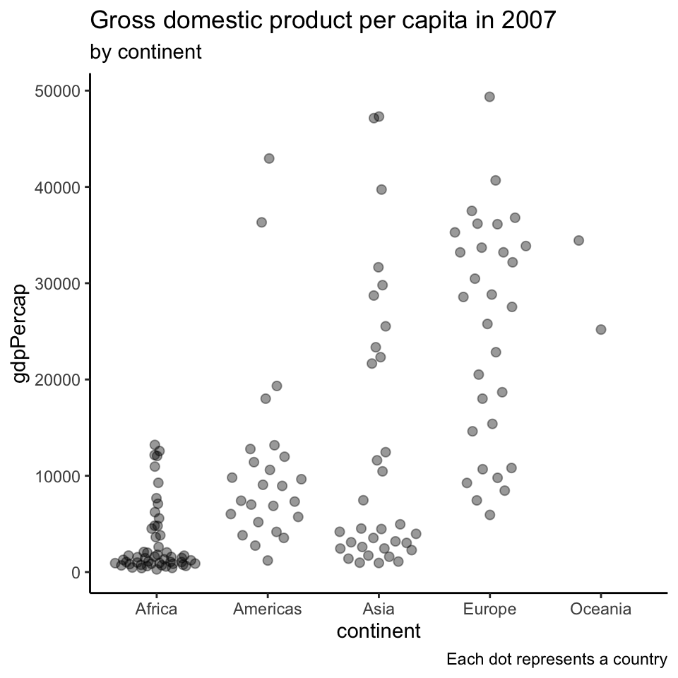
Showing all the data points
ggplot (filter (gapminder, == 2007 ),aes (x= continent, y= gdpPercap)) + geom_point (alpha= 0.4 , size= 2 + labs (title= 'Gross domestic product per capita in 2007' ,subtitle= 'by continent' ,caption= 'Each dot represents a country'
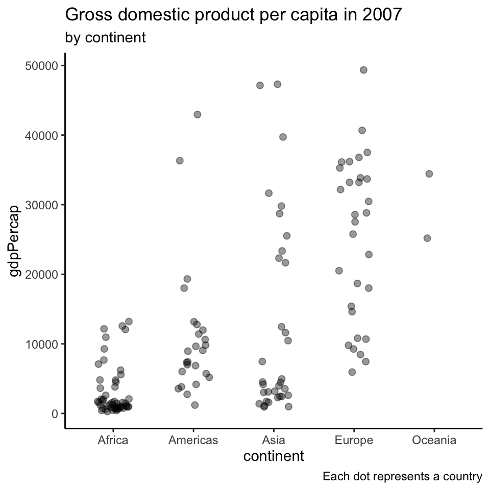
Showing all the data points (2)
ggplot (filter (gapminder, == 2007 ),aes (x= continent, y= gdpPercap)) + geom_point (alpha= 0.4 ,size= 2 ,position= position_jitter (.2 )) + labs (title= 'Gross domestic product per capita in 2007' ,subtitle= 'by continent' ,caption= 'Each dot represents a country'
Beeswarm
:: install ("ggbeeswarm" )library (beeswarm)
ggplot (filter (gapminder, == 2007 ),aes (x= continent, y= gdpPercap)) + geom_quasirandom (alpha= 0.4 , size= 2 + labs (title= 'Gross domestic product per capita in 2007' ,subtitle= 'by continent' ,caption= 'Each dot represents a country'
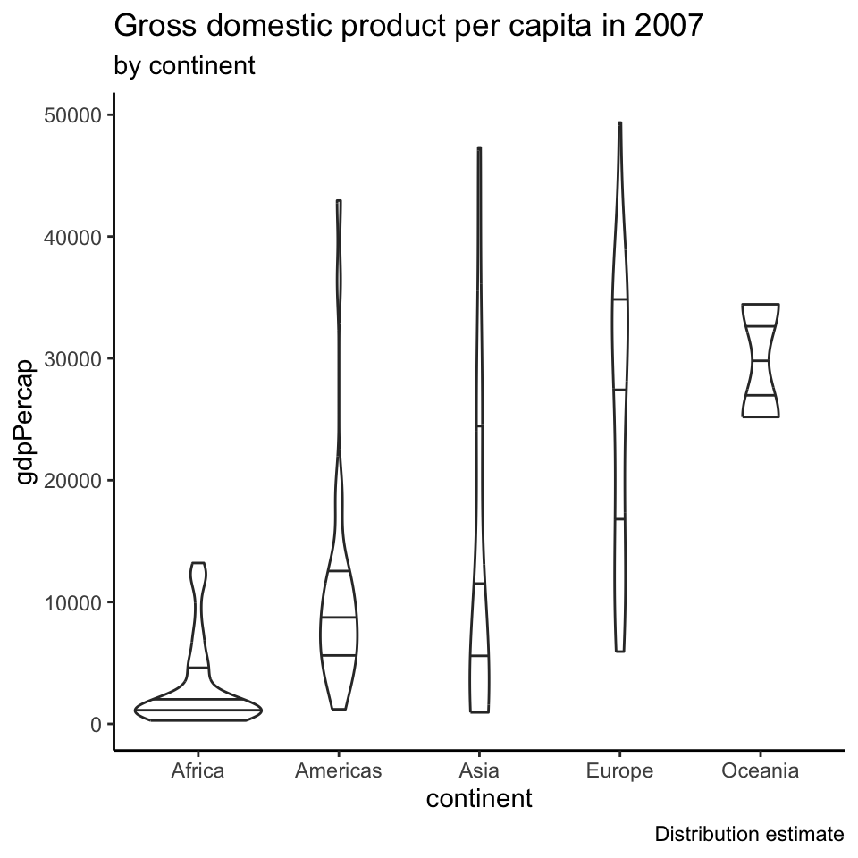
Violin plots
ggplot (filter (gapminder, == 2007 ),aes (x= continent, y= gdpPercap)) + geom_violin (draw_quantiles = c (.25 ,.5 ,.75 )+ labs (title= 'Gross domestic product per capita in 2007' ,subtitle= 'by continent' ,caption= 'Distribution estimate'
Using quantiles to summarize a dataset
These 5 numbers nicely summarize a dataset
mimum
\(0.25\) -quantilemedian
\(0.75\) -quantilemaximum
The Inter Quantile Range (IQR) is the data interval between \(q(0.75)\) and \(q(0.25)\)
It tells you the range where the “middle half” of the dataset is.
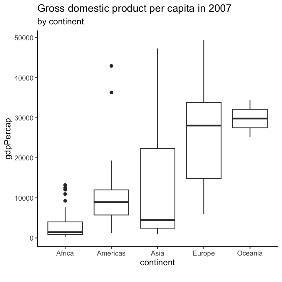
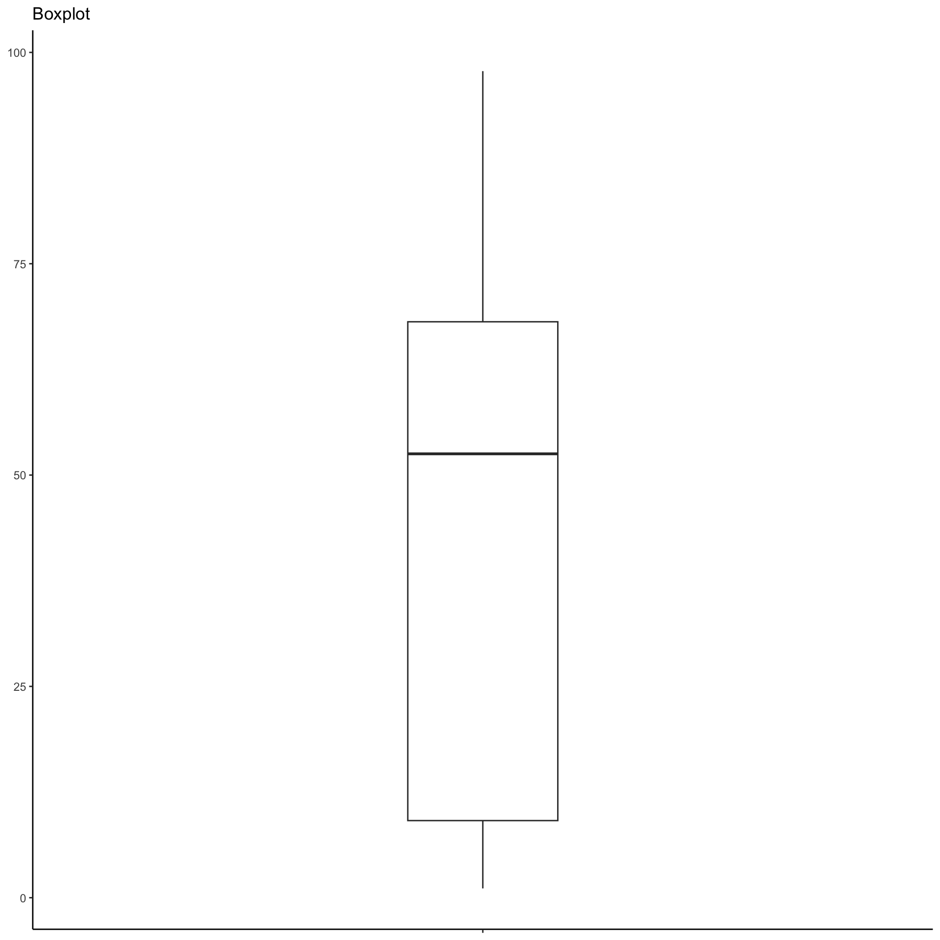
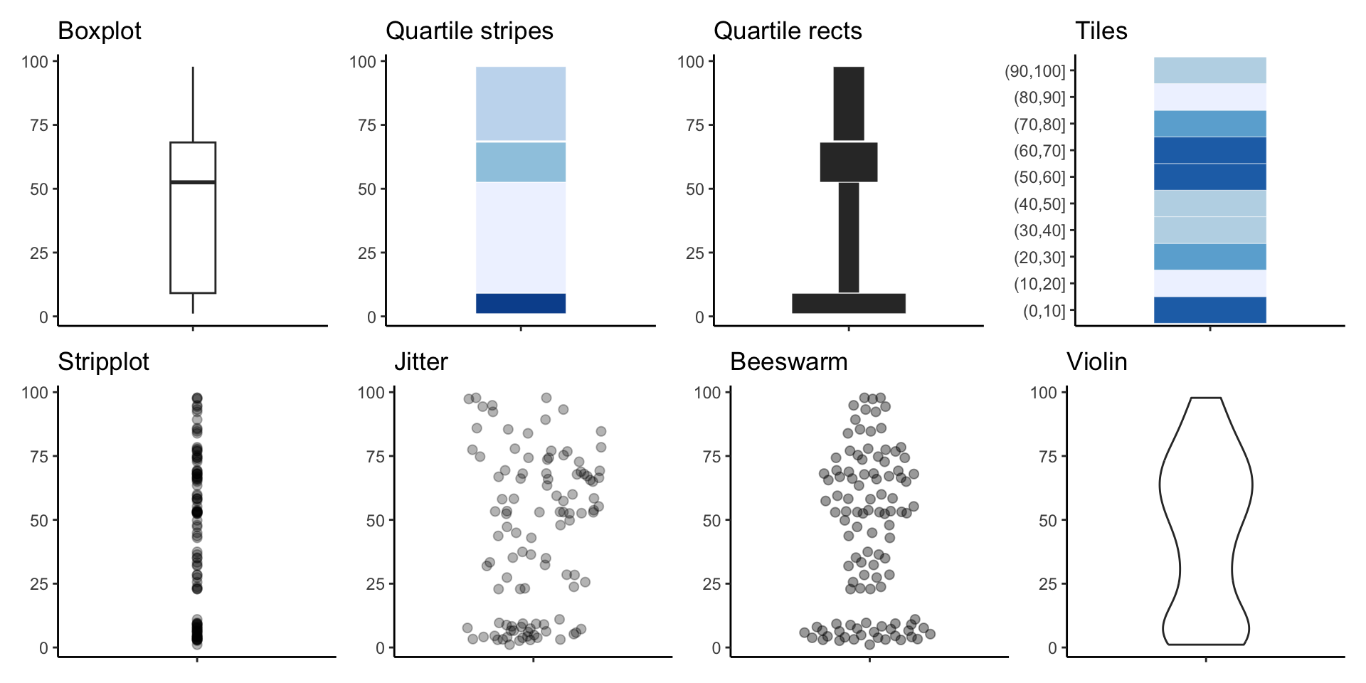
Box plots
ggplot (filter (gapminder, == 2007 ),aes (x= continent, y= gdpPercap)) + geom_boxplot () + labs (title= 'Gross domestic product per capita in 2007' ,subtitle= 'by continent' ,caption= ''
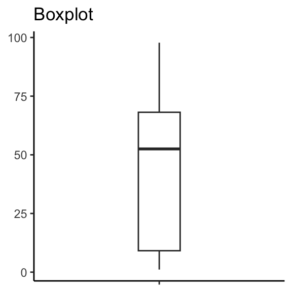
Box plots (2)
Box plots (2)
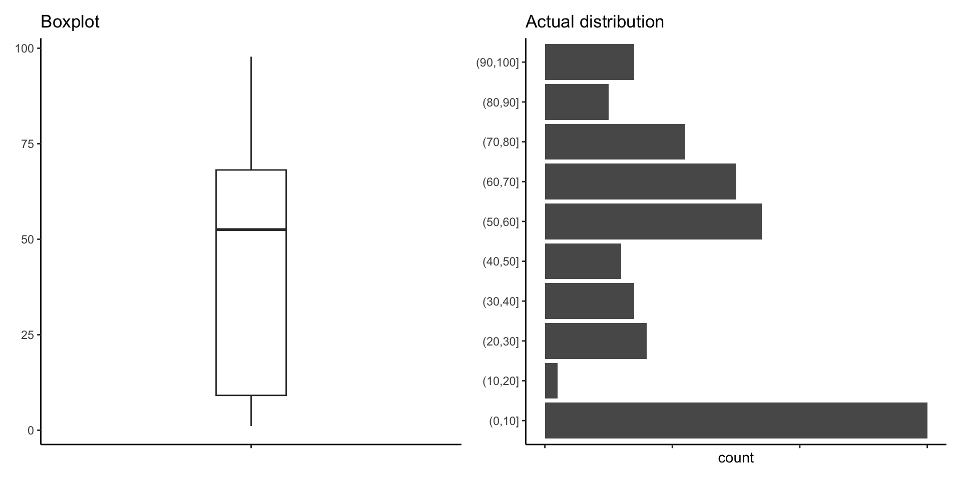
How many points are there between 0 and 10?
Box plots (2)
<- ggplot (unbalanced, aes (x= factor (0 ), y= val)) + labs (title= "Boxplot" ) + geom_boxplot (width= 0.2 ) + theme (axis.text.x = element_blank (),axis.title = element_blank ())
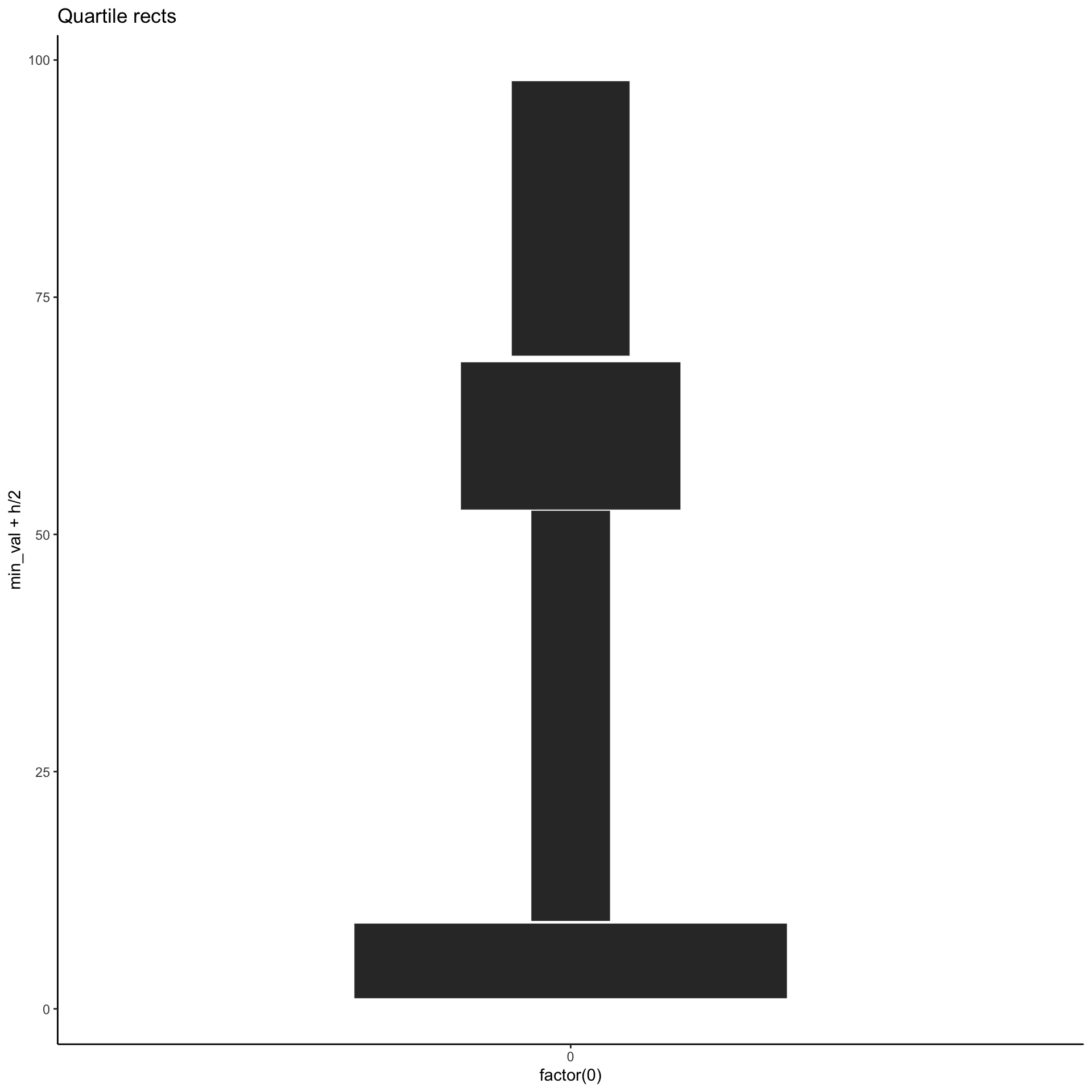
A potential alternative
<- unbalanced %>% group_by (g = ntile (val, 4 )%>% summarise (min_val = min (val),max_val = max (val),h = max_val - min_val,w = 4 / h%>% ggplot (aes (x = factor (0 ), y= min_val + h/ 2 , height = h, width = w)) + labs (title= "Quartile rects" ) + geom_tile (color= "white" )
A potential alternative
# A tibble: 107 × 1
     val
   <dbl>
 1  7.65
 2  3.02
 3  9.37
 4  3.12
 5  2.65
 6  6.04
 7  4.54
 8  7.22
 9  1.10
10  3.17
# ℹ 97 more rows
A potential alternative
<- unbalanced %>% group_by (g = ntile (val, 4 )
# A tibble: 107 × 2
# Groups:   g [4]
     val     g
   <dbl> <int>
 1  7.65     1
 2  3.02     1
 3  9.37     2
 4  3.12     1
 5  2.65     1
 6  6.04     1
 7  4.54     1
 8  7.22     1
 9  1.10     1
10  3.17     1
# ℹ 97 more rows
A potential alternative
<- unbalanced %>% group_by (g = ntile (val, 4 )%>% summarise (min_val = min (val),max_val = max (val),h = max_val - min_val,w = 4 / h
# A tibble: 4 × 5
      g min_val max_val     h      w
  <int>   <dbl>   <dbl> <dbl>  <dbl>
1     1    1.10    9.00  7.90 0.506
2     2    9.25   52.5  43.3  0.0925
3     3   52.6    68.2  15.6  0.257
4     4   68.8    97.8  29.0  0.138
A potential alternative
<- unbalanced %>% group_by (g = ntile (val, 4 )%>% summarise (min_val = min (val),max_val = max (val),h = max_val - min_val,w = 4 / h%>% ggplot (aes (x = factor (0 ), y= min_val + h/ 2 , height = h, width = w)) + labs (title= "Quartile rects" ) + geom_tile (color= "white" )
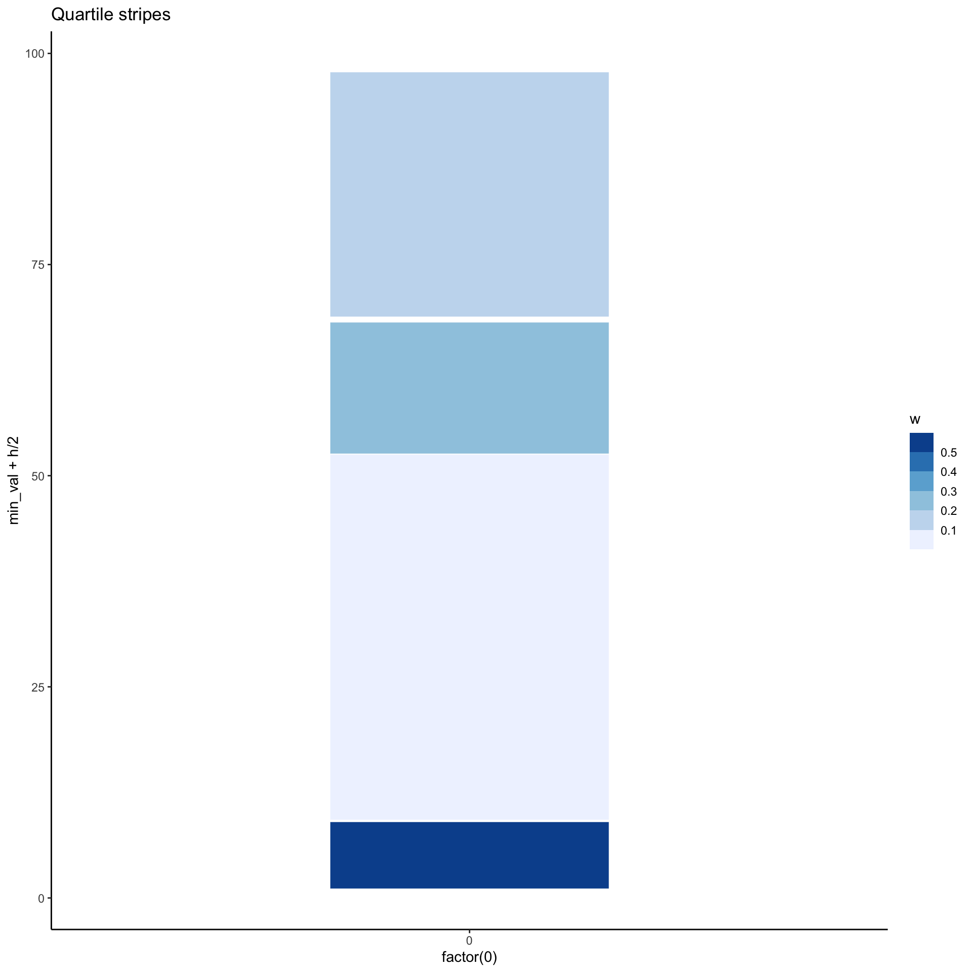
Another alternative
<- unbalanced %>% group_by (g = ntile (val, 4 )%>% summarise (min_val = min (val),max_val = max (val),h = max_val - min_val,w = 4 / h%>% ggplot (aes (x = factor (0 ), y= min_val + h/ 2 , height = h,fill = w)) + labs (title= "Quartile stripes" ) + geom_tile (width = 0.4 , color= "white" ) + scale_fill_fermenter (direction = 1 )
Yet another alternative
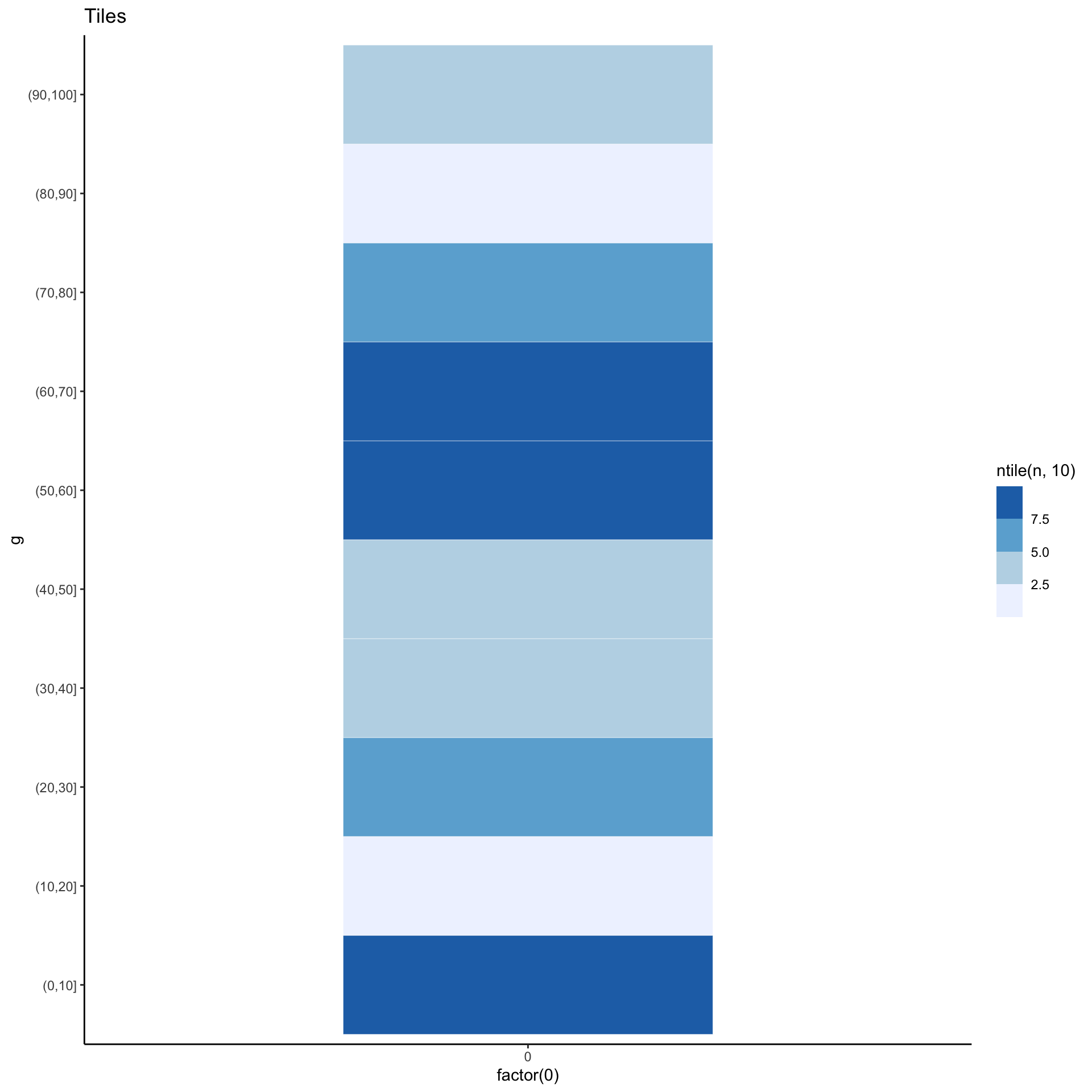
<- unbalanced %>% count (g = cut (val, (0 : 10 ) * 10 )%>% ggplot (aes (x= factor (0 ), y= g, fill= ntile (n, 10 ))) + labs (title= "Tiles" ) + geom_tile (width= 0.5 , color= "white" , size= 0.1 ) + scale_fill_fermenter (direction = 1 )
Yet another alternative
# A tibble: 107 × 1
     val
   <dbl>
 1  7.65
 2  3.02
 3  9.37
 4  3.12
 5  2.65
 6  6.04
 7  4.54
 8  7.22
 9  1.10
10  3.17
# ℹ 97 more rows
Yet another alternative
<- unbalanced %>% count (g = cut (val, (0 : 10 ) * 10 )
# A tibble: 10 × 2
   g            n
   <fct>    <int>
 1 (0,10]      30
 2 (10,20]      1
 3 (20,30]      8
 4 (30,40]      7
 5 (40,50]      6
 6 (50,60]     17
 7 (60,70]     15
 8 (70,80]     11
 9 (80,90]      5
10 (90,100]     7
Yet another alternative
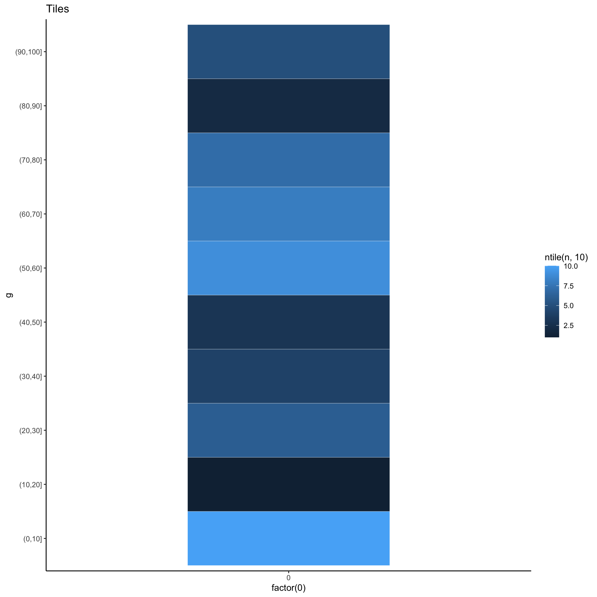
<- unbalanced %>% count (g = cut (val, (0 : 10 ) * 10 )%>% ggplot (aes (x= factor (0 ), y= g, fill= ntile (n, 10 ))) + labs (title= "Tiles" ) + geom_tile (width= 0.5 , color= "white" , size= 0.1 )
Yet another alternative
<- unbalanced %>% count (g = cut (val, (0 : 10 ) * 10 )%>% ggplot (aes (x= factor (0 ), y= g, fill= ntile (n, 10 ))) + labs (title= "Tiles" ) + geom_tile (width= 0.5 , color= "white" , size= 0.1 ) + scale_fill_fermenter (direction = 1 )
All together now!