Finding the cherries is much easier with color vision.
A little bit of theory
The visual system
The retina of the eye has two kinds of receptors:
rods: black and white vision in low light.
Little role in the preception of colors.
cones: color vision in normal light.
Concentrated around the visual axis.
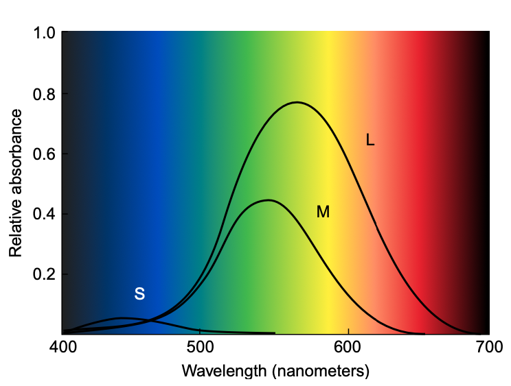
Responsivity of human cone cells
The visual system
Image from Ware (2008)
How does this impact our work?
Showing small blue text on a black background is a bad idea. There is insufficient luminance contrast.
Showing small blue text on a black background is a bad idea. There is insufficient luminance contrast.
This effect is due to the low sensitivity of cones to blue wavelengths.
How does this impact our work?
Showing small yellow text on a white background is a bad idea. There is insufficient luminance contrast.
Showing small yellow text on a white background is a bad idea. There is insufficient luminance contrast.
Yellow wavelengths excite two different types of cones, making it almost as light as pure white.
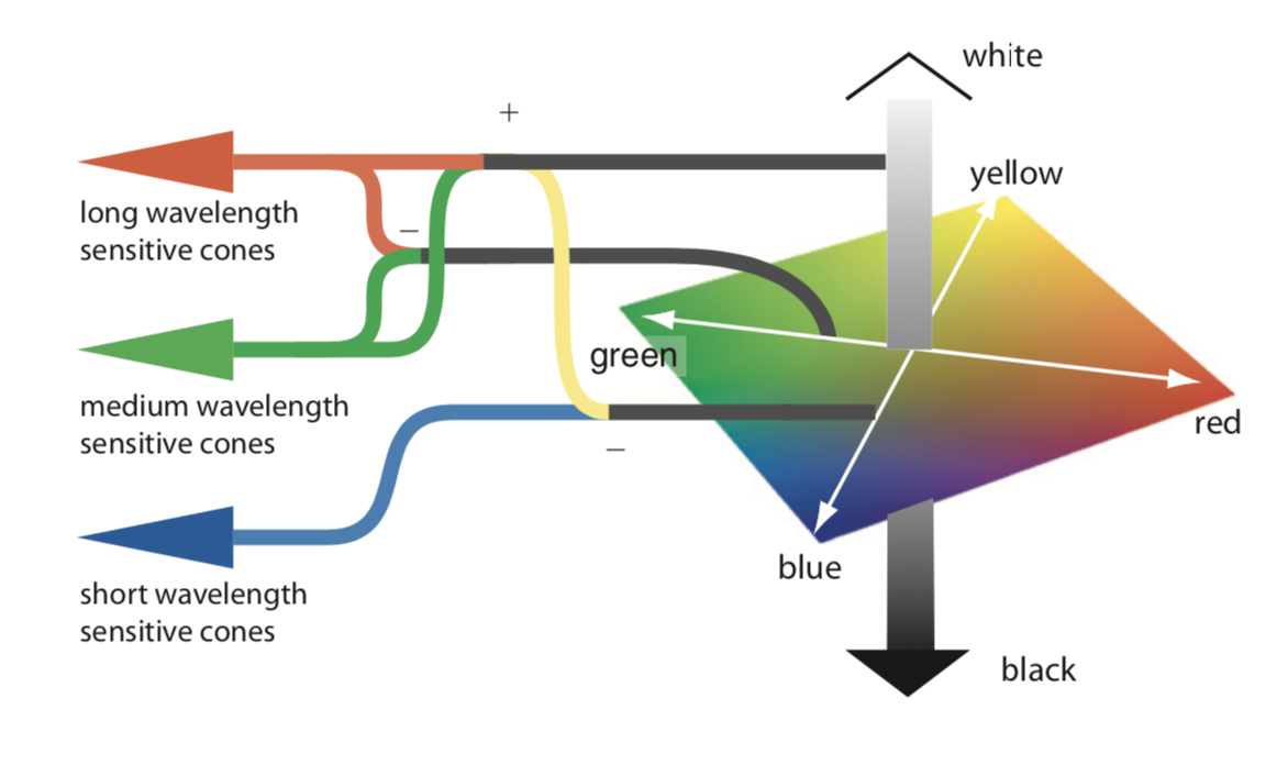
Opponent process theory
The brain combines signals from different cones to build three channels:
Red-Green
Yellow-Blue
Black-White
Unique hues
When there is a strong positive or negative signal on one of the three channels, and a neutral one on the other two,
we have “special” colors.
In most languages, these six colors are identified as the basic ones.
[Brent Berlin and Paul Kay, 1969. Basic Color Terms: Their Universality and Evolution]
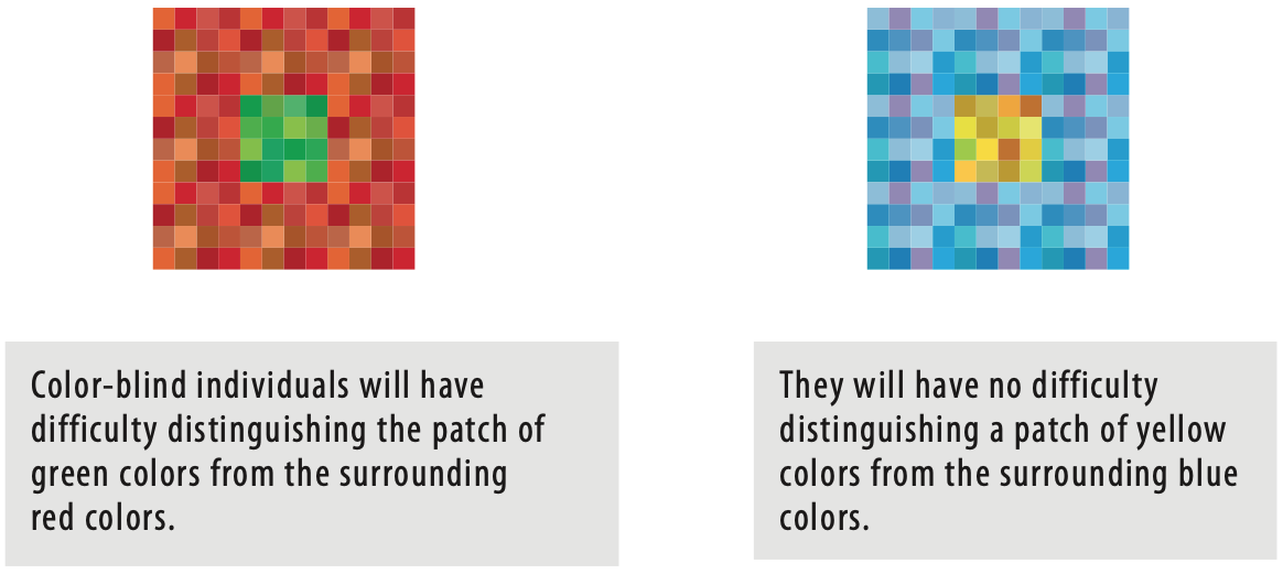
Color blindness
A considerable number of people is missing one or more color channels.
Most commonly, the missing channel is the red-green one.
When designing a color scale we need to take this into account in order to be inclusive.
Image from Ware (2008)
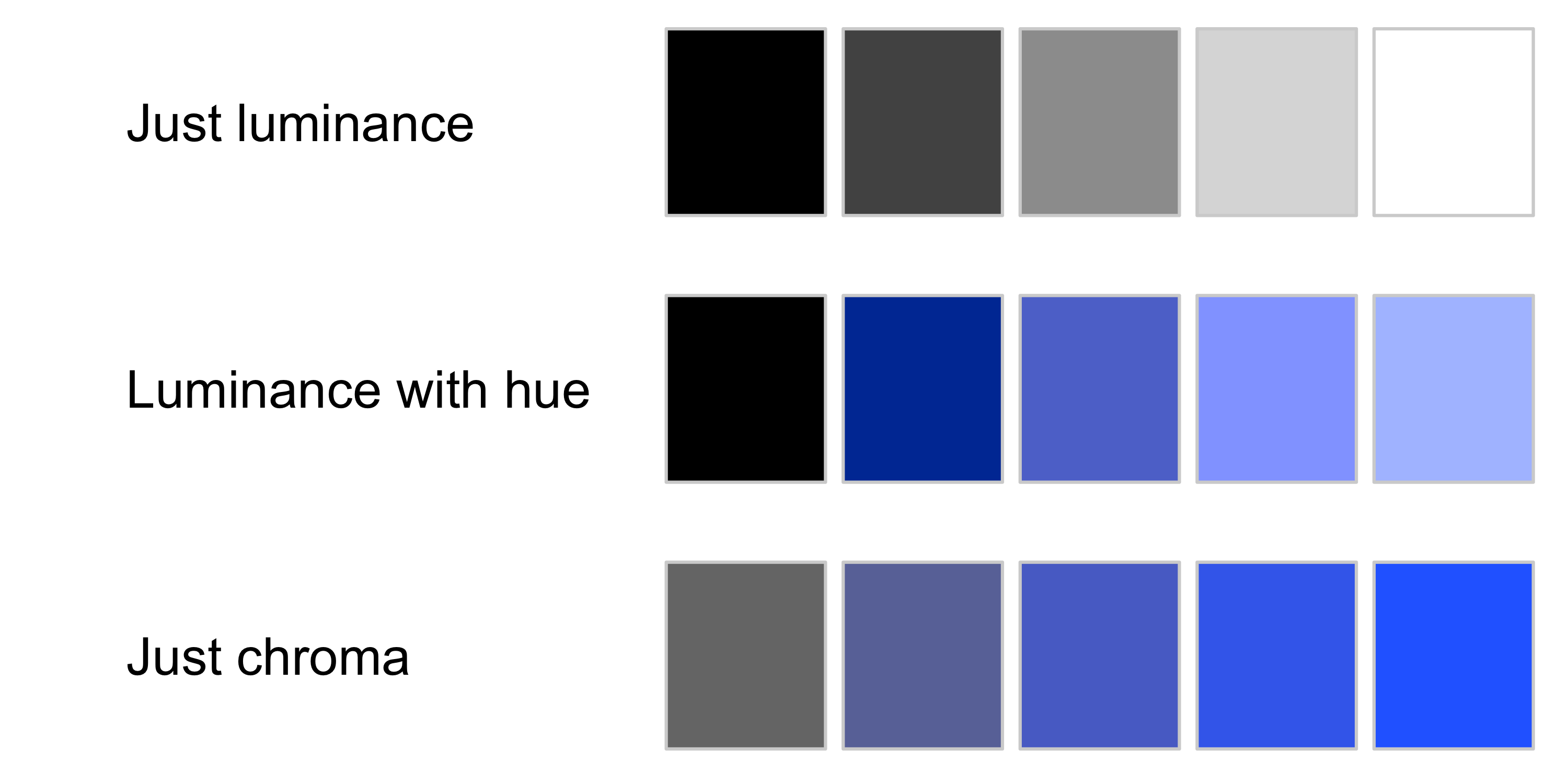
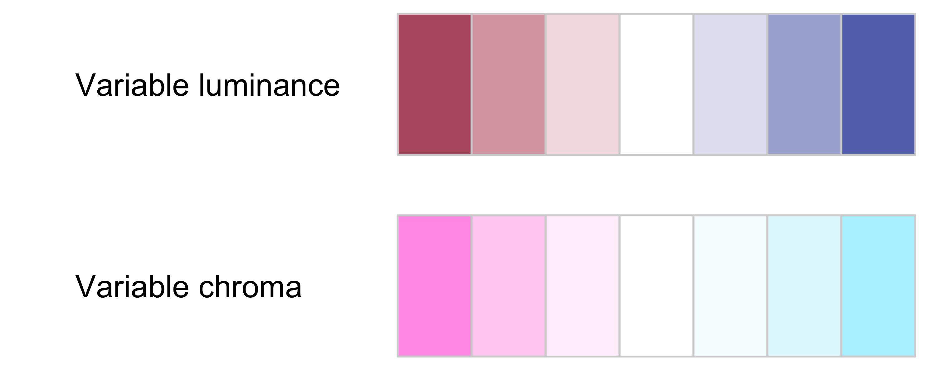
Contrast
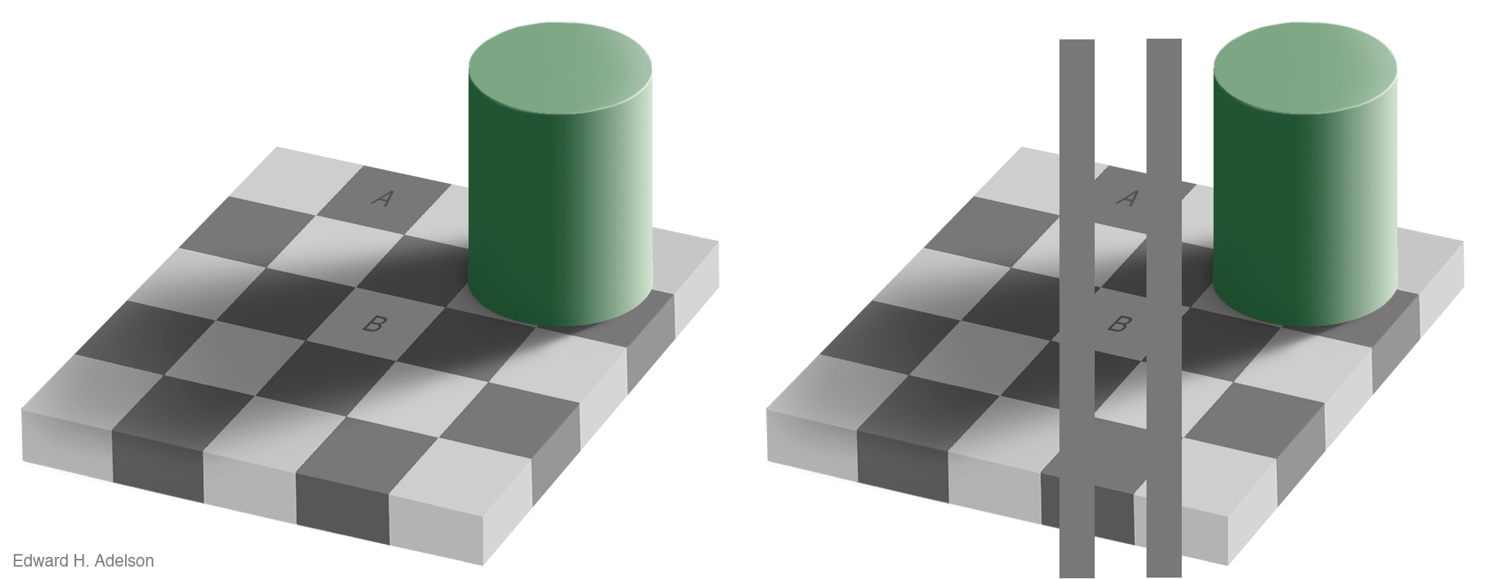
The effect of contrast is distortion of a patch of color in a way that increases the difference between a color and its surroundings.
We talk about luminance contrast when it occurs on the black-white channel, and chromatic when it occurs on the other two channels.
This phenomenon is called simultaneous contrast, where the background interferes with our perception of a patch of color.
It can create problems when reading values from a graphic.
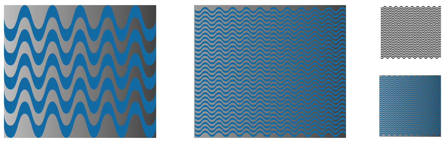
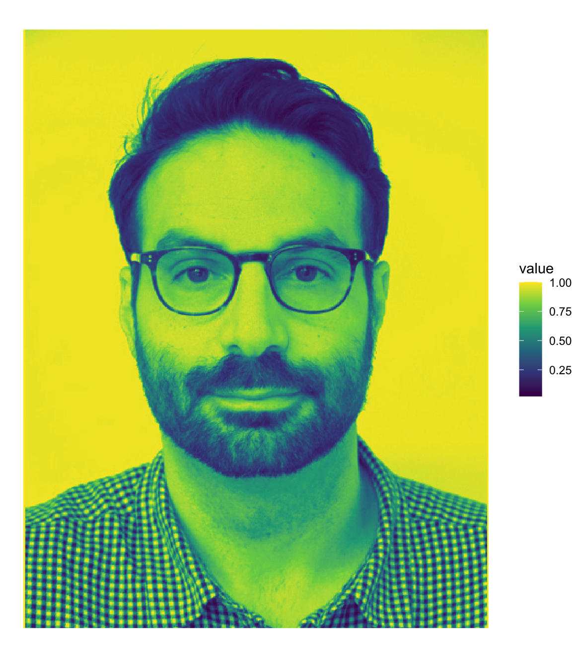
Spatial detail
The luminance channel is more effective at conveying spatial details.
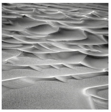
Shapes from shades
We perceive three dimensional surfaces through changes of luminance, rather than through chromatic changes.
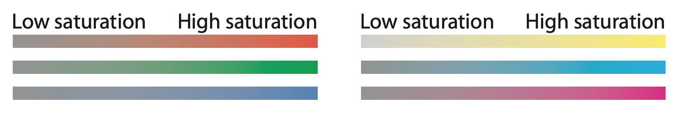
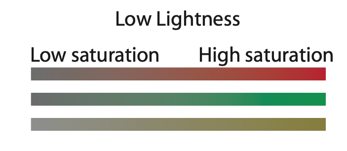
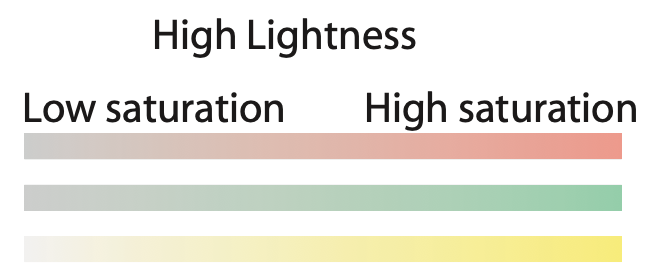
Saturation
The more vivid a color, the more saturated it is said to be.
More saturated colors are those that have strong signals on one or both of the chromatic channels.
Saturation
The maximum saturation for a given hue varies with luminance.
When colors are dark, the difference between cone signals on chromatic channels is smaller.
When colors are light, there is a reduction in saturation due to the color reproduction technology rather than perception.
Color segmentation
Remember the discriminability issue? Here it is at play!
Color spaces
To work with colors, we need to agree on a representation. Such representations of colors are called color spaces.
The RGB color space
\((red, green, blue)\)
In computer representations, each component goes from 0 to 255.
Why red, green and blue?
This is the set of colors with the widest gamut, that is the set of all colors that can be defined by means of combining the three primary colors, e.g., (235, 91, 52) or #eb5b34.
Color spaces
RGB is computationally convenient.
However, it is a poor fit for how our eyes work: it is not perceptually accurate.
In a perceptually uniform color space,
colors with the same perceptual distance are at the same distance in the space.
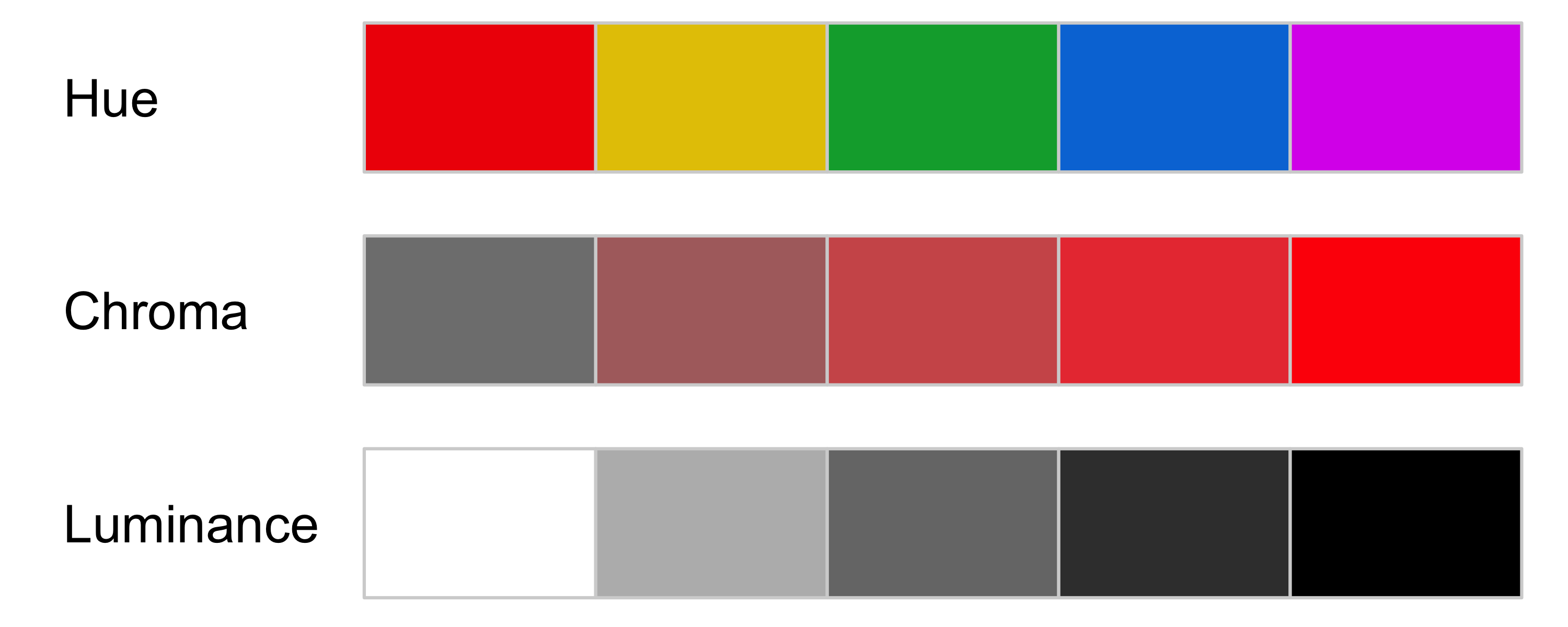
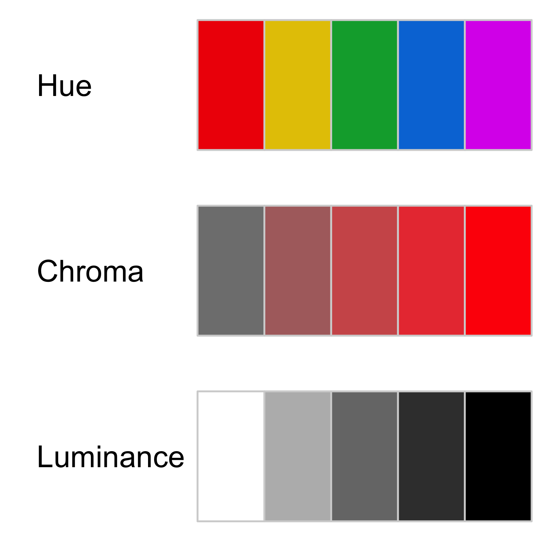
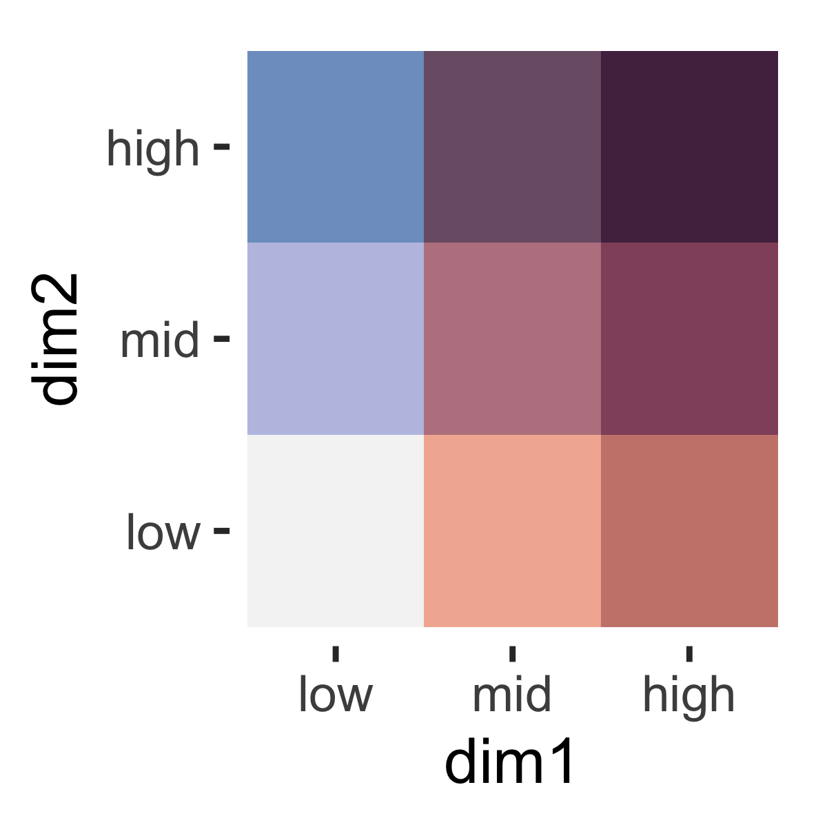
HCL color space
HCL (Hue-Chroma-Luminance): color space models that are designed to accord with human perception of color.
HCL - Hue
What we intuitively think of as pure colors:
HCL - Chroma
The “colorness” or intensity of the color.
From “vivid” to “muted”:
HCL - Luminance
Intuitively, the brightness of the color, or the amount of black mixed into the color.
From “dark” to “light”:
Designing a color space for color picking is a about finding which tradeoffs to make. In particular, independent control of hue, lightness and chroma can not be achieved in a color space that also maps sRGB to a simple geometrical shape.
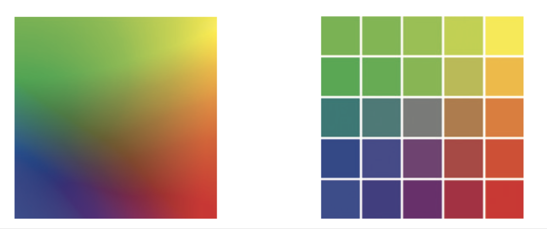
Because of the effects above, it is best not to encode more than 3 to 5 levels using the Chroma or Luminance channel, if we want our readers to be able to distinguish the levels (discriminability).
Fortunately, almost all of the work has been done for us already.
Different color spaces have been defined and standardized in ways that account for uneven or nonlinear aspects of human color perception.
Our decisions about color will focus more on when and how it should be used.
Colormaps
Colormaps
A colormap specifies a mapping between colors and data values
Categorical
Ordered
Sequential
Diverging
Continuous vs. discrete
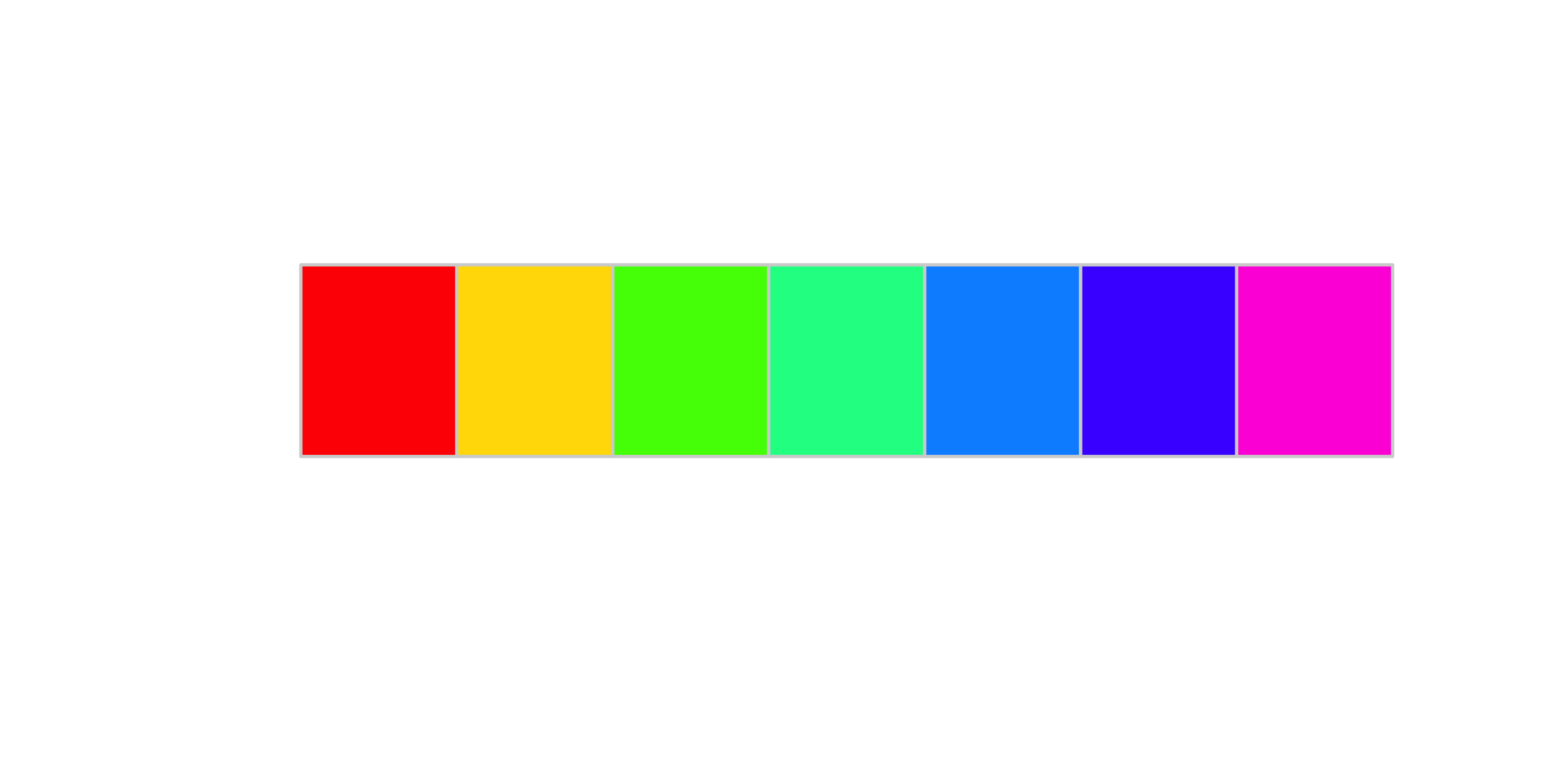
Categorical color maps
Use mainly hue to encode different categories
There are mainly two things to pay attention.
We can distinguish just about 12 bins of color, better to stick to at most 6.
Luminance contrast: we need our colored marks to “stand out” from the background.
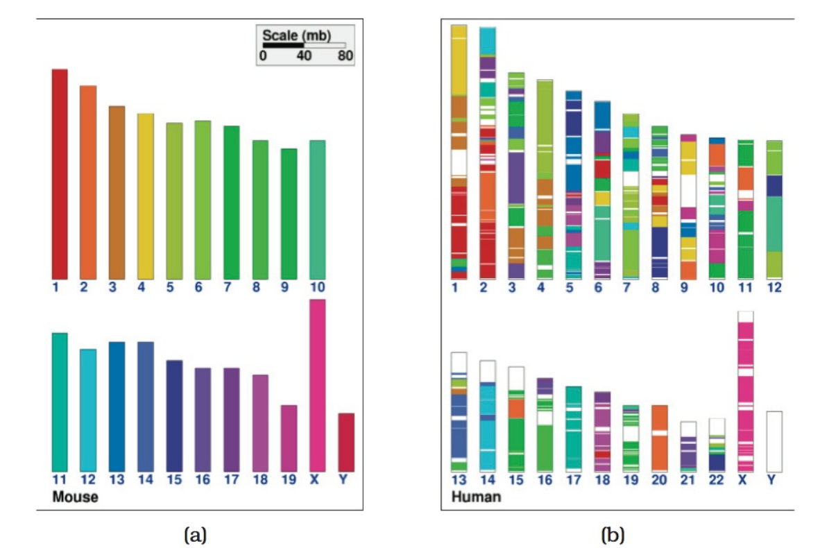
Encoding with color, an example
Encoding with color, an example
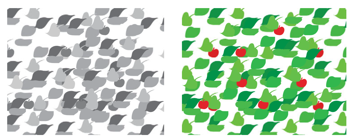
Categorical color maps - a bad example
Source: Munzner, ch.10, fig 10.8.
Ordered colormaps: sequential
Ordered colormaps: diverging
Encoding with color, an example
Encoding with color, an example
Encoding with color, an example
Encoding with color, an example
Encoding with color, an example
Encoding with color, an example
Encoding with color, an example
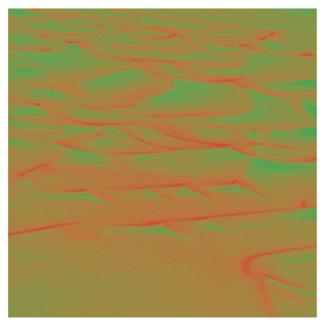
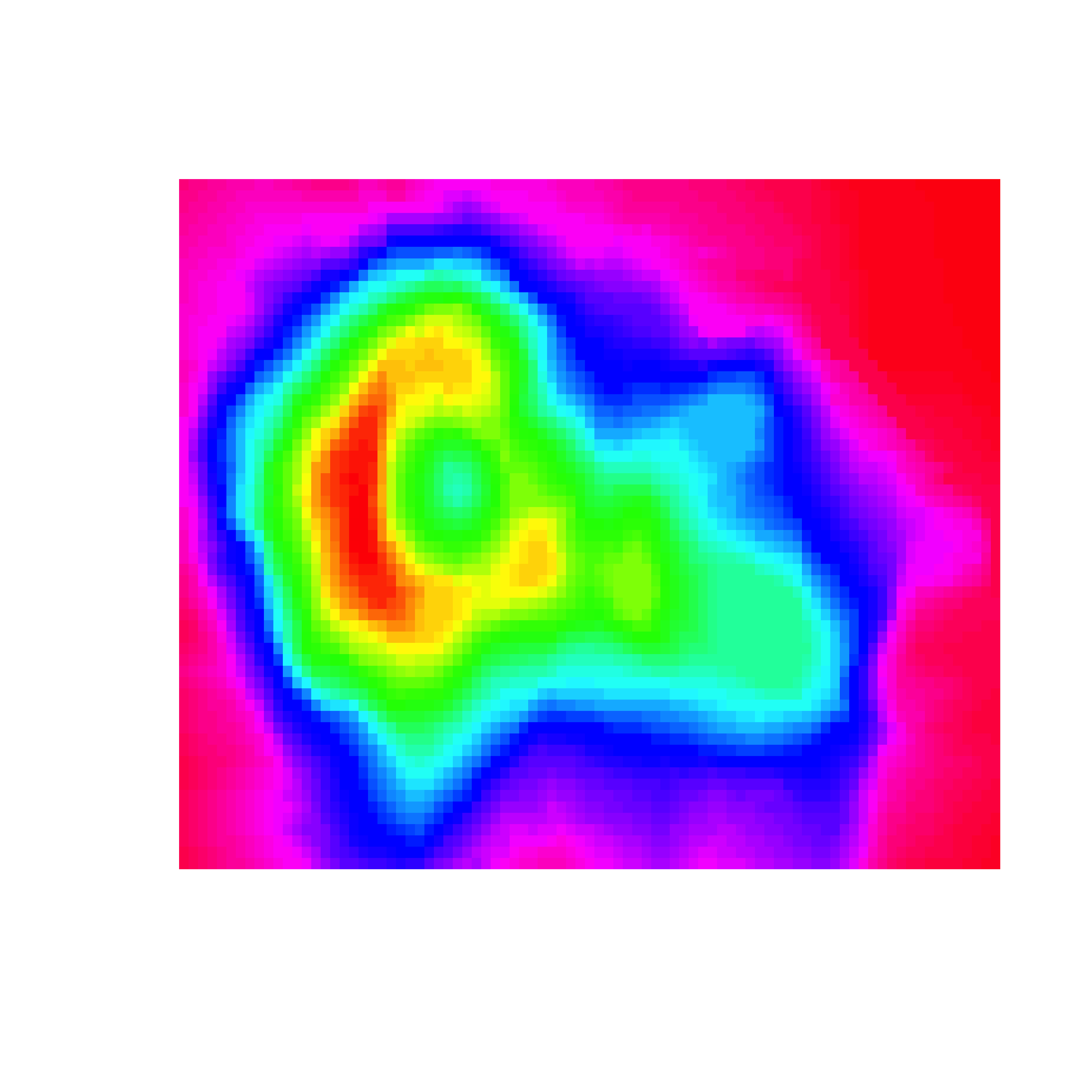
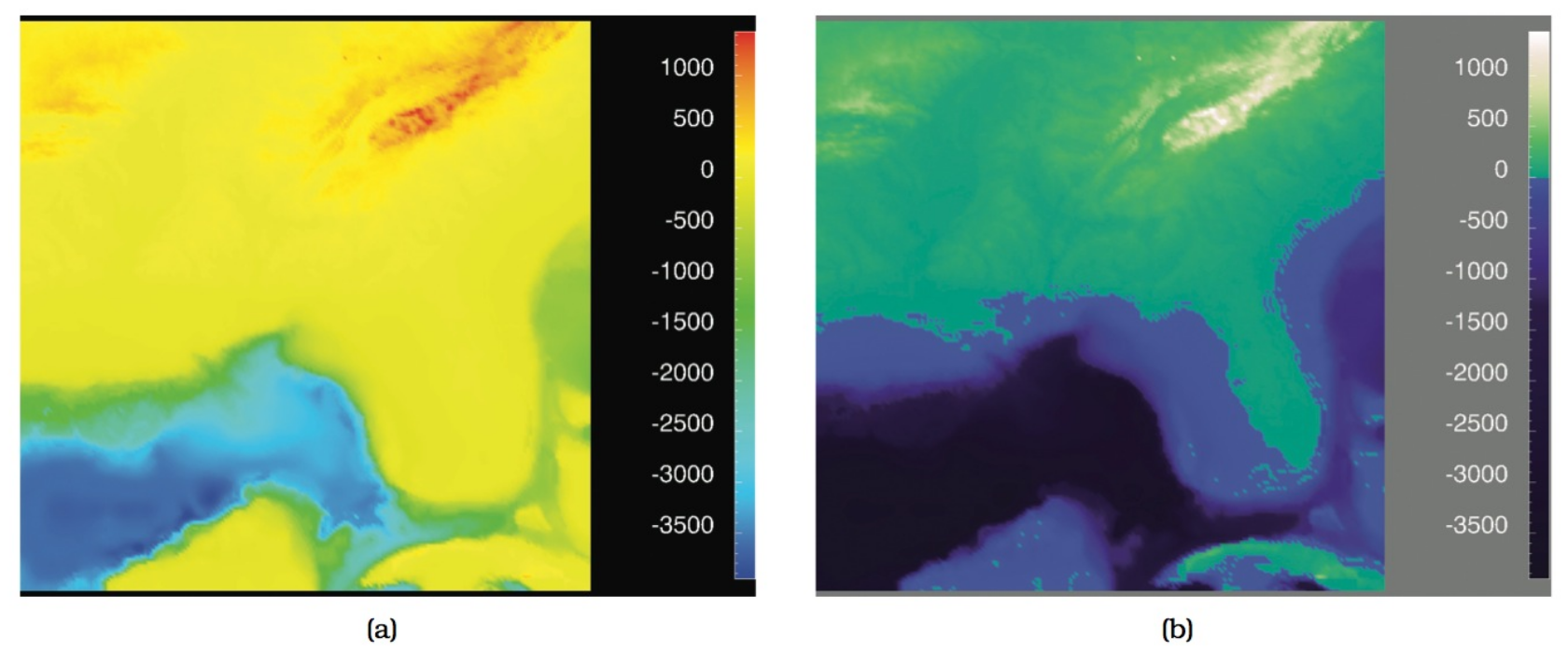
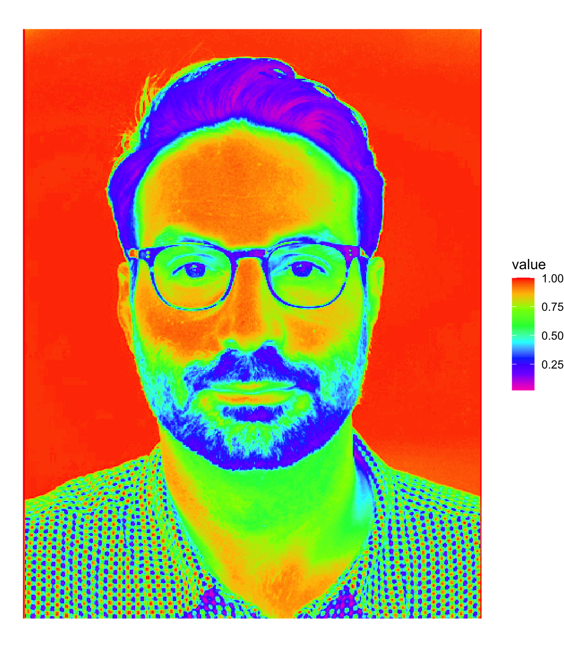
The rainbow color map
It’s often used to encode ordered data, why is it confusing?
The rainbow color map
The rainbow color map
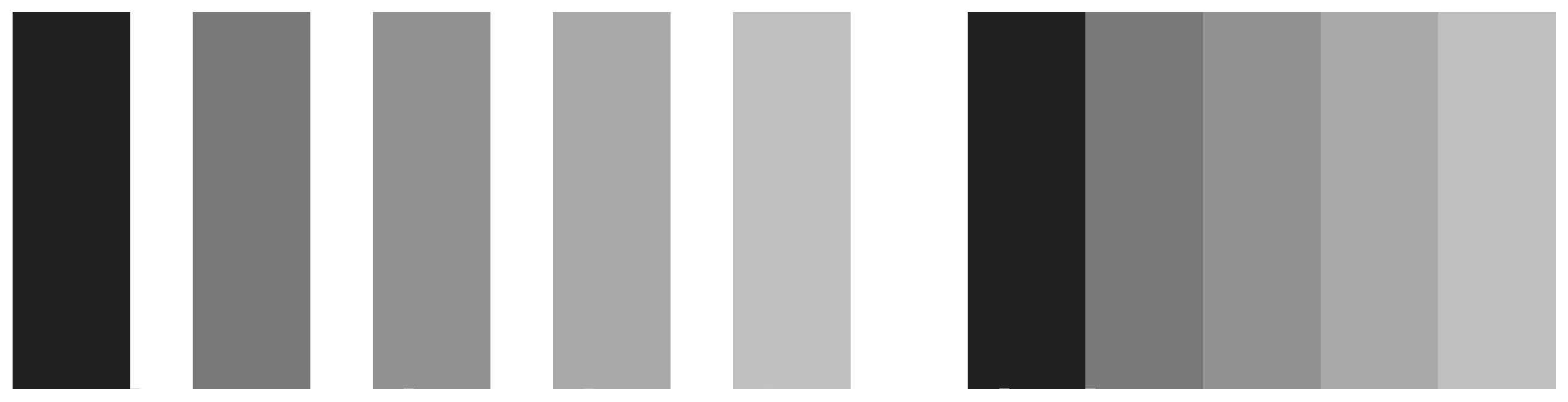
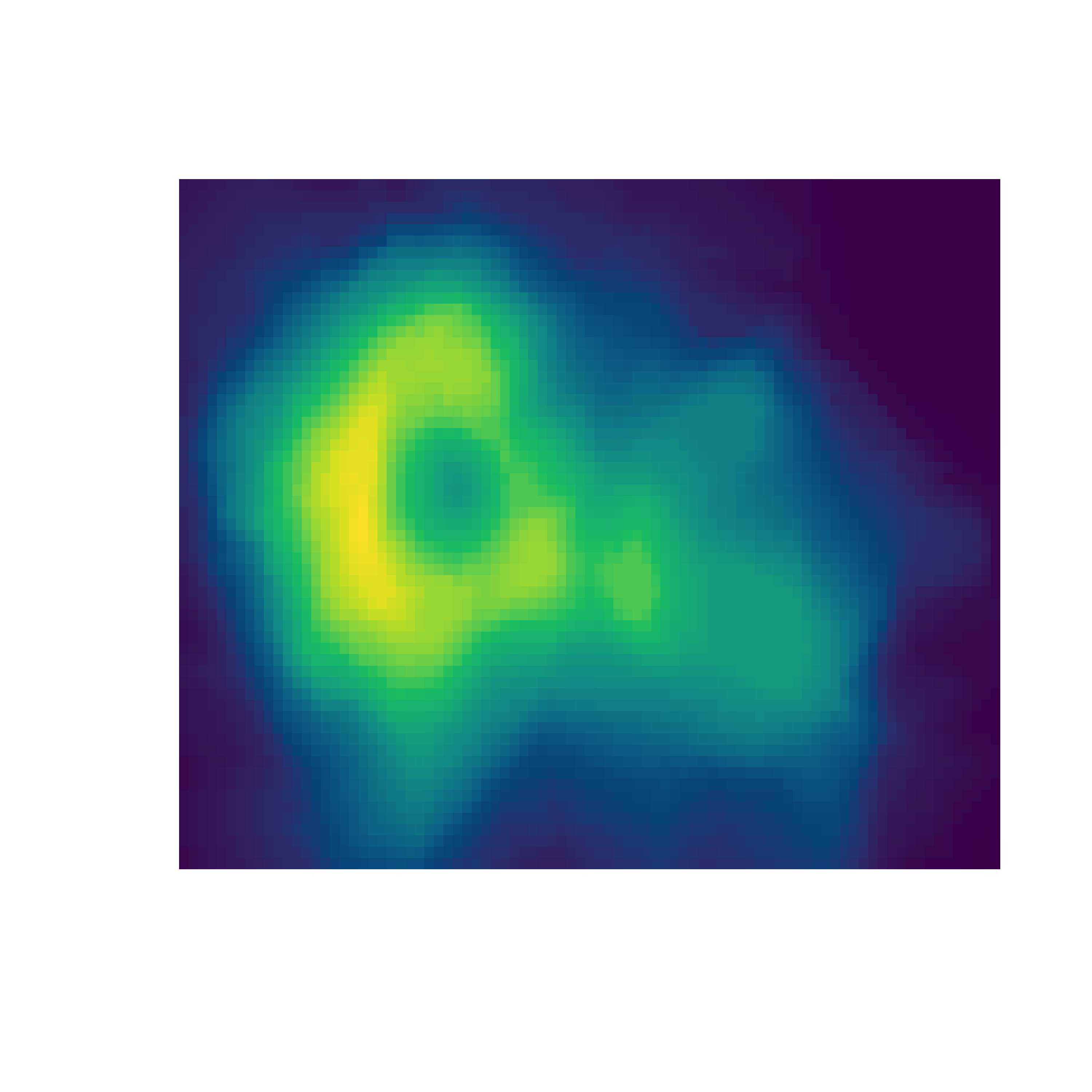
Monotonically increasing luminance colormap
The rainbow color map
The rainbow color map
An overview of R colormaps
You don’t need to create your colormaps from scratch.
R supports a rich collection of colormaps ready for use.
The contrast ratio, as defined by the World Wide Web Consortium, is a number quantifying the contrast with the background. It should be higher than 4 for text, as a general guideline.