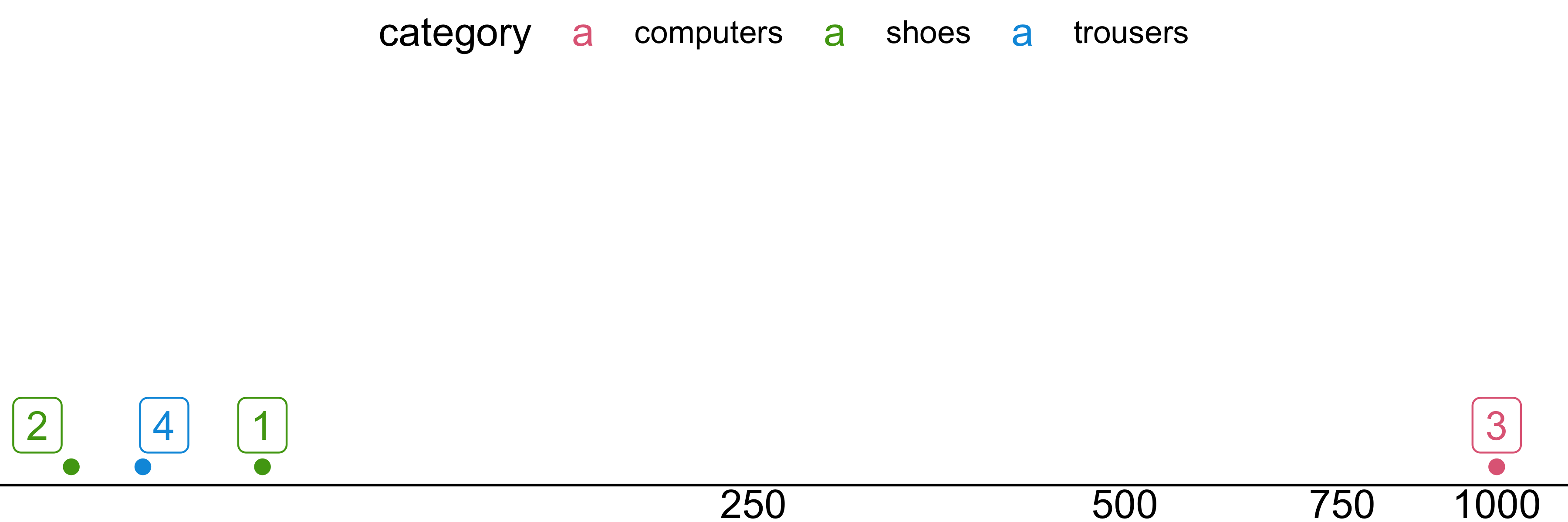
| idx | category | price |
|---|---|---|
| 1 | shoes | 100 |
| 2 | shoes | 70 |
| 3 | computers | 1000 |
| 4 | trousers | 80 |
Layered Grammar of Graphics
Data Visualization and Exploration
Scales
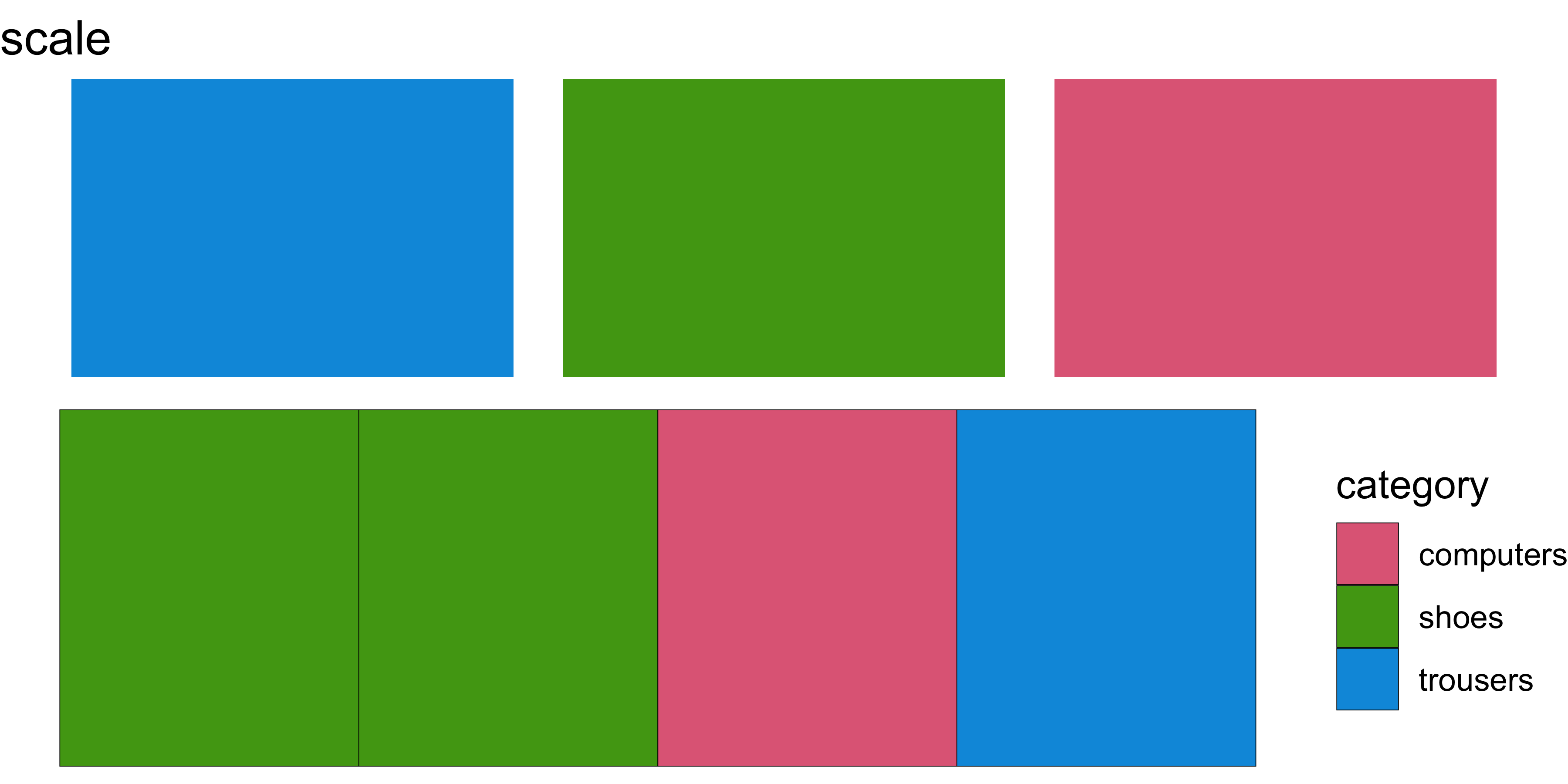
A scale controls the mapping from data values to aesthetic values.

Scales
A scale controls the mapping from data values to aesthetic values.
| idx | category | price |
|---|---|---|
| 1 | shoes | 100 |
| 2 | shoes | 70 |
| 3 | computers | 1000 |
| 4 | trousers | 80 |
Scales
A scale controls the mapping from data values to aesthetic values.
| idx | category | price |
|---|---|---|
| 1 | shoes | 100 |
| 2 | shoes | 70 |
| 3 | computers | 1000 |
| 4 | trousers | 80 |
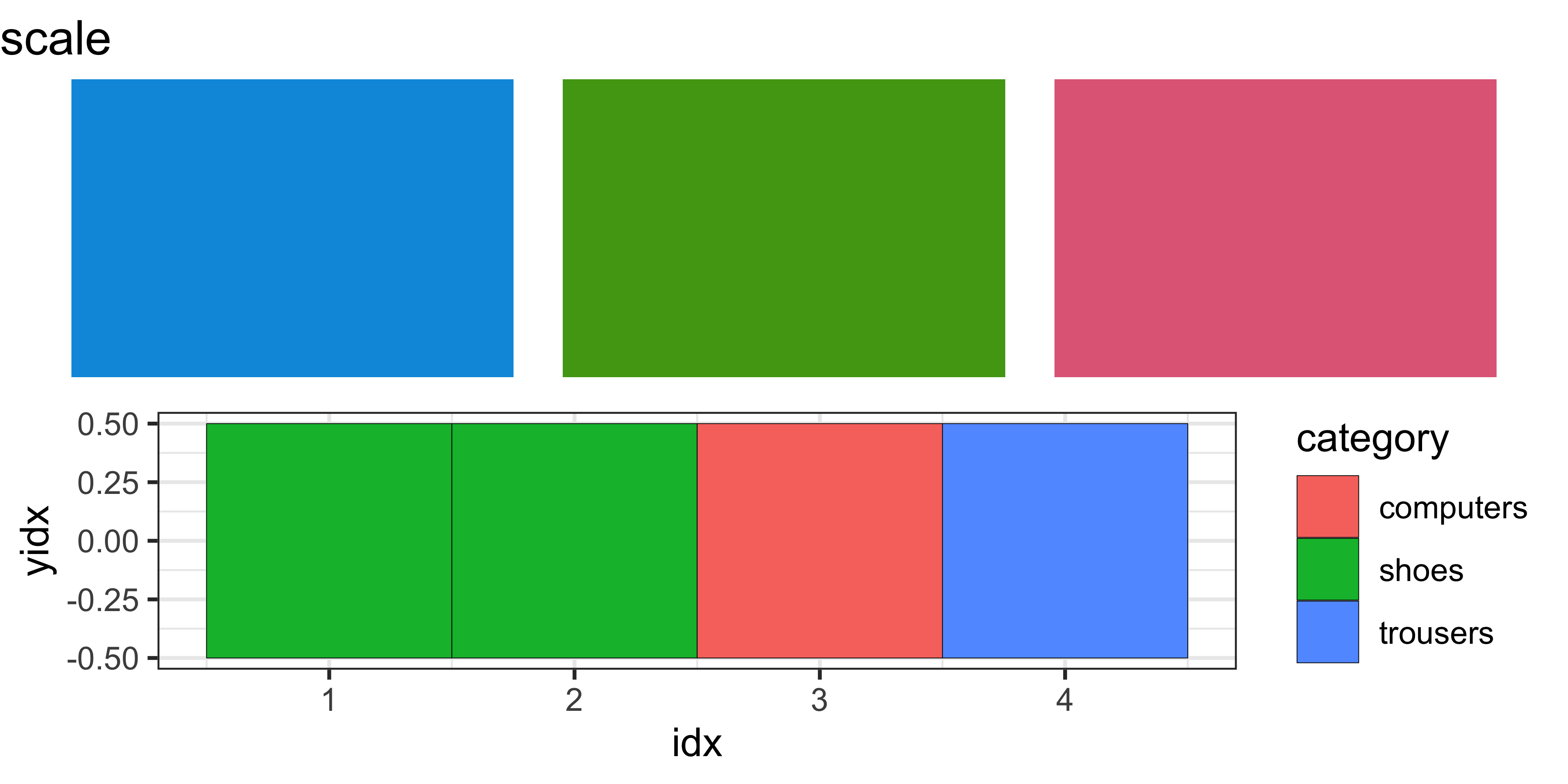
palette <- tibble(color = qualitative_hcl(3)) %>%
  mutate(x=rank(color), y=0)
p1 <- ggplot(palette, aes(fill=color, x=x, y=y)) +
  geom_tile(width=.9) +
  scale_fill_identity() +
  labs(title="scale") +
  theme_void()
p2 <- scale_example %>%
  mutate(yidx = 0) %>%
  ggplot(aes(x=idx, fill=category, y=yidx)) +
    geom_tile(color='black')
grid.arrange(p1, p2)
Scales
A scale controls the mapping from data values to aesthetic values.
| idx | category | price |
|---|---|---|
| 1 | shoes | 100 |
| 2 | shoes | 70 |
| 3 | computers | 1000 |
| 4 | trousers | 80 |
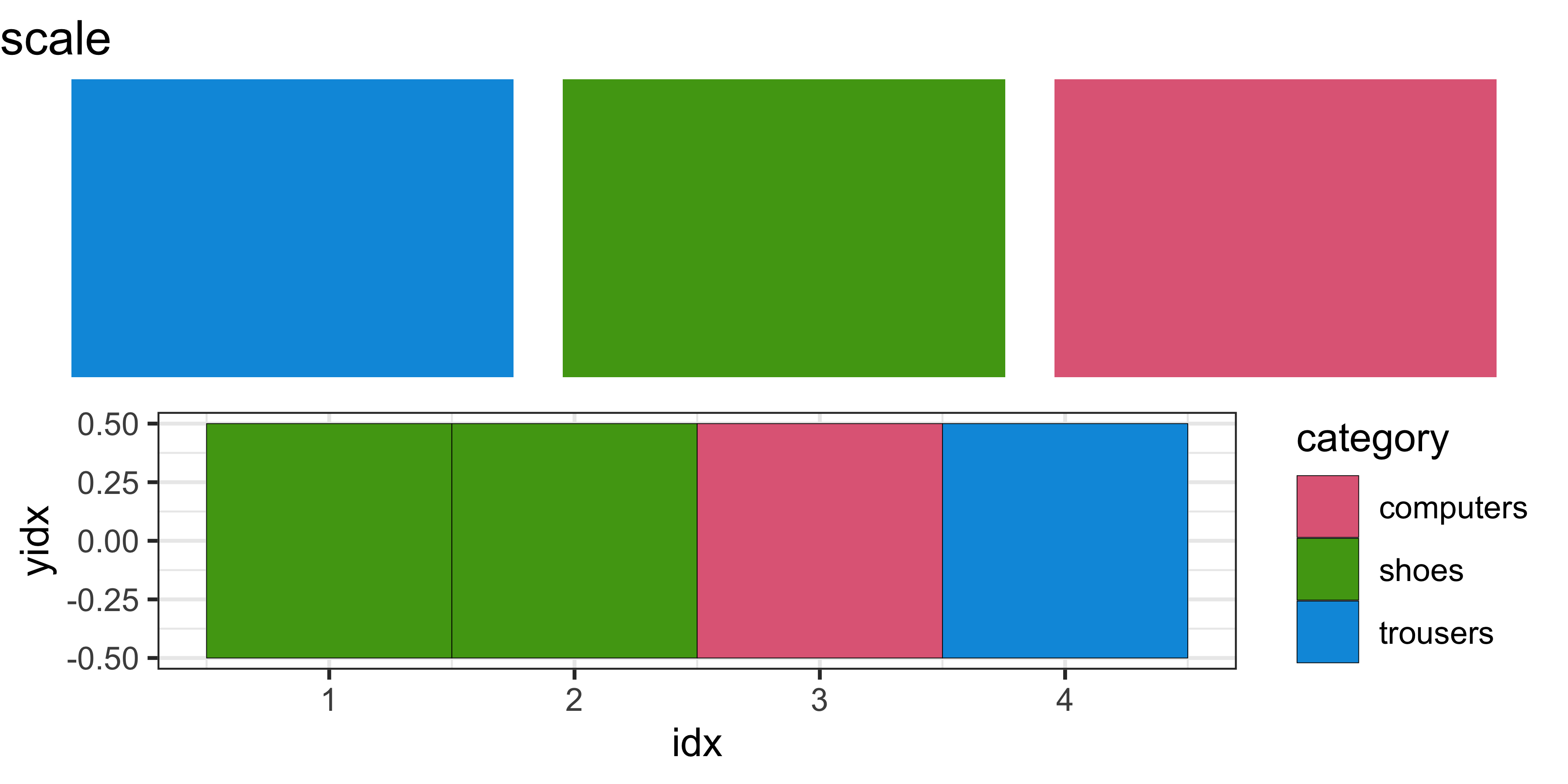
palette <- tibble(color = qualitative_hcl(3)) %>%
  mutate(x=rank(color), y=0)
p1 <- ggplot(palette, aes(fill=color, x=x, y=y)) +
  geom_tile(width=.9) +
  scale_fill_identity() +
  labs(title="scale") +
  theme_void()
p2 <- scale_example %>%
  mutate(yidx = 0) %>%
  ggplot(aes(x=idx, fill=category, y=yidx)) +
    geom_tile(color='black') +
    scale_fill_discrete_qualitative()
grid.arrange(p1, p2)
Scales
A scale controls the mapping from data values to aesthetic values.
| idx | category | price |
|---|---|---|
| 1 | shoes | 100 |
| 2 | shoes | 70 |
| 3 | computers | 1000 |
| 4 | trousers | 80 |
palette <- tibble(color = qualitative_hcl(3)) %>%
  mutate(x=rank(color), y=0)
p1 <- ggplot(palette, aes(fill=color, x=x, y=y)) +
  geom_tile(width=.9) +
  scale_fill_identity() +
  labs(title="scale") +
  theme_void()
p2 <- scale_example %>%
  mutate(yidx = 0) %>%
  ggplot(aes(x=idx, fill=category, y=yidx)) +
    geom_tile(color='black') +
    scale_fill_discrete_qualitative() +
    theme_void()
grid.arrange(p1, p2)
Scales
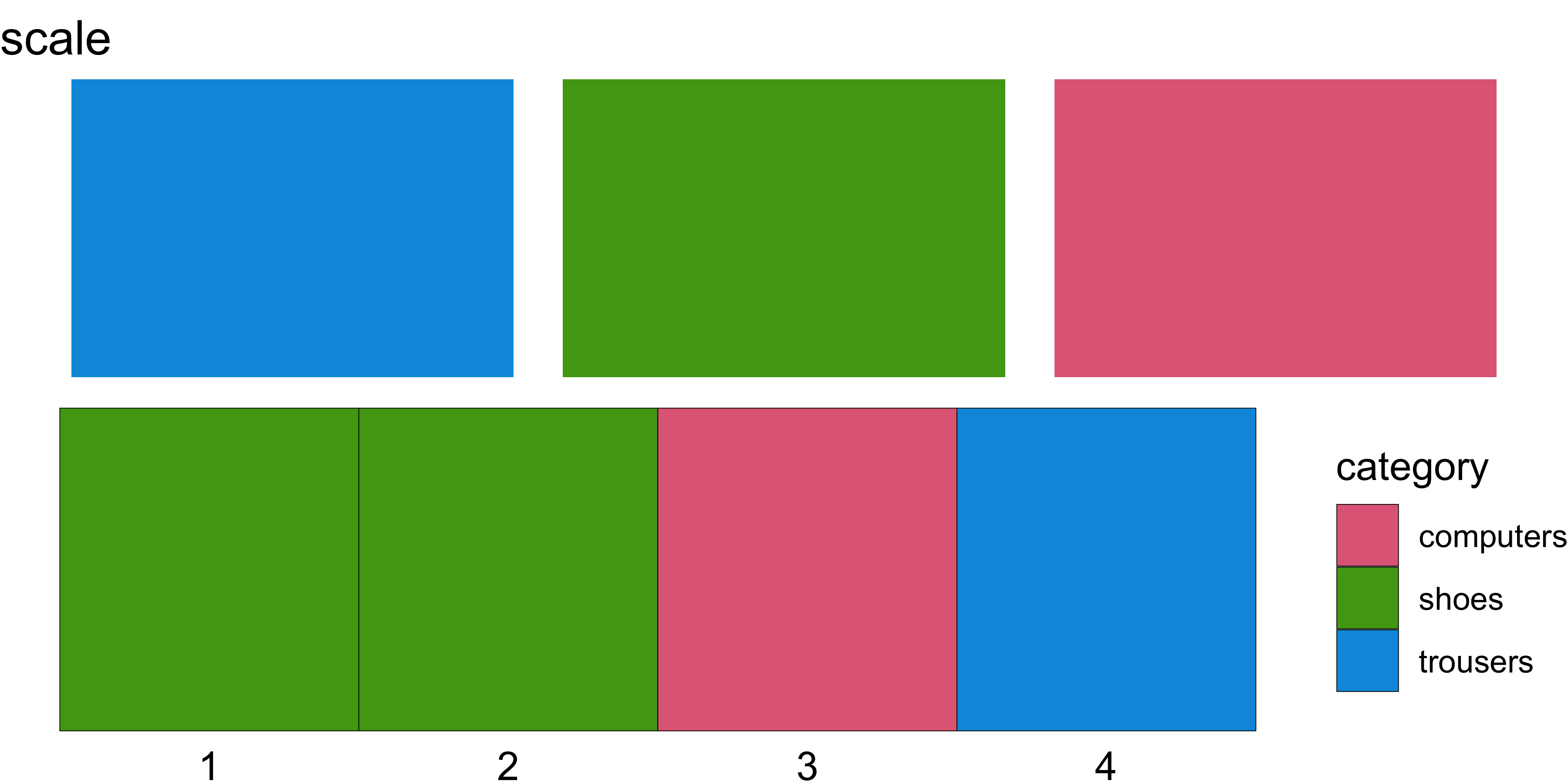
A scale controls the mapping from data values to aesthetic values.
| idx | category | price |
|---|---|---|
| 1 | shoes | 100 |
| 2 | shoes | 70 |
| 3 | computers | 1000 |
| 4 | trousers | 80 |
palette <- tibble(color = qualitative_hcl(3)) %>%
  mutate(x=rank(color), y=0)
p1 <- ggplot(palette, aes(fill=color, x=x, y=y)) +
  geom_tile(width=.9) +
  scale_fill_identity() +
  labs(title="scale") +
  theme_void()
p2 <- scale_example %>%
  mutate(yidx = 0) %>%
  ggplot(aes(x=idx, fill=category, y=yidx)) +
    geom_tile(color='black') +
    scale_fill_discrete_qualitative() +
    theme_void() +
    theme(axis.text.x = element_text())
grid.arrange(p1, p2)
Scales
A scale controls the mapping from data values to aesthetic values.
| idx | category | price |
|---|---|---|
| 1 | shoes | 100 |
| 2 | shoes | 70 |
| 3 | computers | 1000 |
| 4 | trousers | 80 |
Scales
A scale controls the mapping from data values to aesthetic values.
| idx | category | price |
|---|---|---|
| 1 | shoes | 100 |
| 2 | shoes | 70 |
| 3 | computers | 1000 |
| 4 | trousers | 80 |
Scales
A scale controls the mapping from data values to aesthetic values.
| idx | category | price |
|---|---|---|
| 1 | shoes | 100 |
| 2 | shoes | 70 |
| 3 | computers | 1000 |
| 4 | trousers | 80 |
Scales
A scale controls the mapping from data values to aesthetic values.
| idx | category | price |
|---|---|---|
| 1 | shoes | 100 |
| 2 | shoes | 70 |
| 3 | computers | 1000 |
| 4 | trousers | 80 |
Scales
A scale controls the mapping from data values to aesthetic values.
| idx | category | price |
|---|---|---|
| 1 | shoes | 100 |
| 2 | shoes | 70 |
| 3 | computers | 1000 |
| 4 | trousers | 80 |
Scales
A scale controls the mapping from data values to aesthetic values.
| idx | category | price |
|---|---|---|
| 1 | shoes | 100 |
| 2 | shoes | 70 |
| 3 | computers | 1000 |
| 4 | trousers | 80 |

Scales
A scale controls the mapping from data values to aesthetic values.
| idx | category | price |
|---|---|---|
| 1 | shoes | 100 |
| 2 | shoes | 70 |
| 3 | computers | 1000 |
| 4 | trousers | 80 |
Scales
A scale controls the mapping from data values to aesthetic values.
| idx | category | price |
|---|---|---|
| 1 | shoes | 100 |
| 2 | shoes | 70 |
| 3 | computers | 1000 |
| 4 | trousers | 80 |

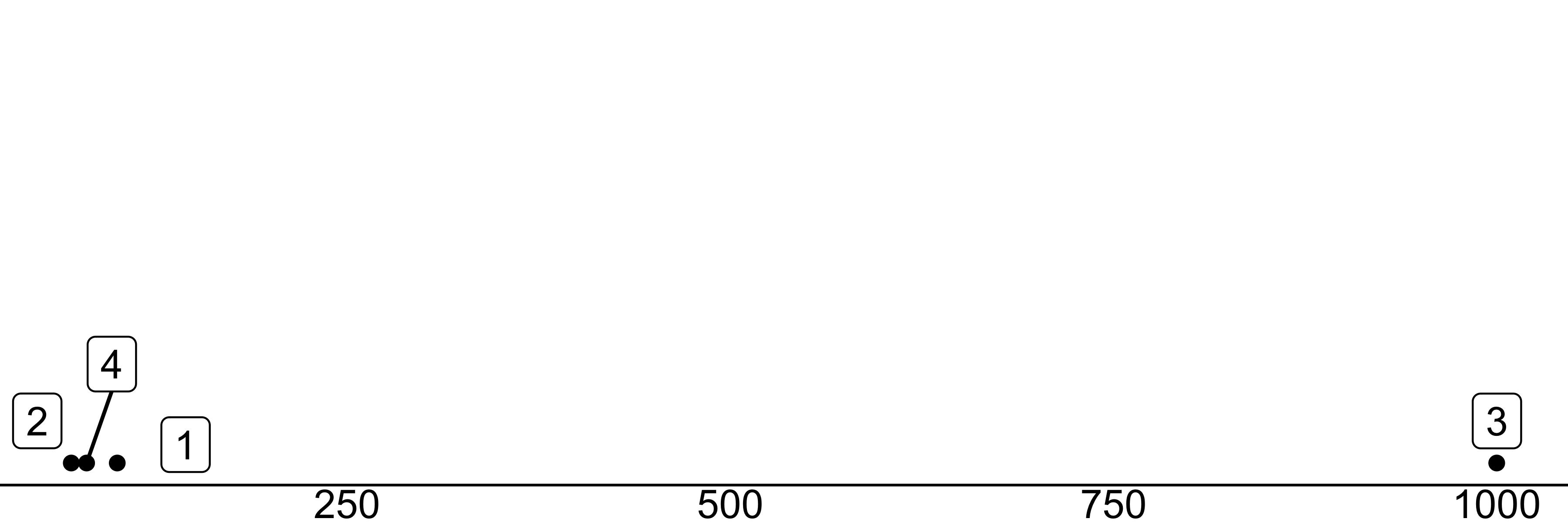
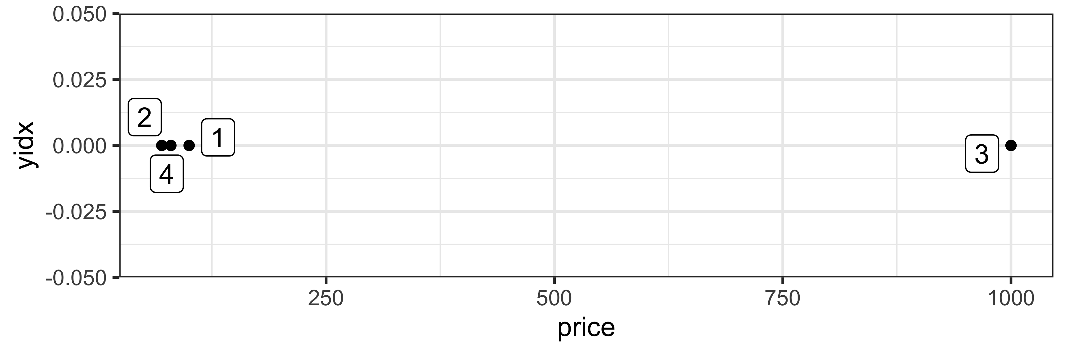
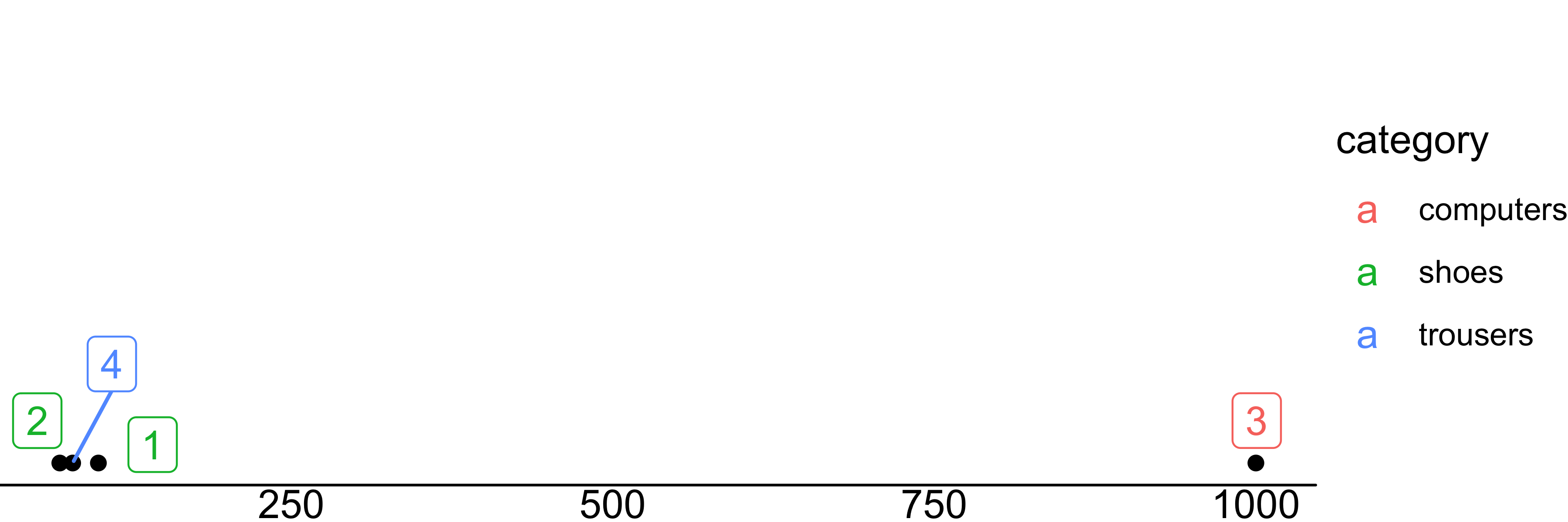
scale_example %>%
  mutate(yidx = 0) %>%
  ggplot(aes(x=price, y=yidx)) +
geom_point(color='black') +
geom_label_repel(aes(label=idx)) +
scale_y_continuous(limits = c(0, 0.01)) +
scale_x_continuous(breaks = c(0,250,500,750,1000)) +
scale_fill_discrete_qualitative() +
theme_void() +
theme(axis.text.x = element_text(),
axis.line.x.bottom = element_line())Scales
A scale controls the mapping from data values to aesthetic values.
| idx | category | price |
|---|---|---|
| 1 | shoes | 100 |
| 2 | shoes | 70 |
| 3 | computers | 1000 |
| 4 | trousers | 80 |
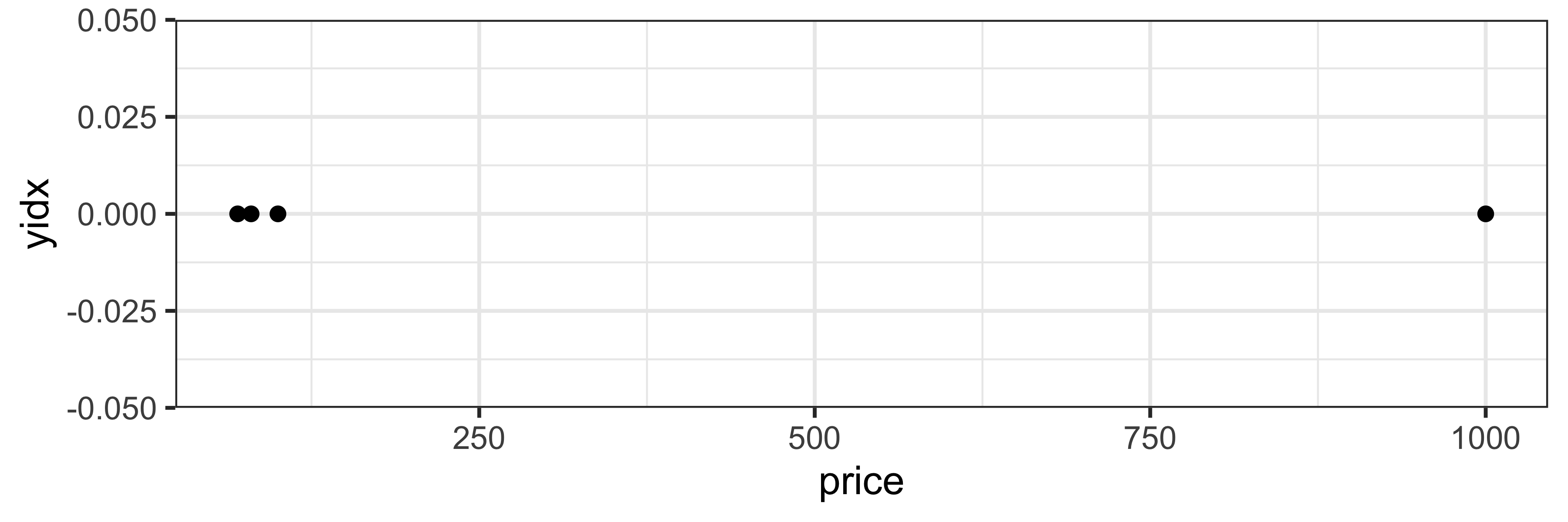
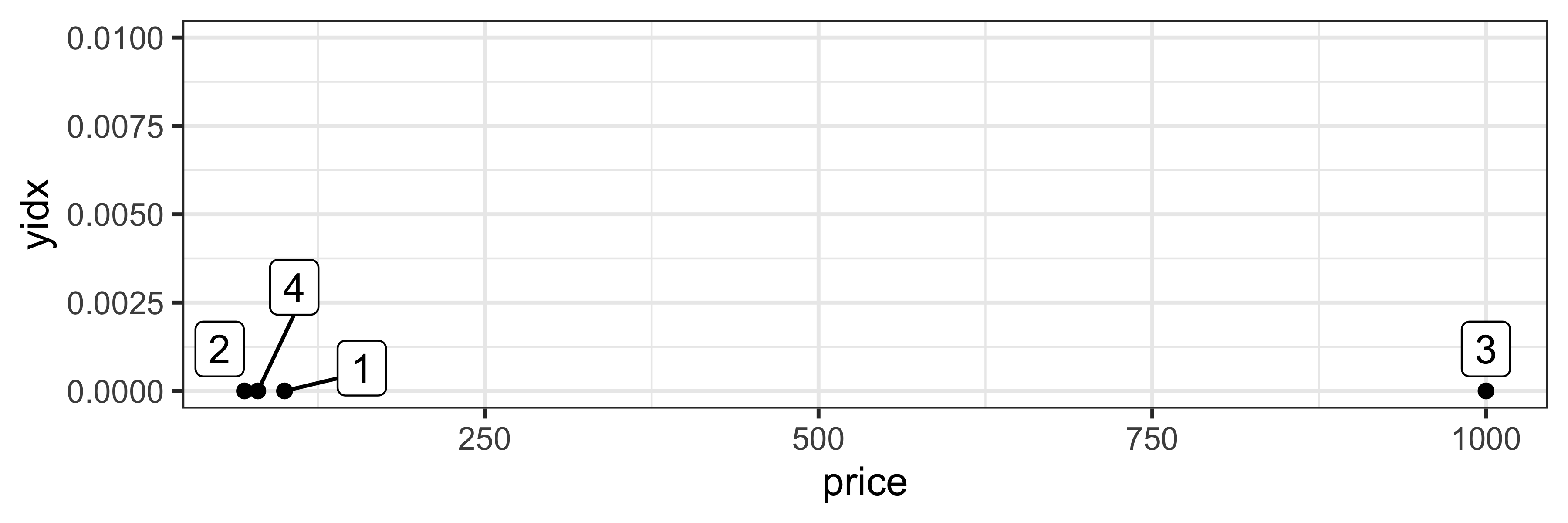
scale_example %>%
  mutate(yidx = 0) %>%
  ggplot(aes(x=price, color=category, y=yidx)) +
    geom_point(color="black") +
    geom_label_repel(aes(label=idx)) +
    scale_y_continuous(limits = c(0, 0.01)) +
    scale_x_continuous(breaks = c(0,250,500,750,1000)) +
    scale_fill_discrete_qualitative() +
    theme_void() +
    theme(axis.text.x = element_text(),
          axis.line.x.bottom = element_line())
Scales
A scale controls the mapping from data values to aesthetic values.
| idx | category | price |
|---|---|---|
| 1 | shoes | 100 |
| 2 | shoes | 70 |
| 3 | computers | 1000 |
| 4 | trousers | 80 |
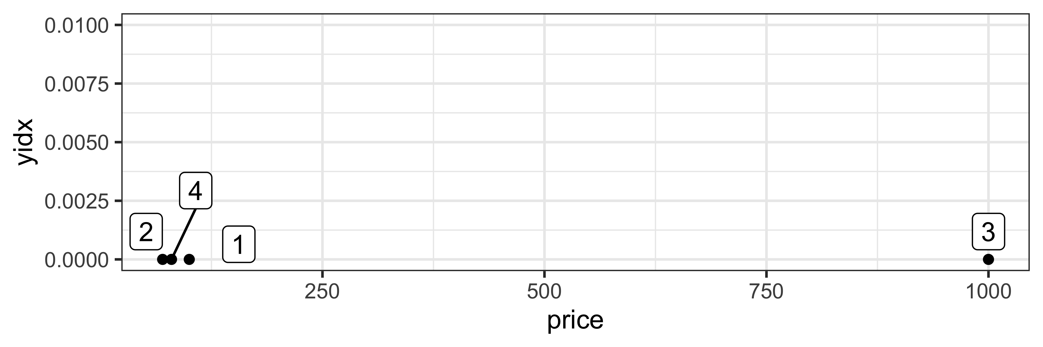
scale_example %>%
  mutate(yidx = 0) %>%
  ggplot(aes(x=price, color=category, y=yidx)) +
    geom_point() +
    geom_label_repel(aes(label=idx)) +
    scale_y_continuous(limits = c(0, 0.01)) +
    scale_x_continuous(breaks = c(0,250,500,750,1000)) +
    scale_fill_discrete_qualitative() +
    theme_void() +
    theme(axis.text.x = element_text(),
          axis.line.x.bottom = element_line())
Scales
A scale controls the mapping from data values to aesthetic values.
| idx | category | price |
|---|---|---|
| 1 | shoes | 100 |
| 2 | shoes | 70 |
| 3 | computers | 1000 |
| 4 | trousers | 80 |
scale_example %>%
  mutate(yidx = 0) %>%
  ggplot(aes(x=price, color=category, y=yidx)) +
    geom_point() +
    geom_label_repel(aes(label=idx)) +
    scale_y_continuous(limits = c(0, 0.01)) +
    scale_x_continuous(breaks = c(0,250,500,750,1000)) +
    scale_fill_discrete_qualitative() +
    theme_void() +
    theme(axis.text.x = element_text(),
          axis.line.x.bottom = element_line(),
          legend.position = 'top')
Scales
A scale controls the mapping from data values to aesthetic values.
| idx | category | price |
|---|---|---|
| 1 | shoes | 100 |
| 2 | shoes | 70 |
| 3 | computers | 1000 |
| 4 | trousers | 80 |
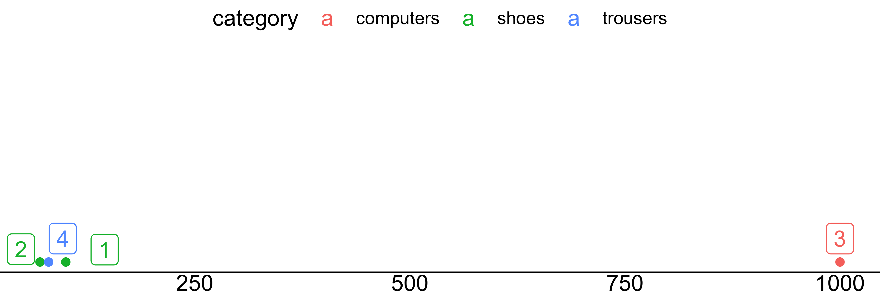
scale_example %>%
  mutate(yidx = 0) %>%
  ggplot(aes(x=price, color=category, y=yidx)) +
    geom_point() +
    geom_label_repel(aes(label=idx)) +
    scale_y_continuous(limits = c(0, 0.01)) +
    scale_x_continuous(breaks = c(0,250,500,750,1000)) +
    scale_color_discrete_qualitative() +
    theme_void() +
    theme(axis.text.x = element_text(),
          axis.line.x.bottom = element_line(),
          legend.position = 'top')
Scales
A scale controls the mapping from data values to aesthetic values.
| idx | category | price |
|---|---|---|
| 1 | shoes | 100 |
| 2 | shoes | 70 |
| 3 | computers | 1000 |
| 4 | trousers | 80 |
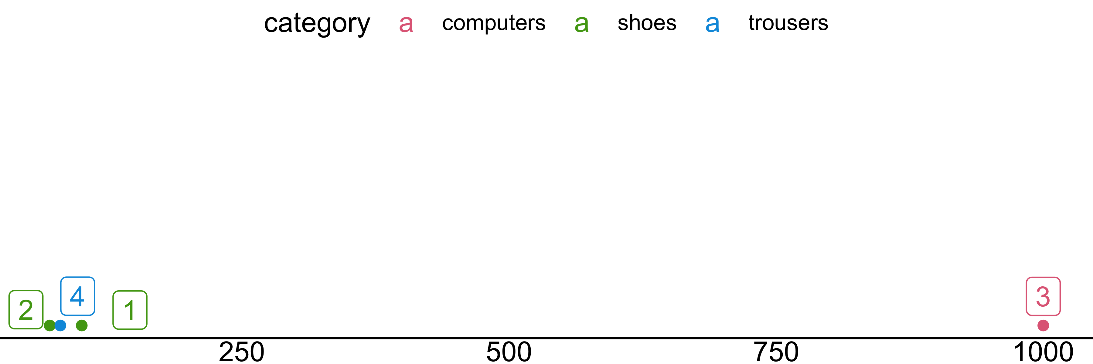
scale_example %>%
mutate(yidx = 0) %>%
ggplot(aes(x=price, color=category, y=yidx)) +
geom_point() +
geom_label_repel(aes(label=idx)) +
scale_y_continuous(limits = c(0, 0.01)) +
scale_x_log10(breaks = c(0,250,500,750,1000)) +
scale_color_discrete_qualitative() +
theme_void() +
theme(axis.text.x = element_text(),
axis.line.x.bottom = element_line(),
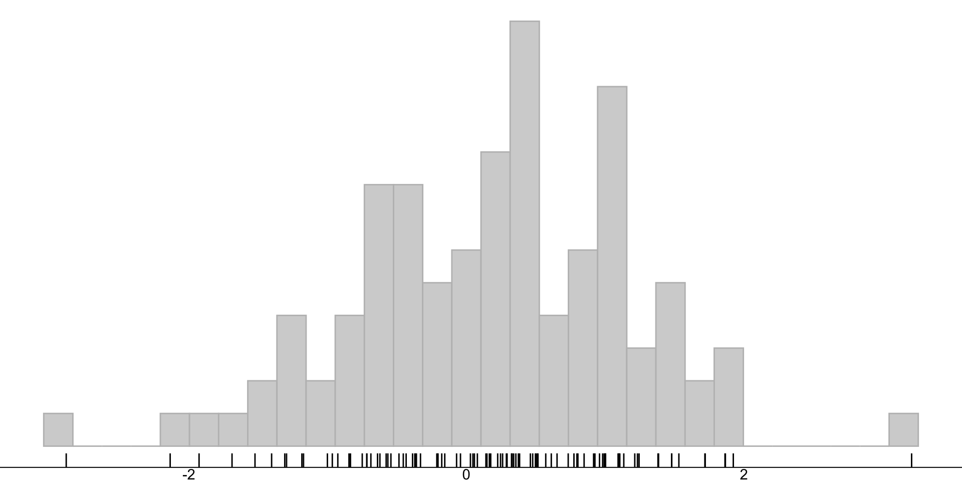
legend.position = 'top')Statistical transformations
Transforms the data, typically by summarizing it.
Examples:
- Identity
- Binning
- Smoothing
- Quantile computation
- Conditional statistics
- Density estimation
![]()
Statistical transformations
Summarization
Statistical transformations
Binning
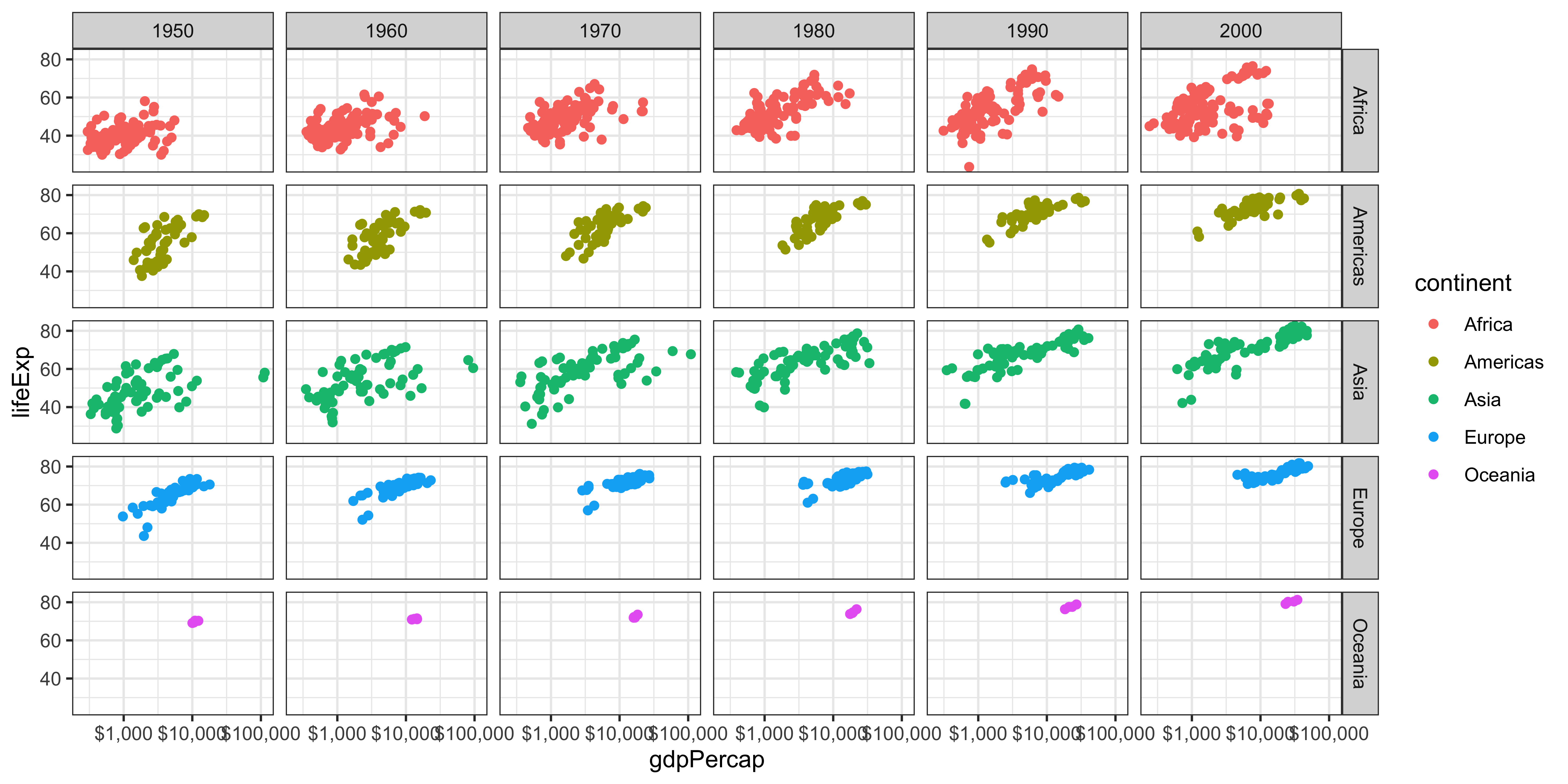
Facet specification
Create multiple plots with the same layers, each on a different subset of data
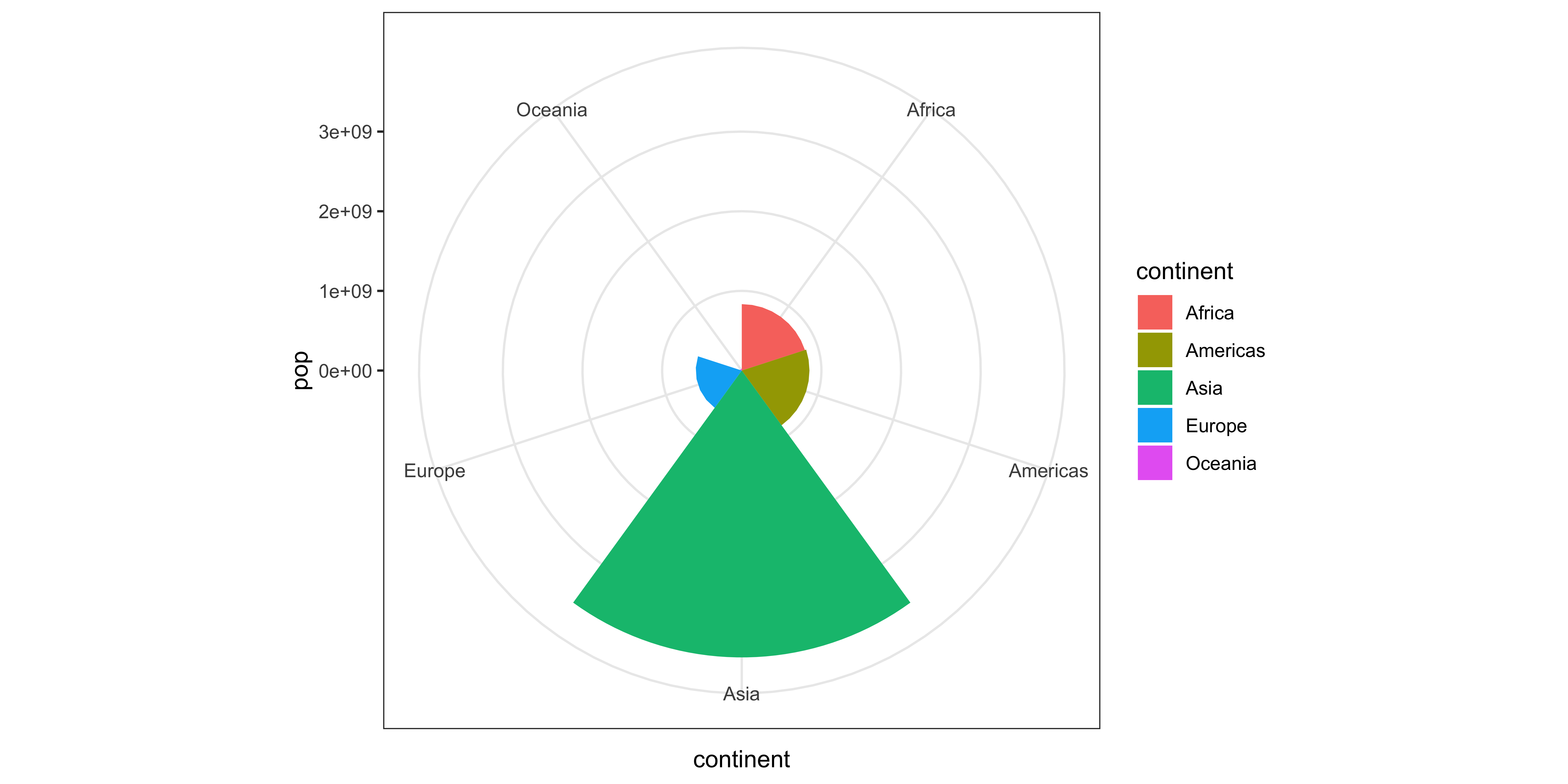
Coordinate system
Maps the position of objects onto the plane of the plot.
Defining a layer
Why is the scale outside the layer definition?
Multiple layers
ggplot() +
  layer(
    data = filter(gapminder, year == 1952),
    mapping = aes(x=gdpPercap, y=lifeExp,
                  color=factor(year)),
    geom = 'point',
    stat = 'identity',
    position = 'identity'
  ) +
  layer(
    data = filter(gapminder, year == 2007),
    mapping = aes(x=gdpPercap, y=lifeExp,
                  color=factor(year)),
    geom = 'point',
    stat = 'identity',
    position = 'identity'
  ) +
  scale_x_log10()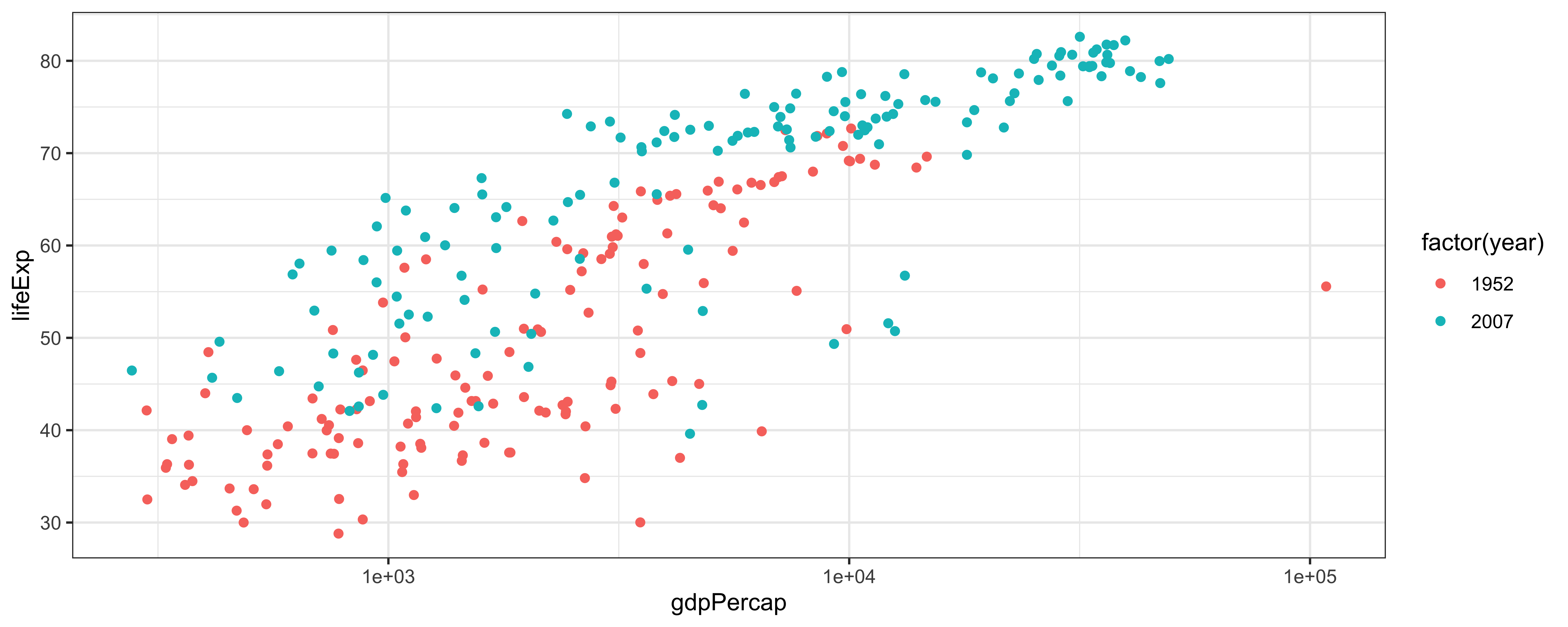
Defining a layer
ggplot() +
layer(
data = gapminder,
mapping = aes(x=gdpPercap, y=lifeExp),
geom = 'point', stat = 'identity',
position = 'identity'
) +
layer(
data = gapminder,
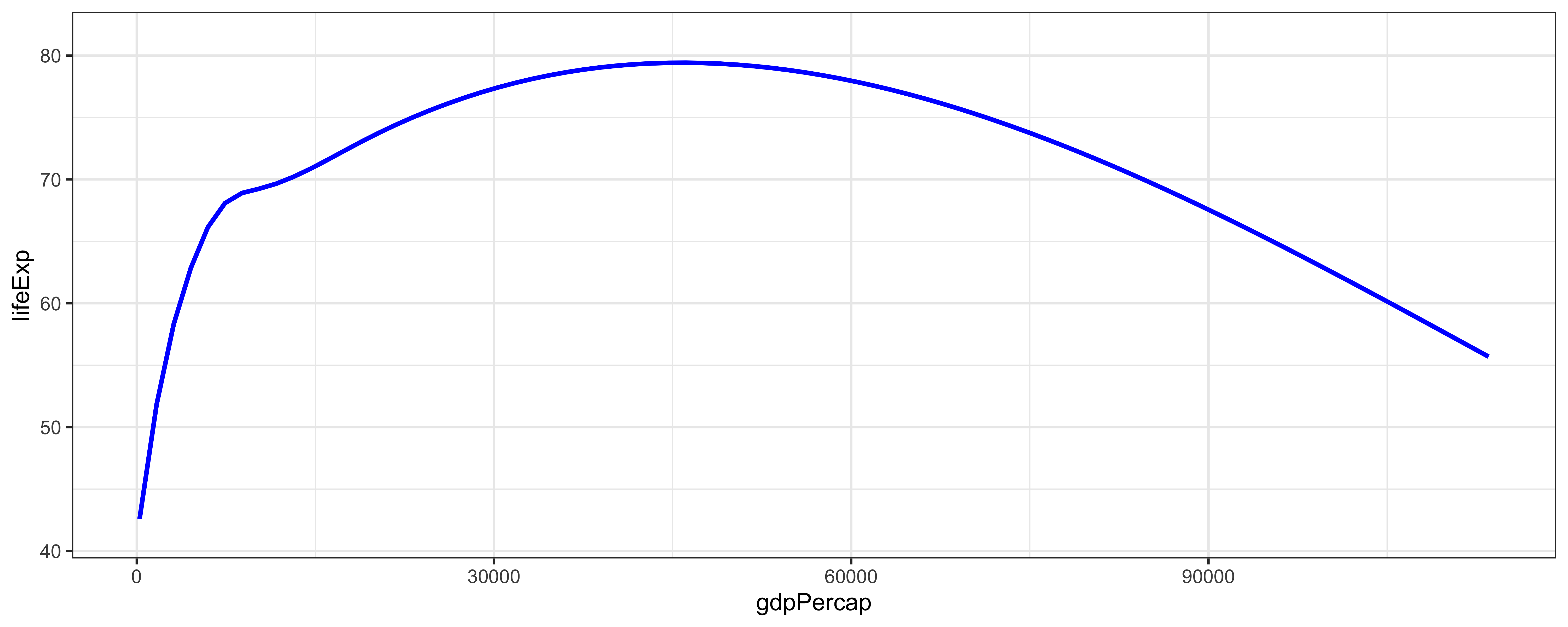
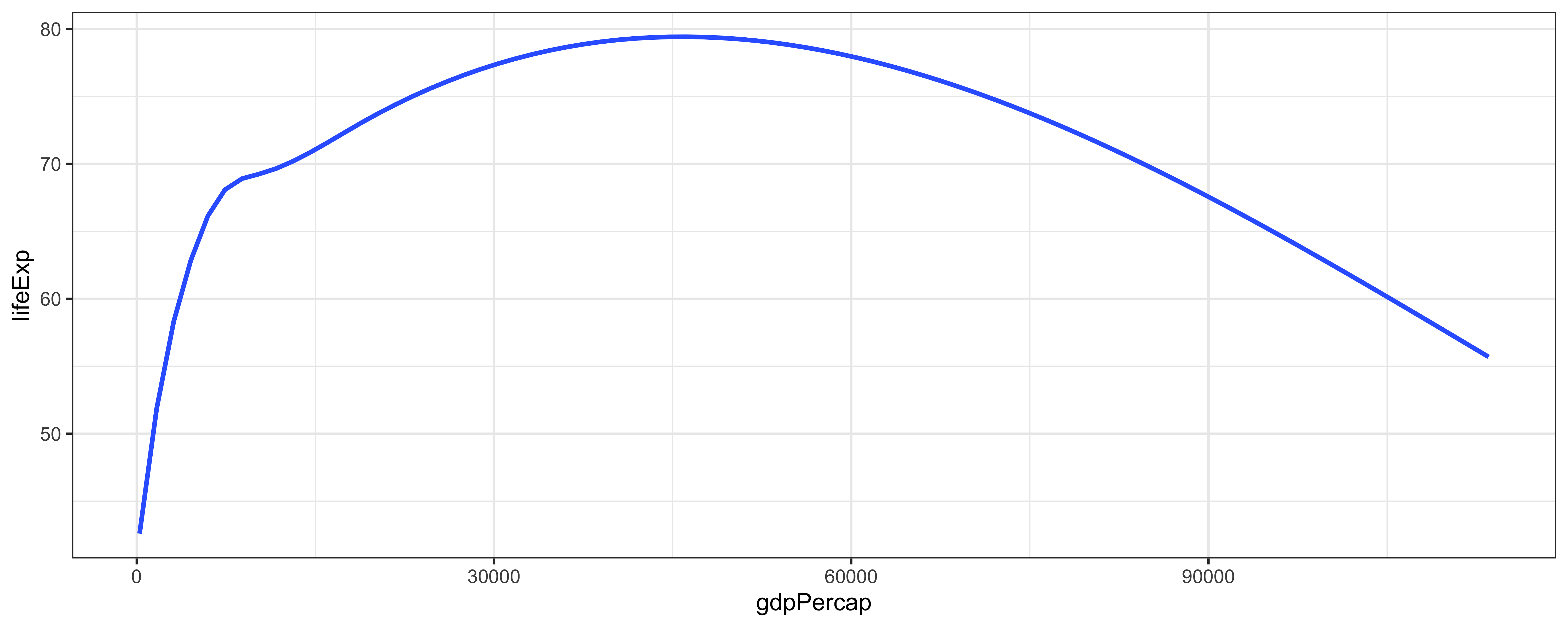
mapping = aes(x=gdpPercap, y=lifeExp),
geom = 'line', stat = 'smooth',
position = 'identity',
params = list(
method = 'gam',
color = 'blue',
size = 1
)
) + scale_x_log10()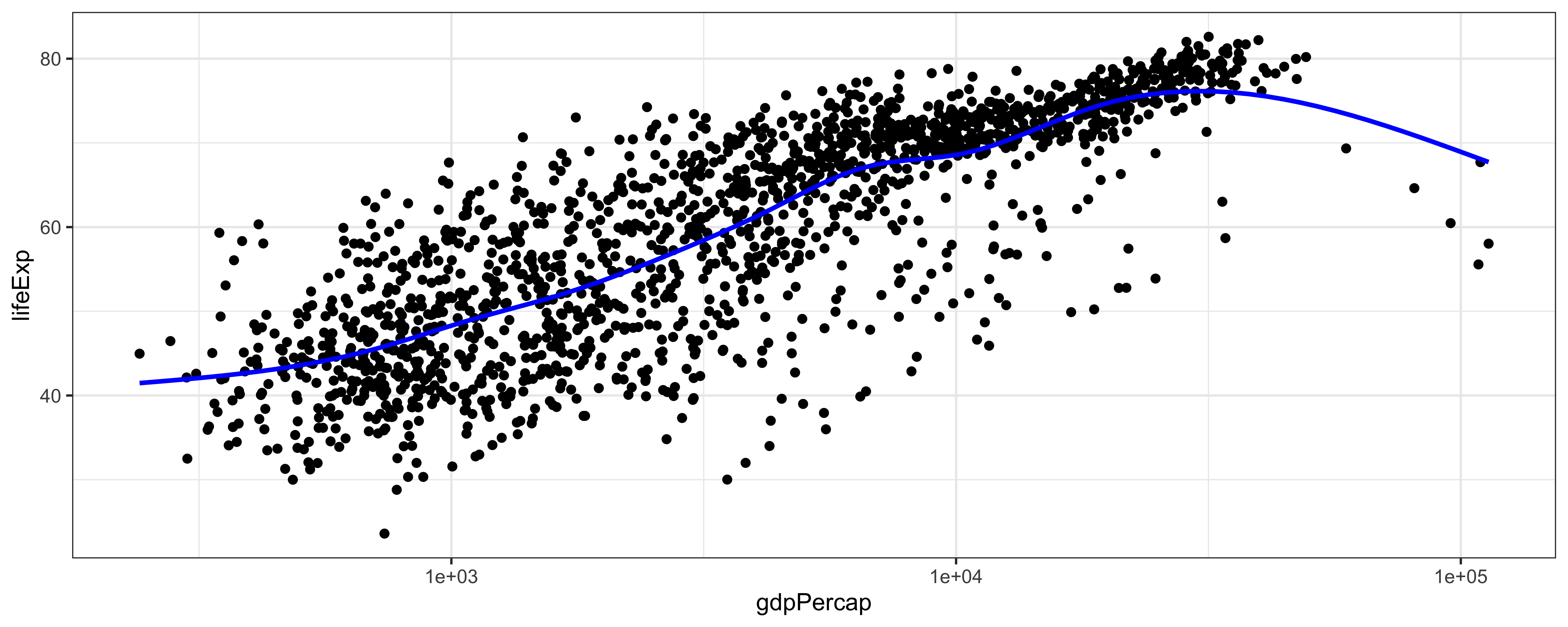
Using default values
Each geom has a default stat, each stat has a default geom
The humble point
The line

The line
The line
The line
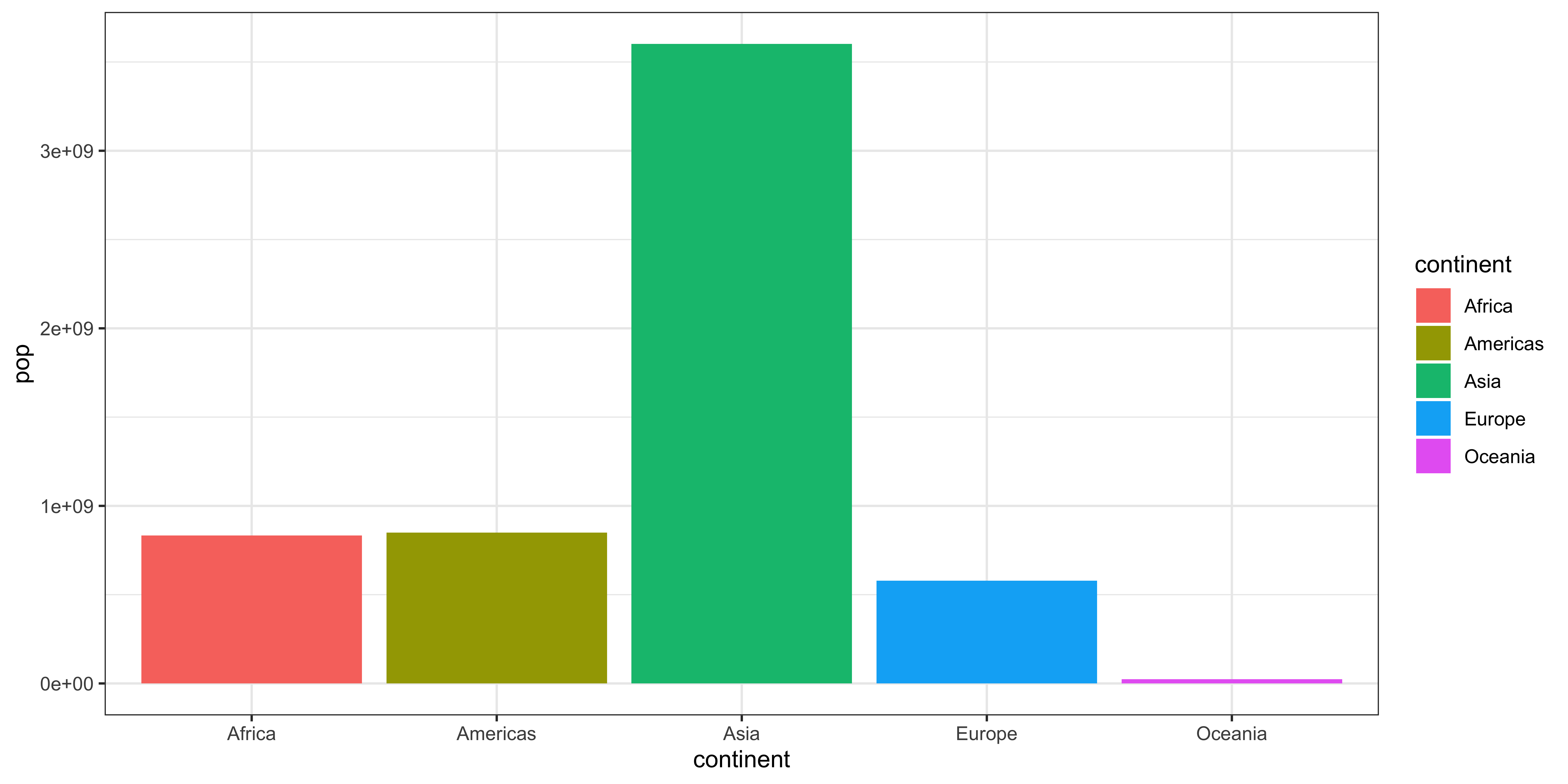
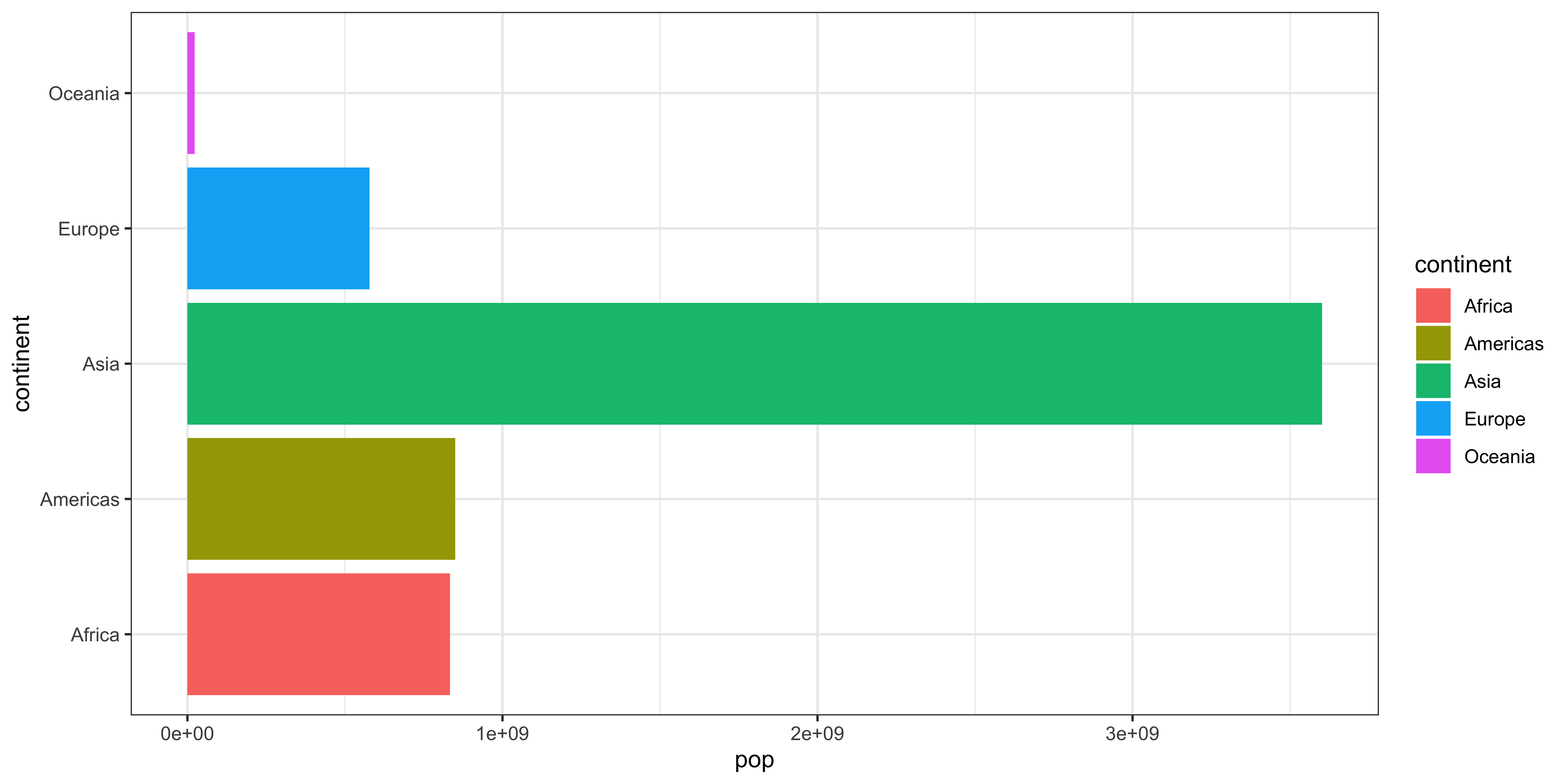
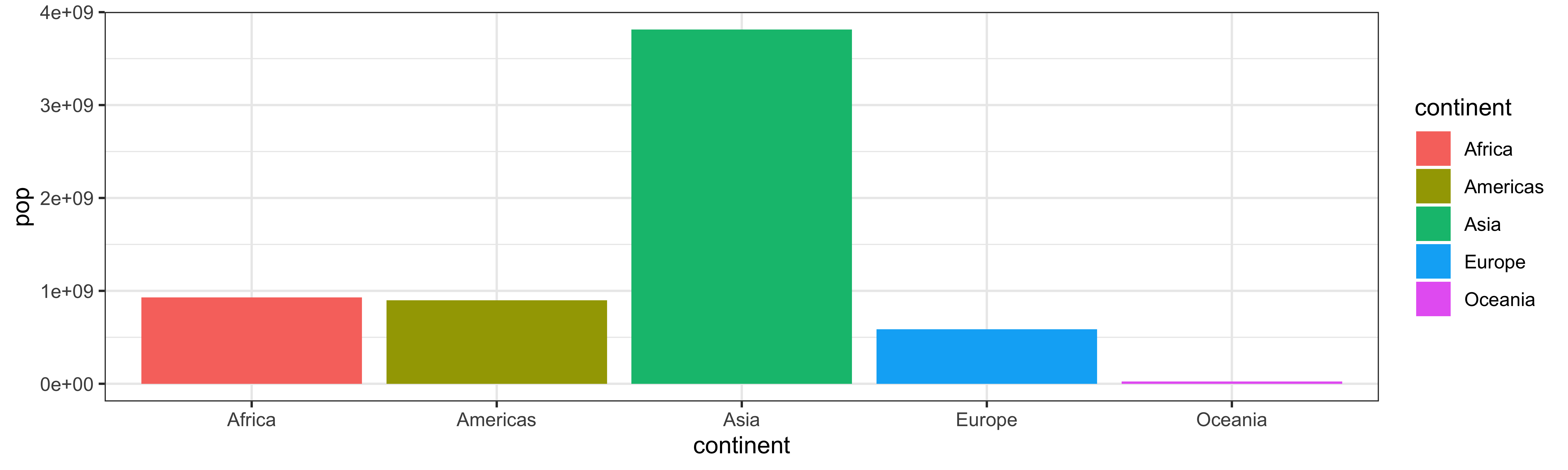
The bar/column

The bar/column
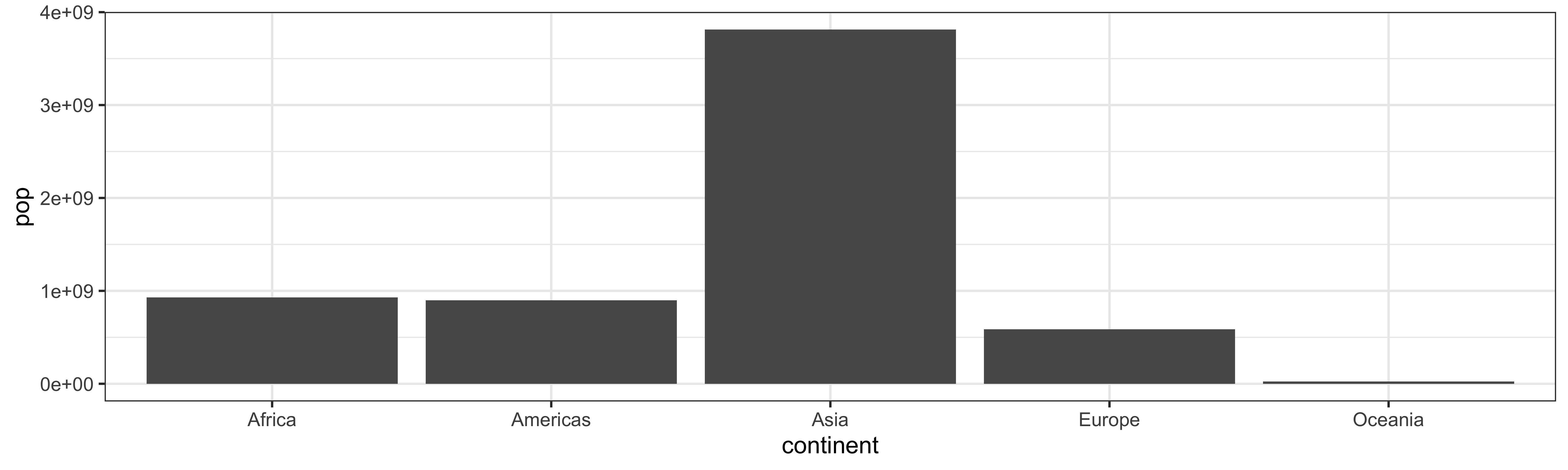
The bar/column
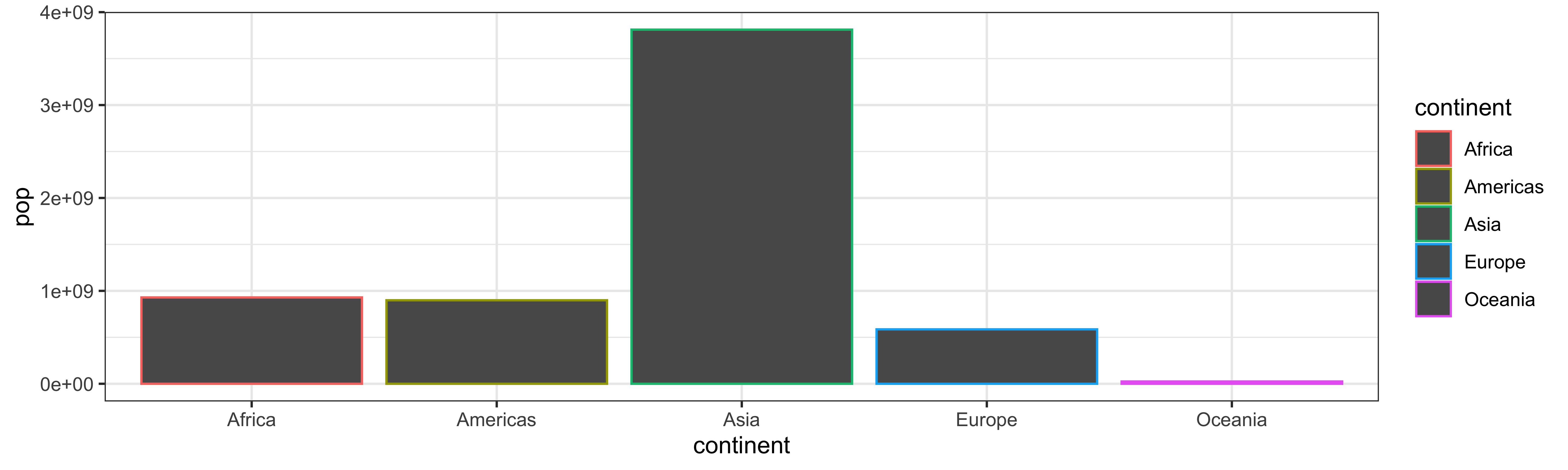
The bar/column (!!)
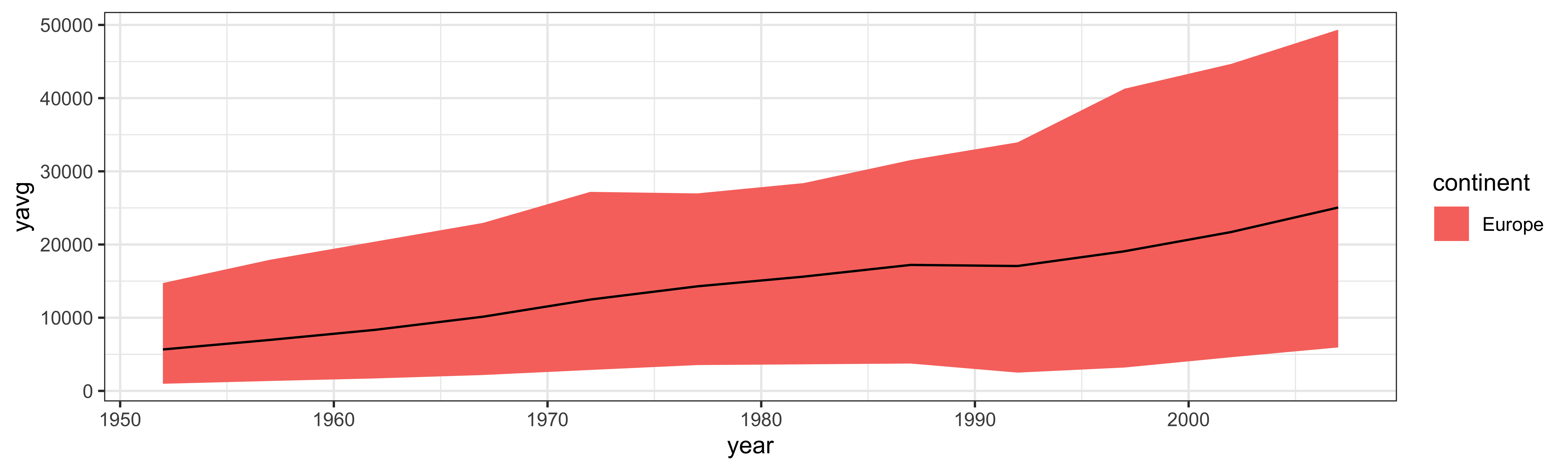
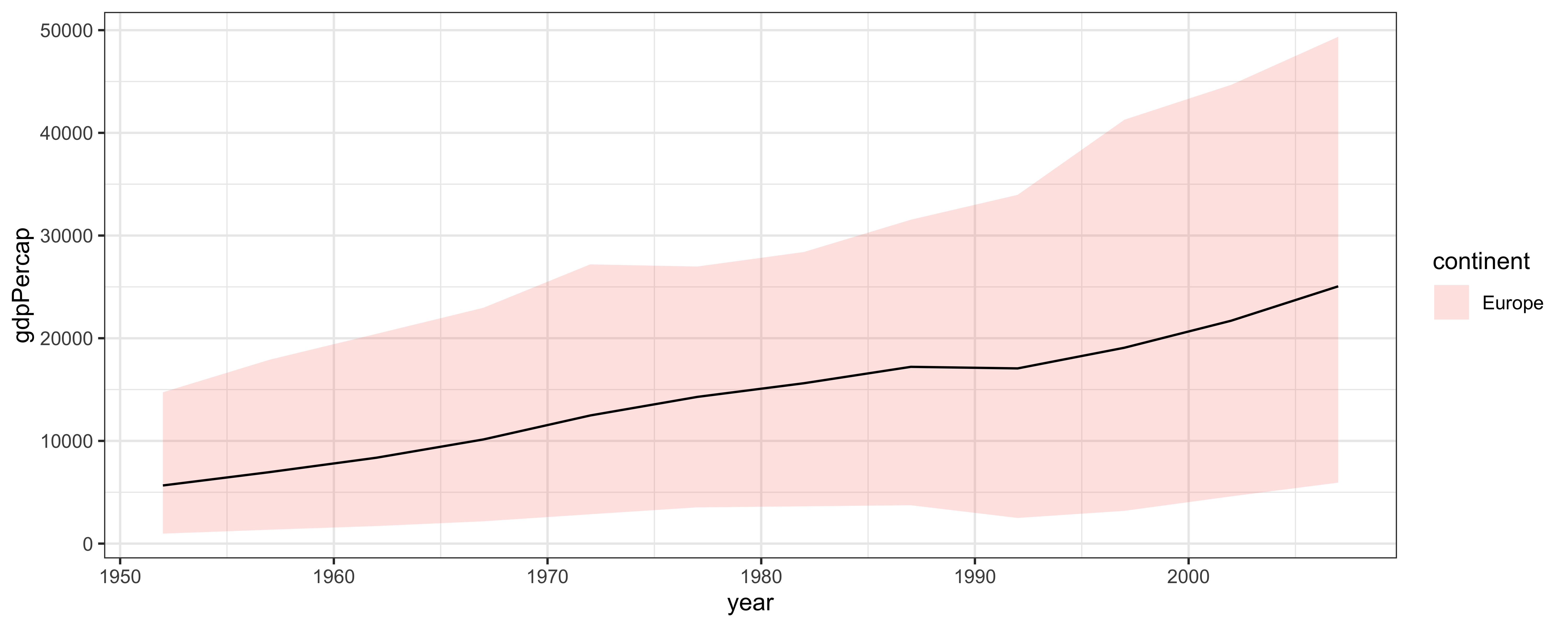
Ribbon

Ribbon
Ribbon
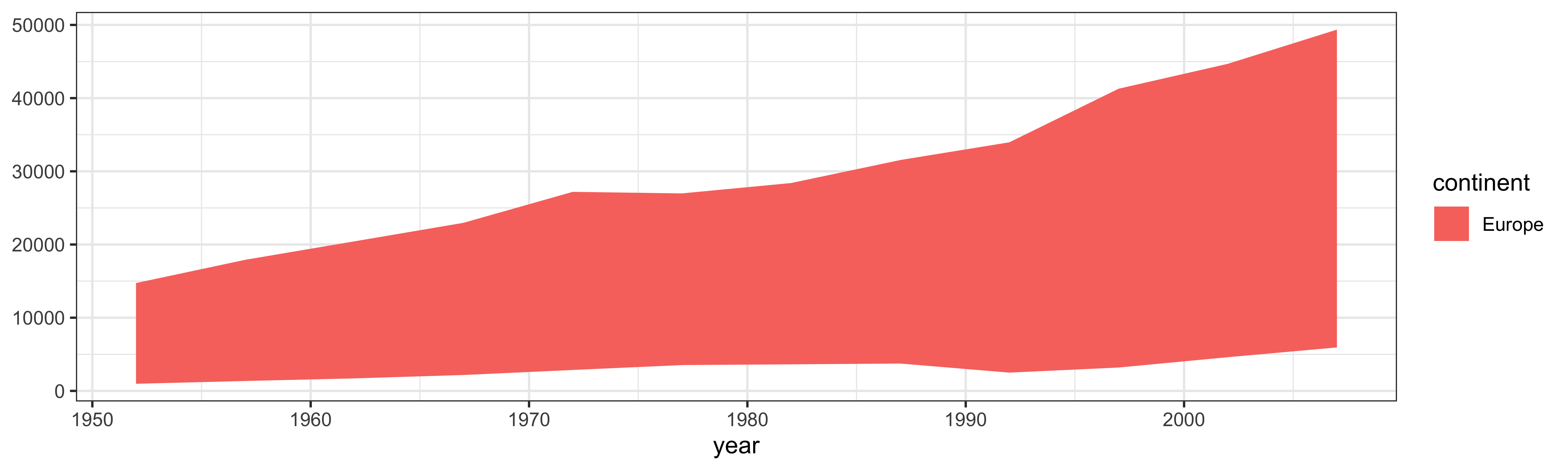
Ribbon
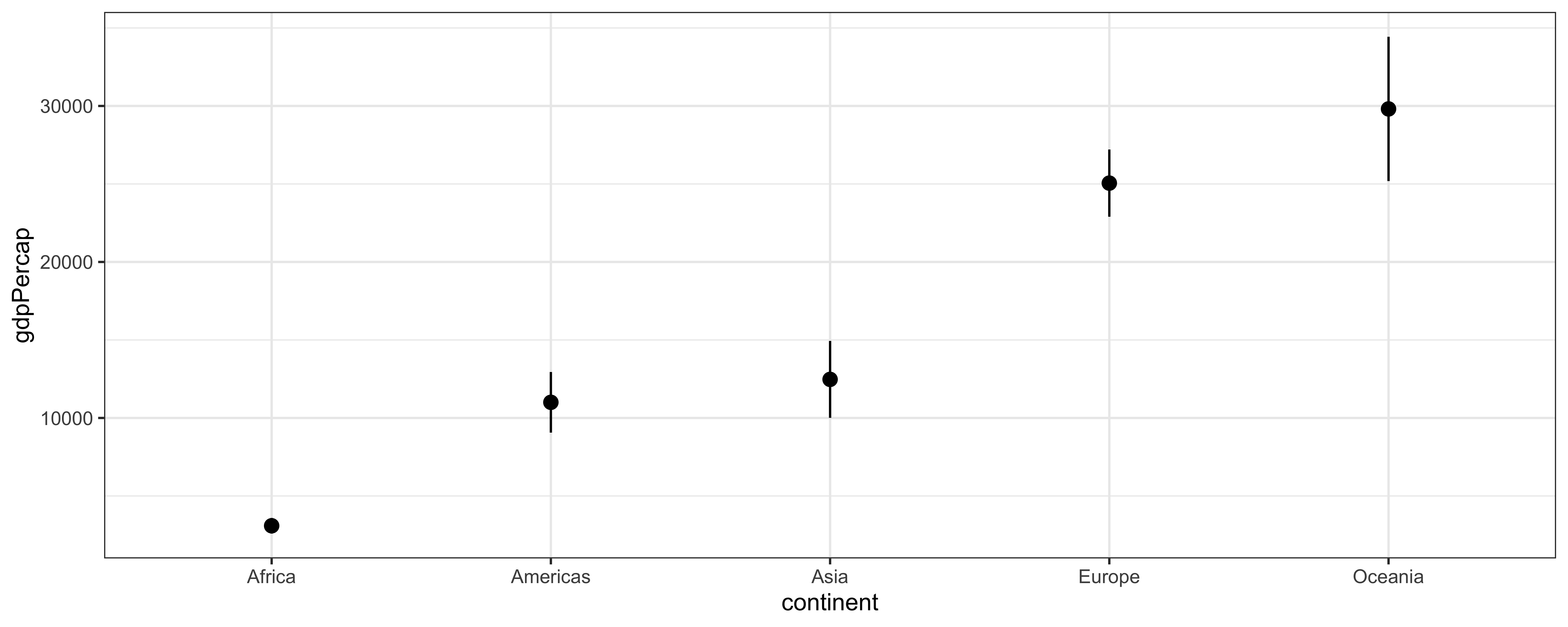
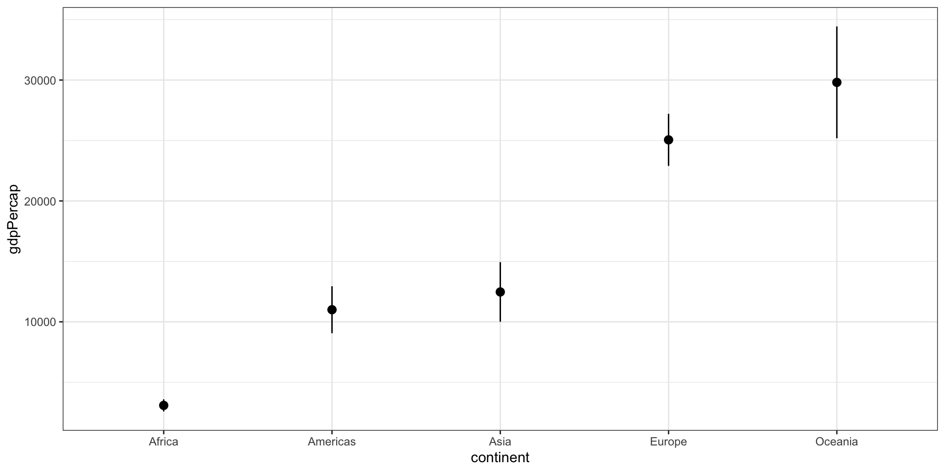
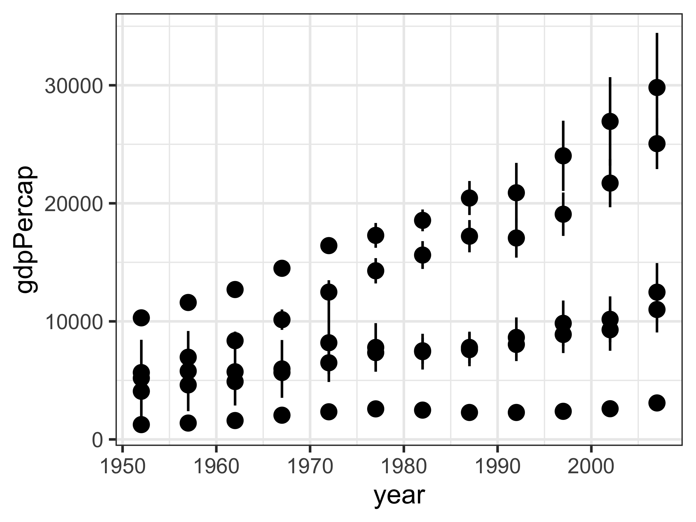
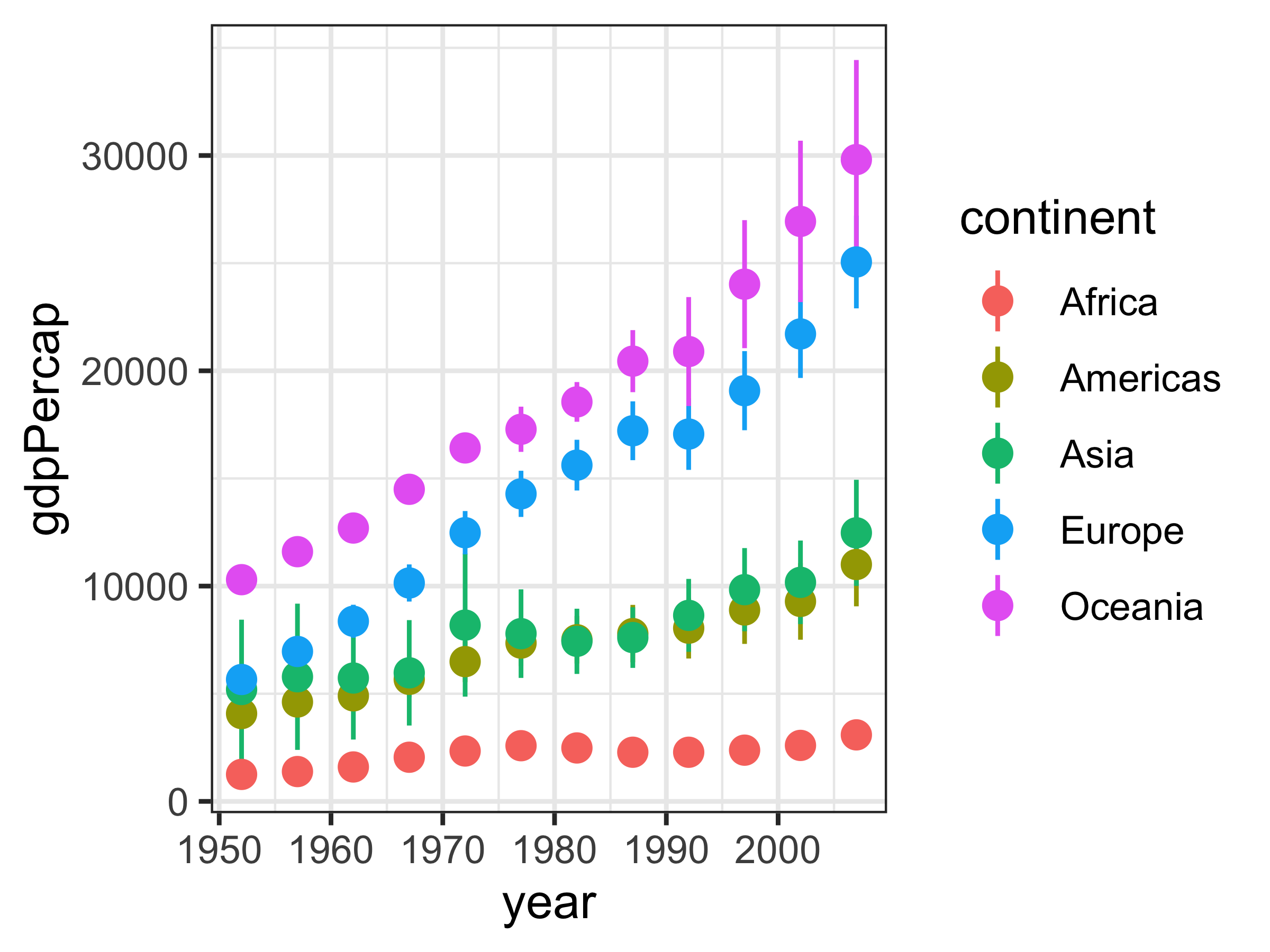
Segments

Segments
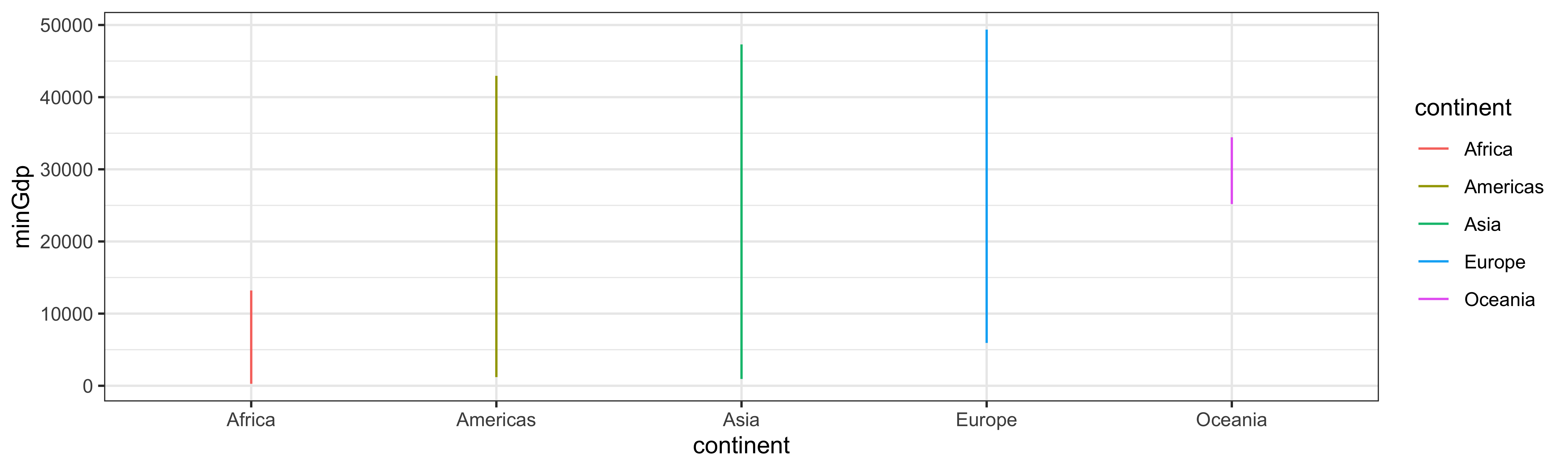
Segments and points
gapminder %>%
drop_na(pop) %>%
group_by(continent, year) %>%
summarise(minGdp = min(gdpPercap),
maxGdp = max(gdpPercap)) %>%
filter(year == 2007) %>%
ggplot(aes(x=continent, y=minGdp,
xend=continent, yend=maxGdp,
color=continent)) +
geom_segment() +
geom_point(mapping = aes(y=minGdp),
size=3) +
geom_point(mapping = aes(y=maxGdp),
size=3)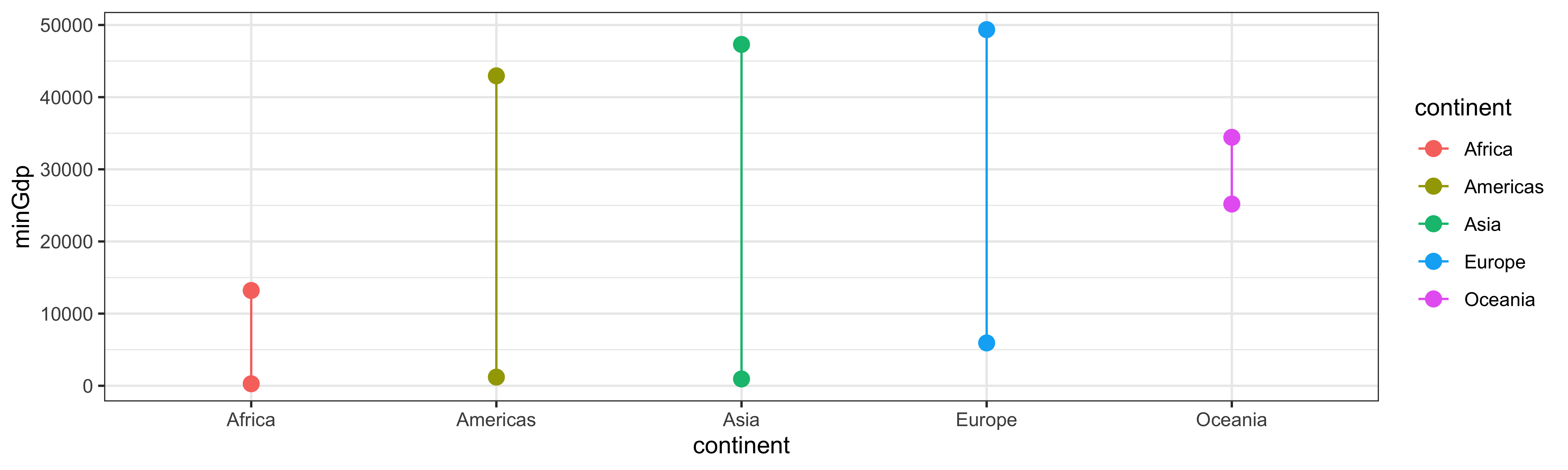
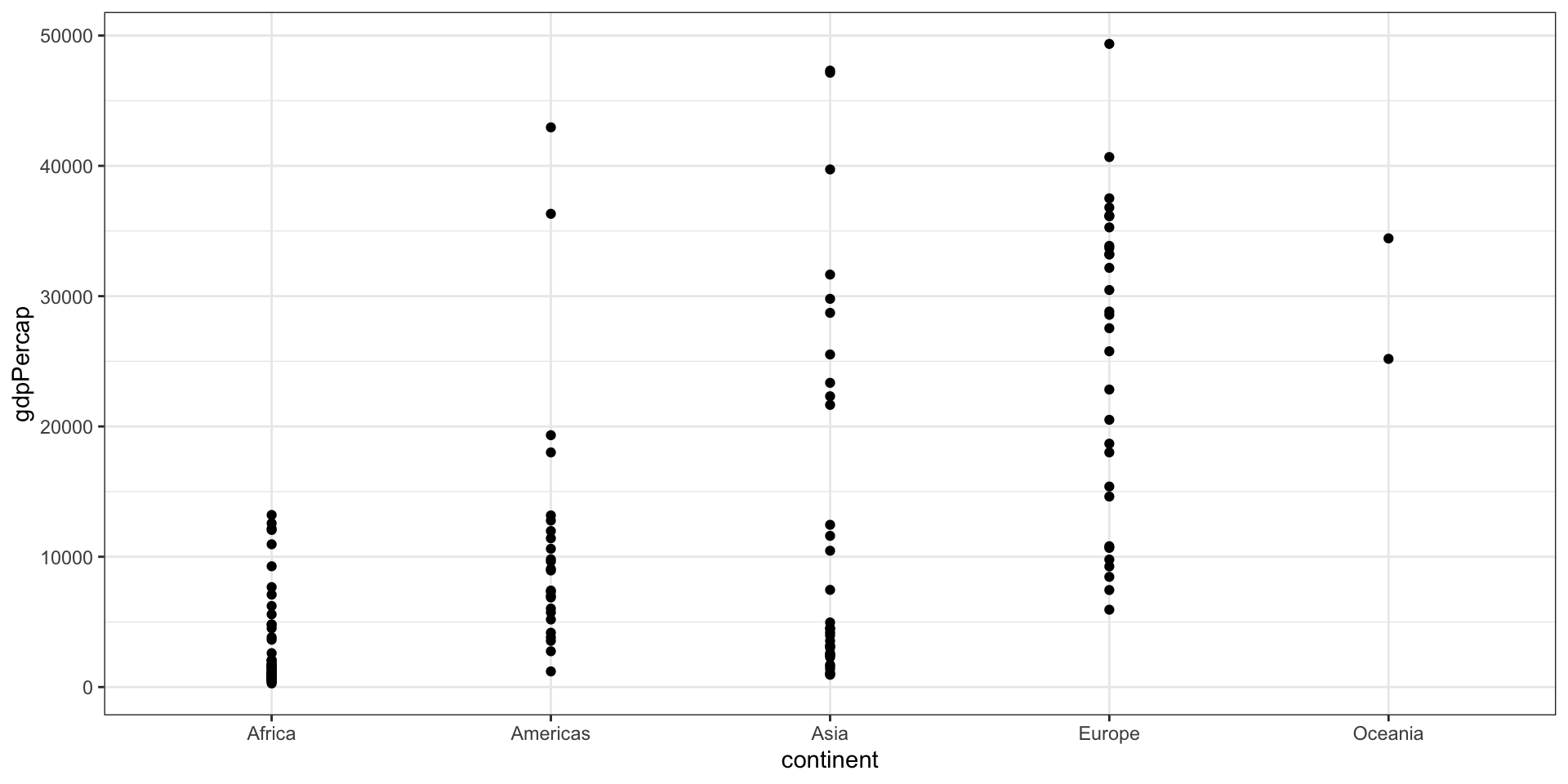
Summaries
Summaries
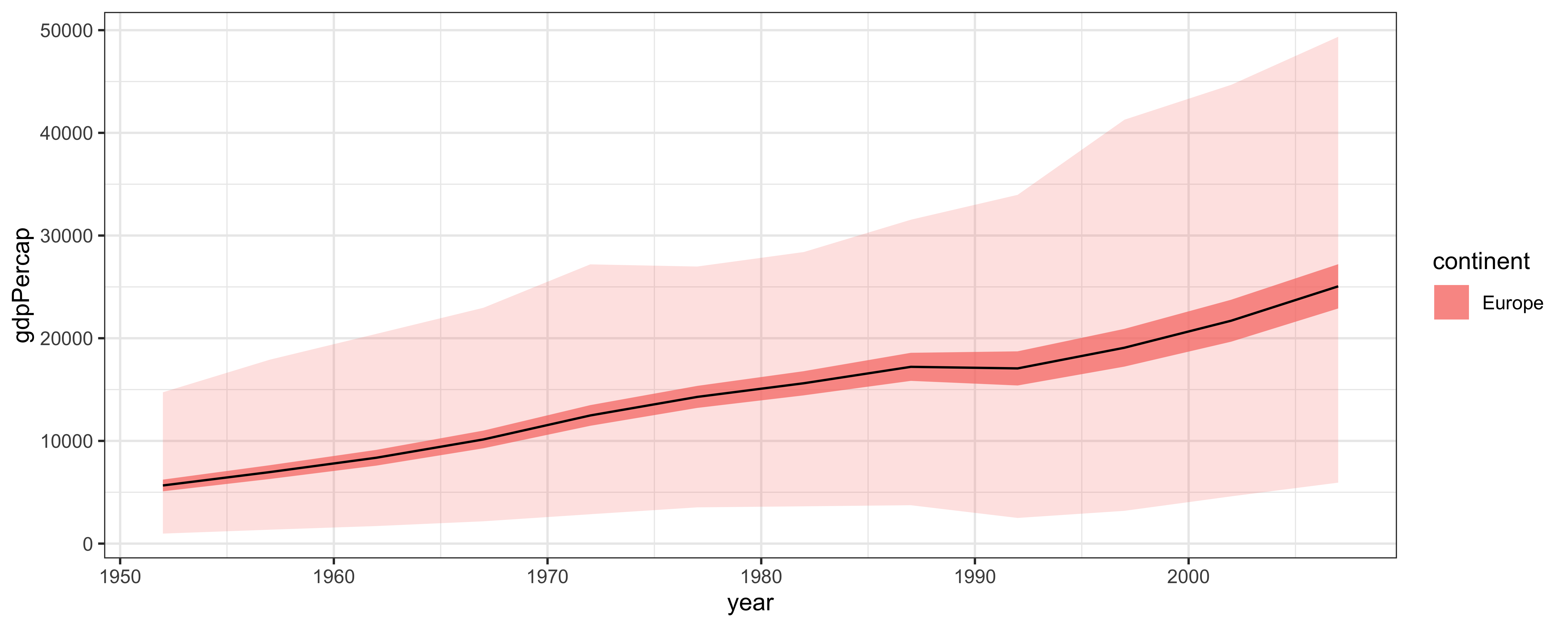
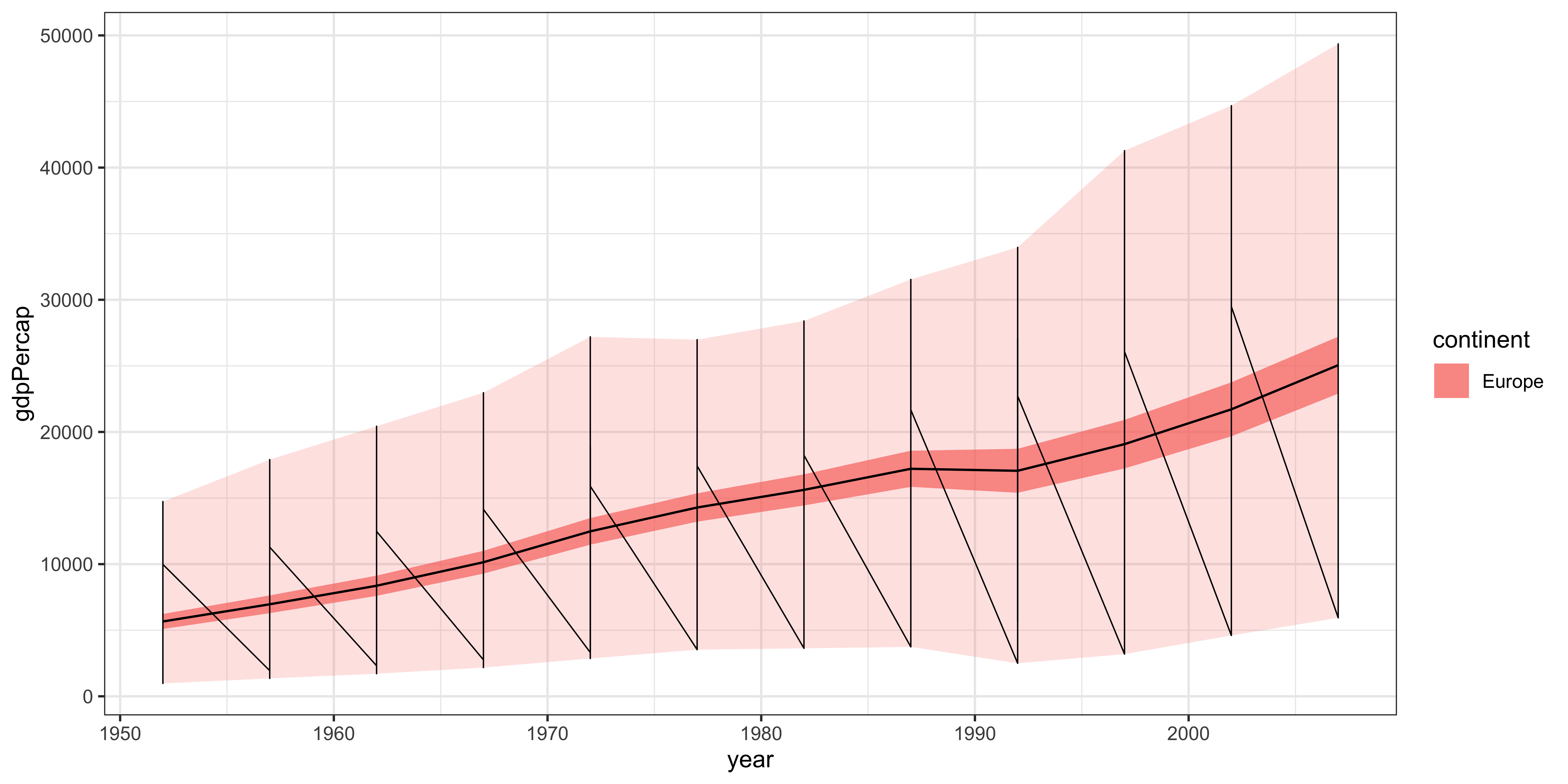
Ribbon, revisited
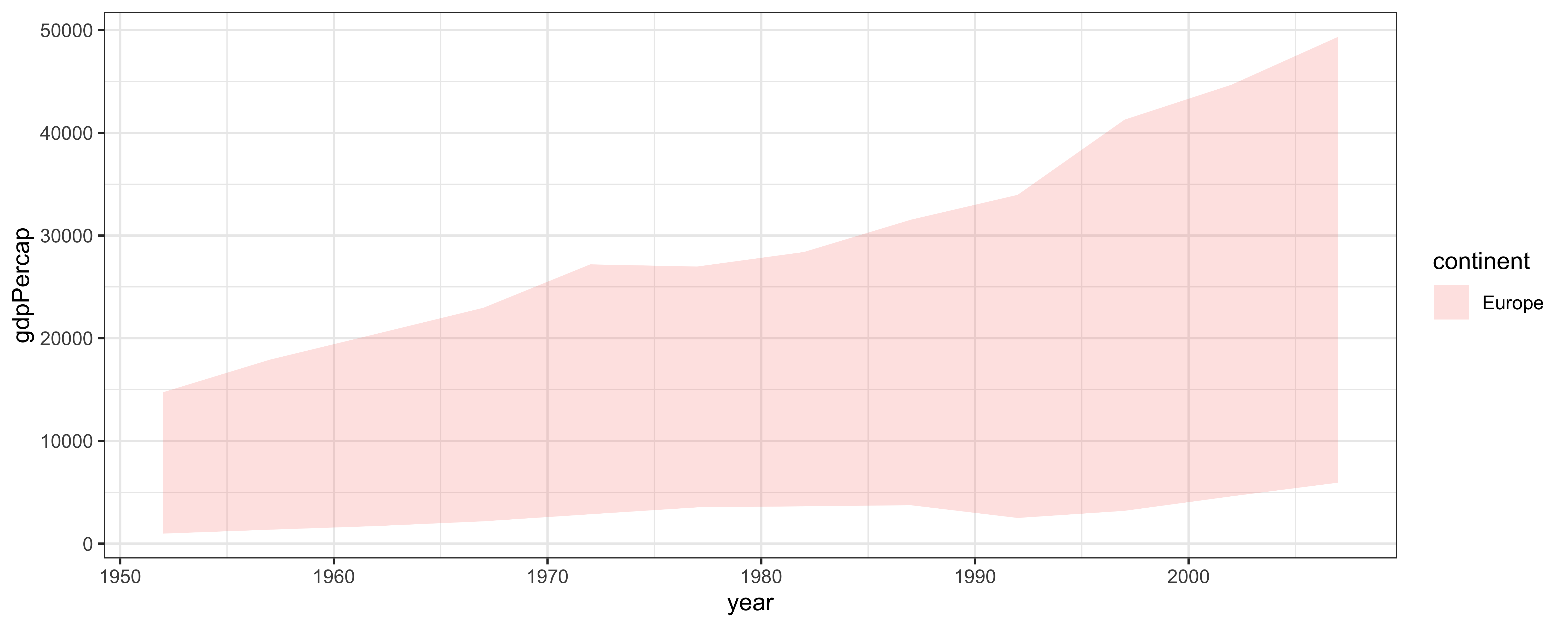
Ribbon, revisited
Ribbon, revisited
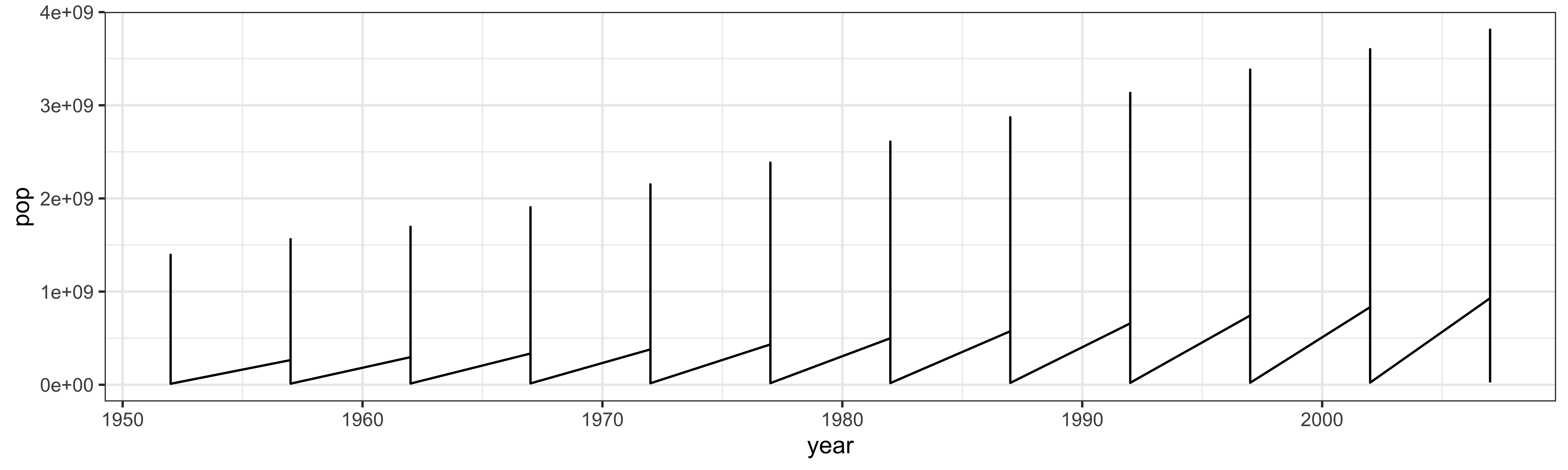
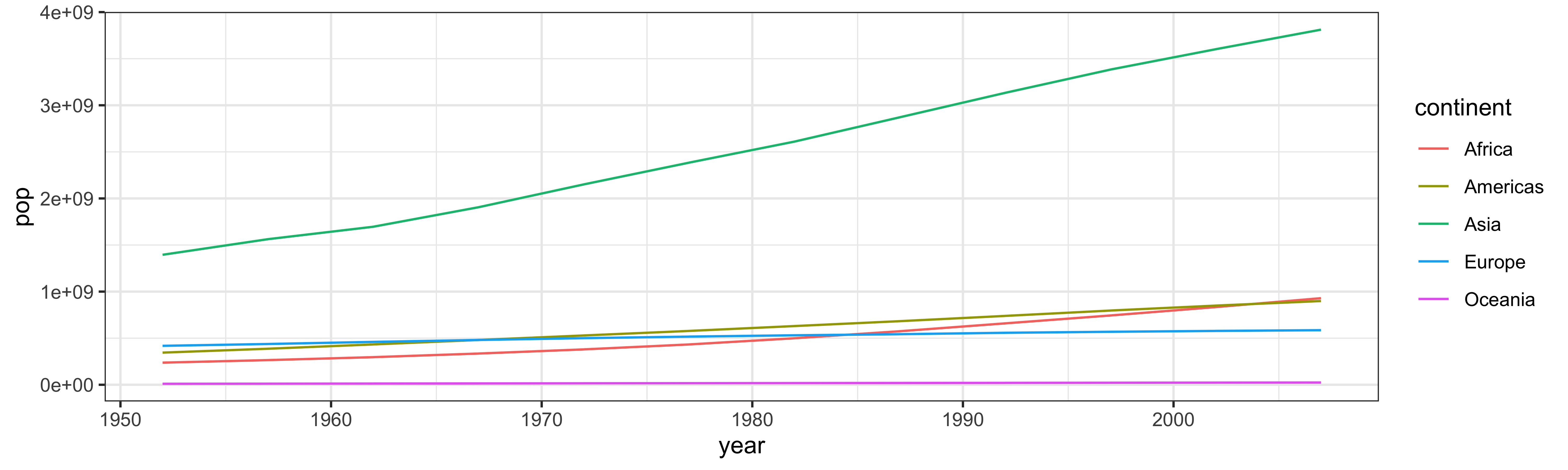
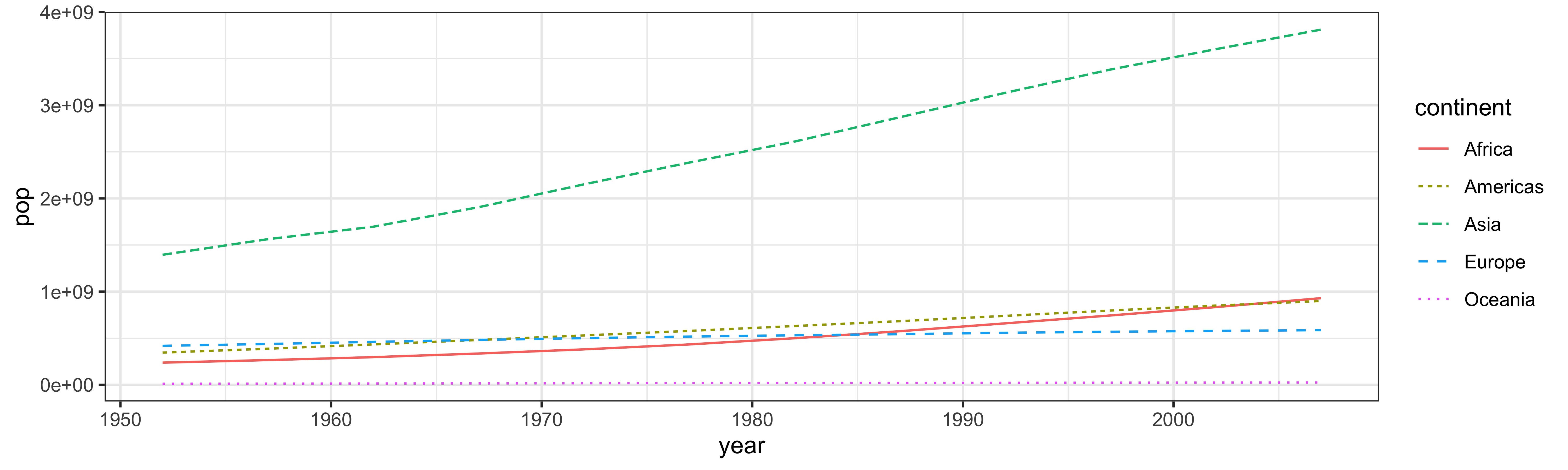
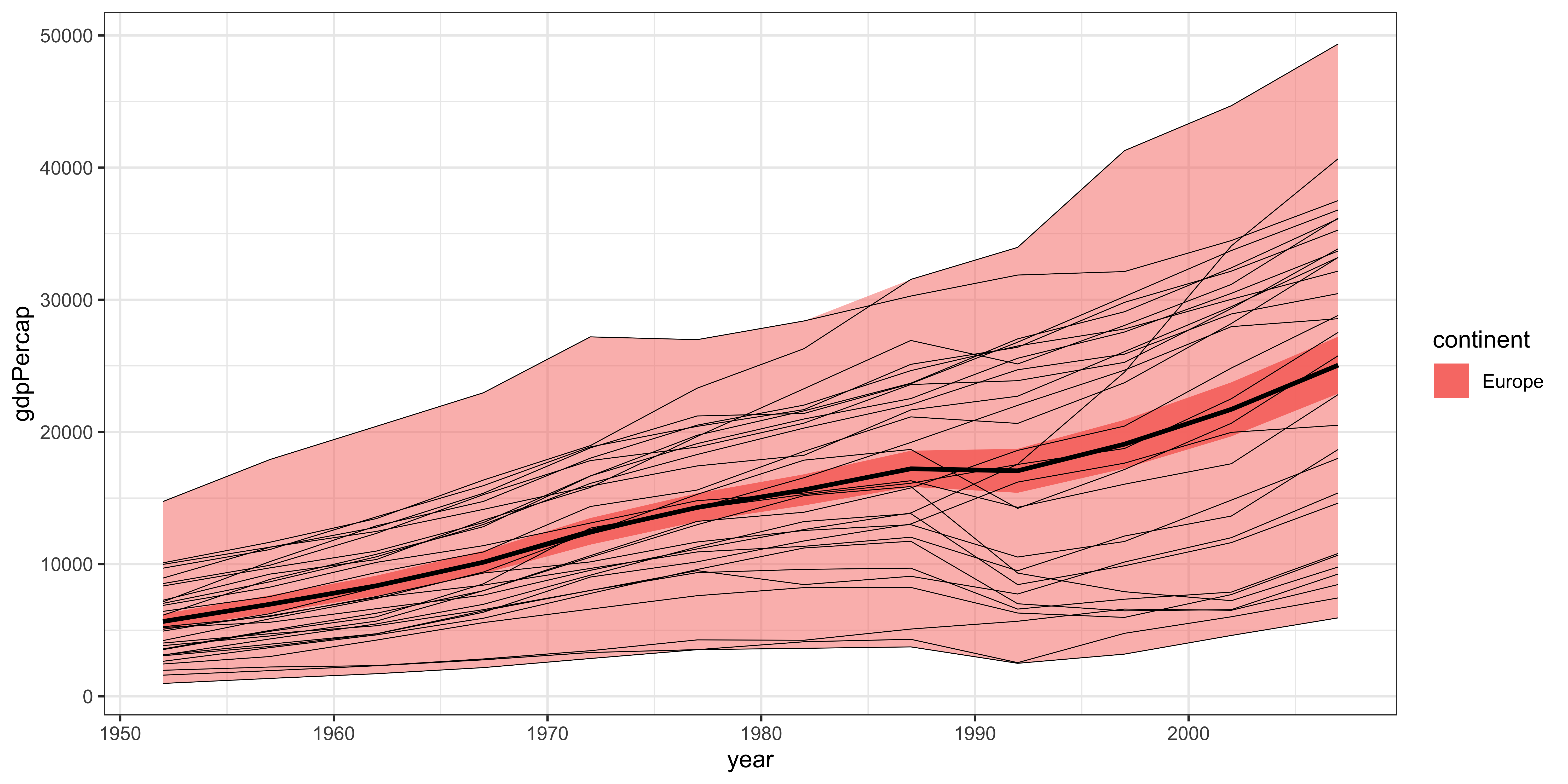
The group aesthetic
The group aesthetic
The group aesthetic
Let’s add a line for each country.
The group aesthetic
Let’s add a line for each country.

The group aesthetic
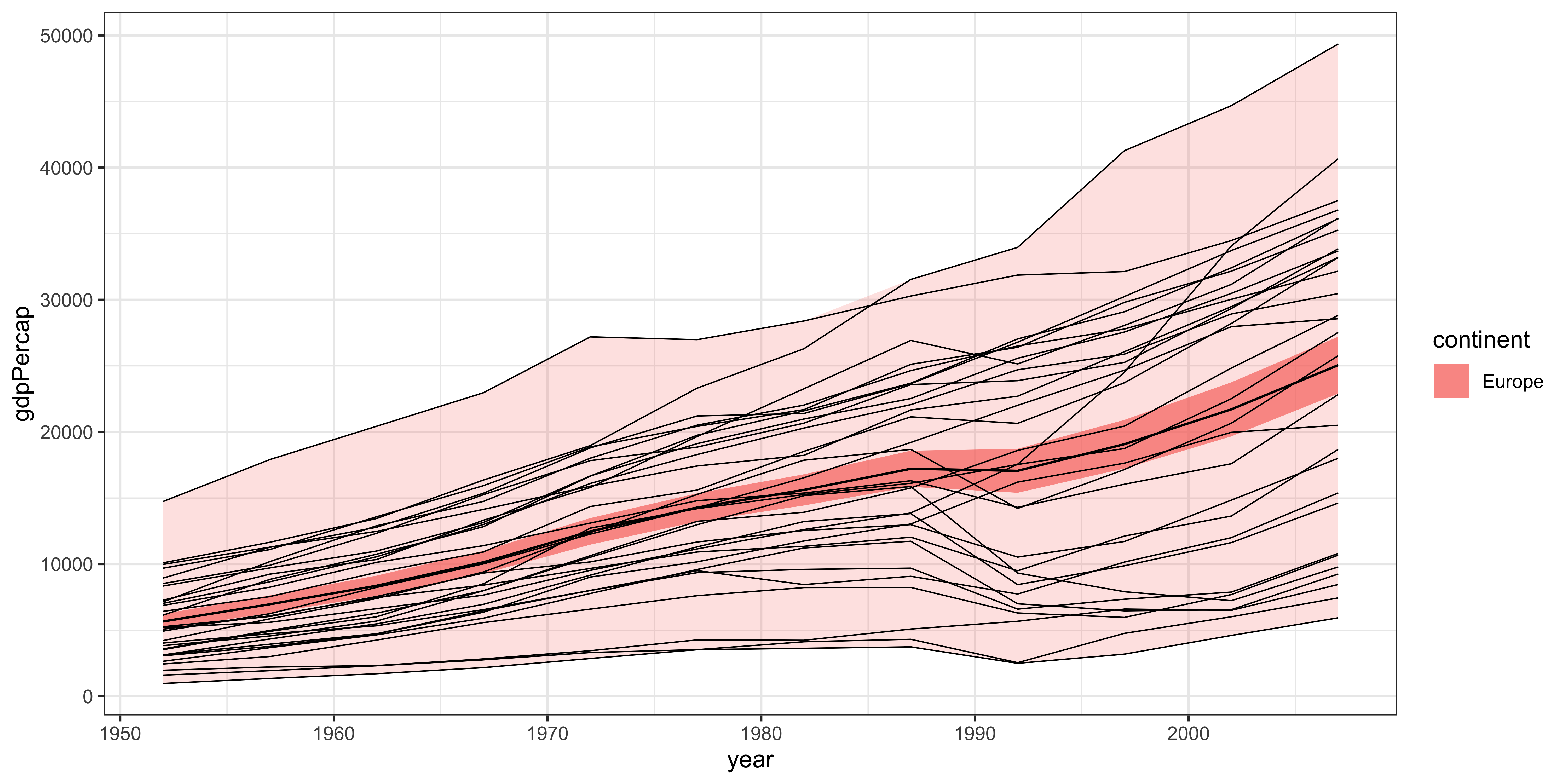
The group aesthetic
Position adjustments: dodging

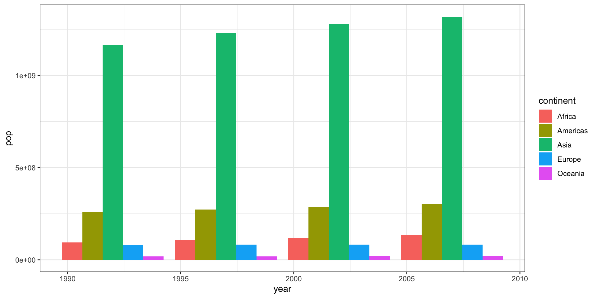
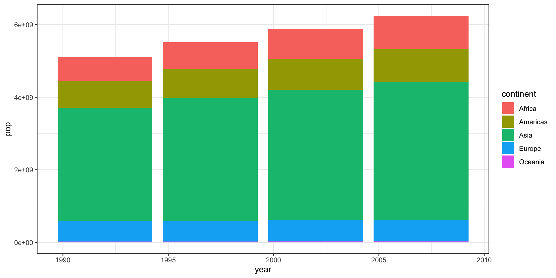
Position adjustments: stacking

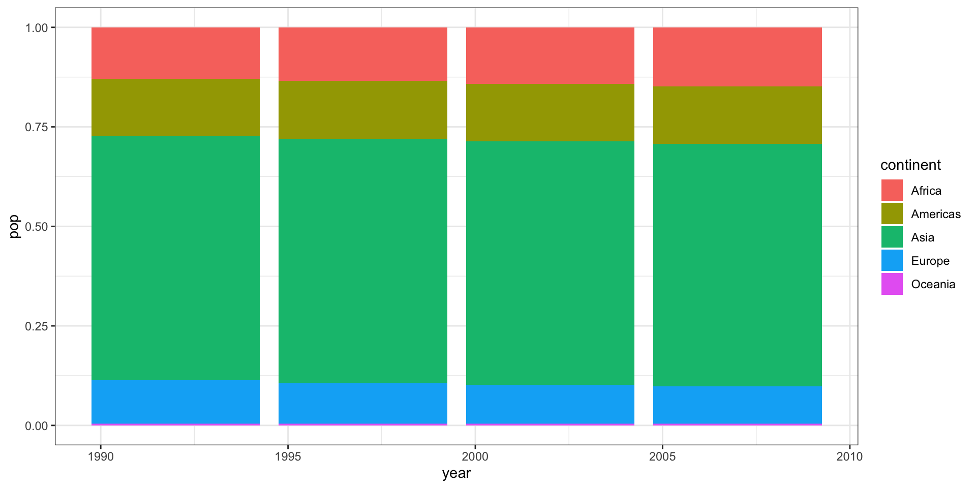
Position adjustments: filling
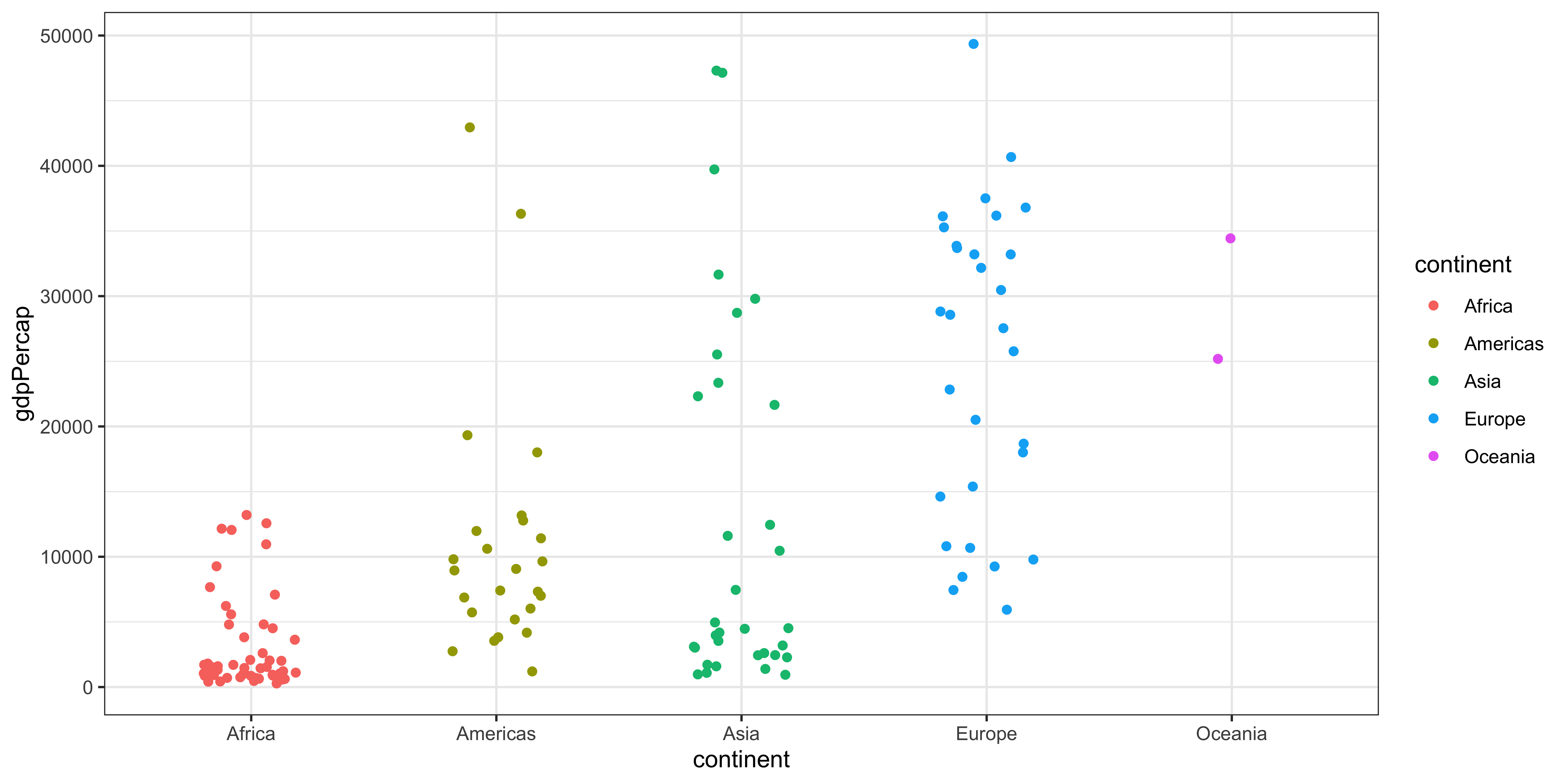
Position jitter
Position jitter
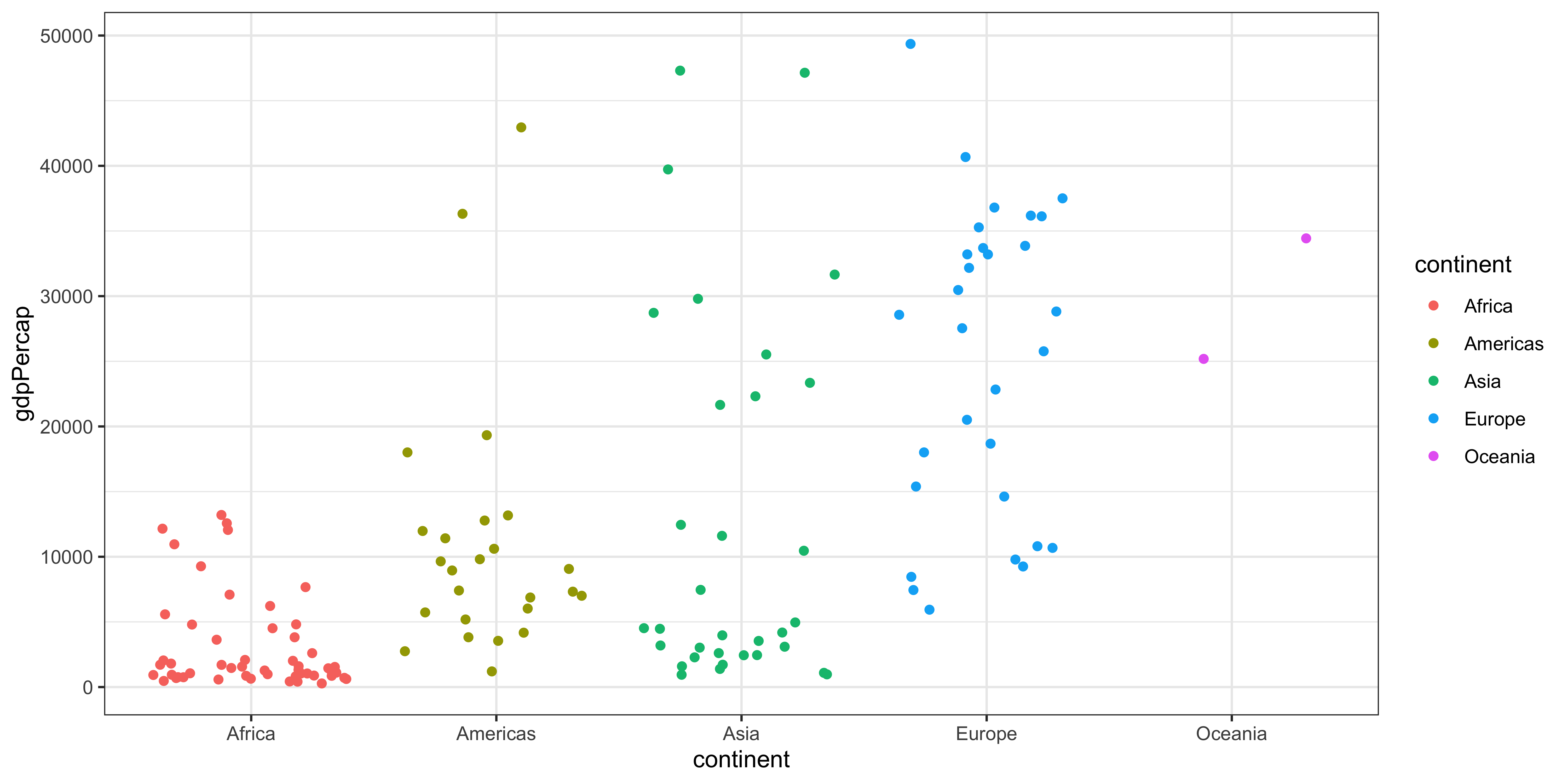
Position jitter
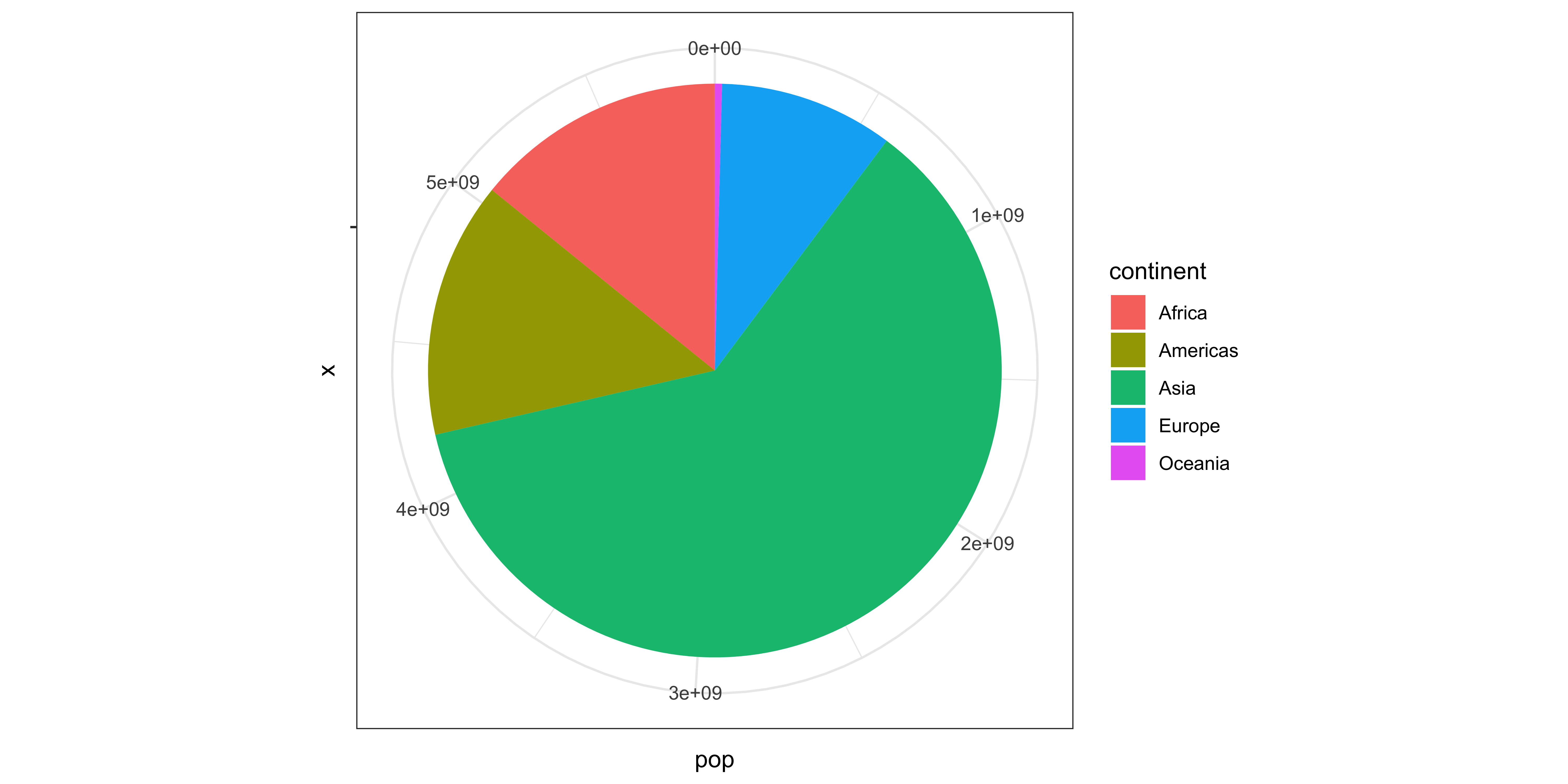
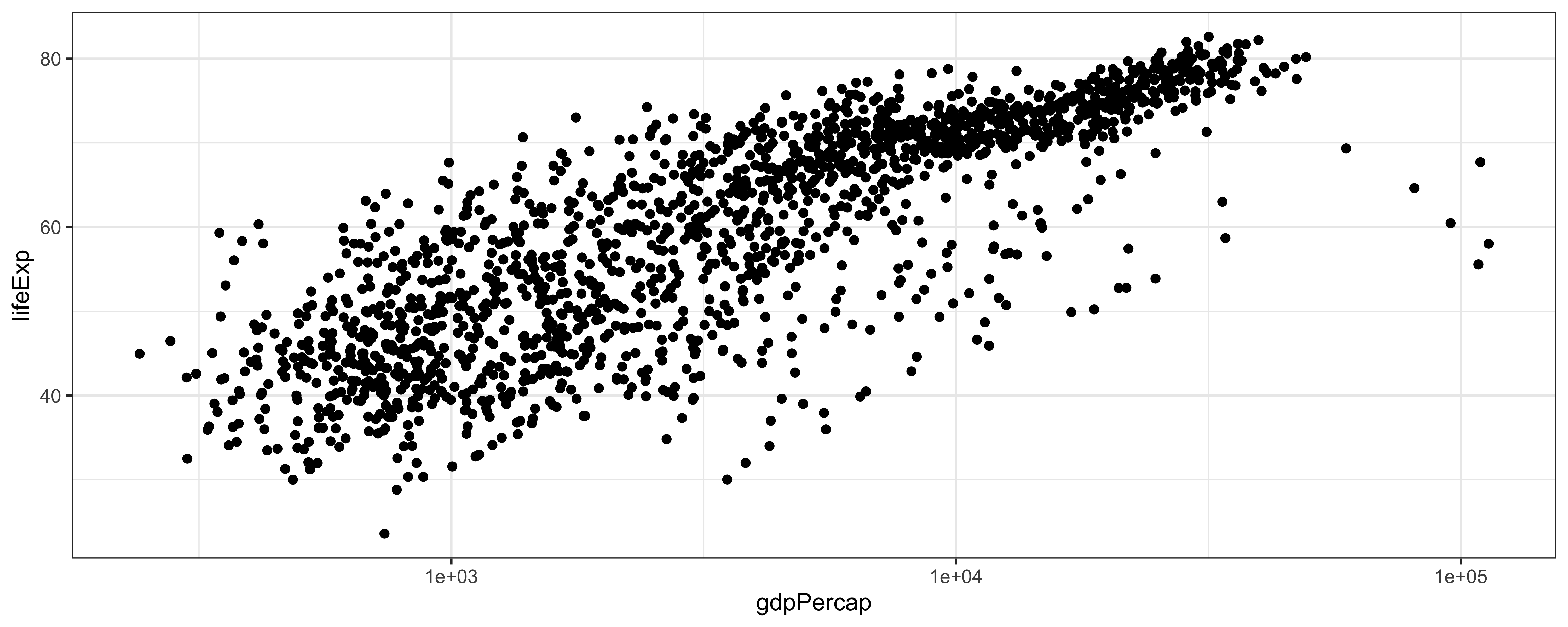
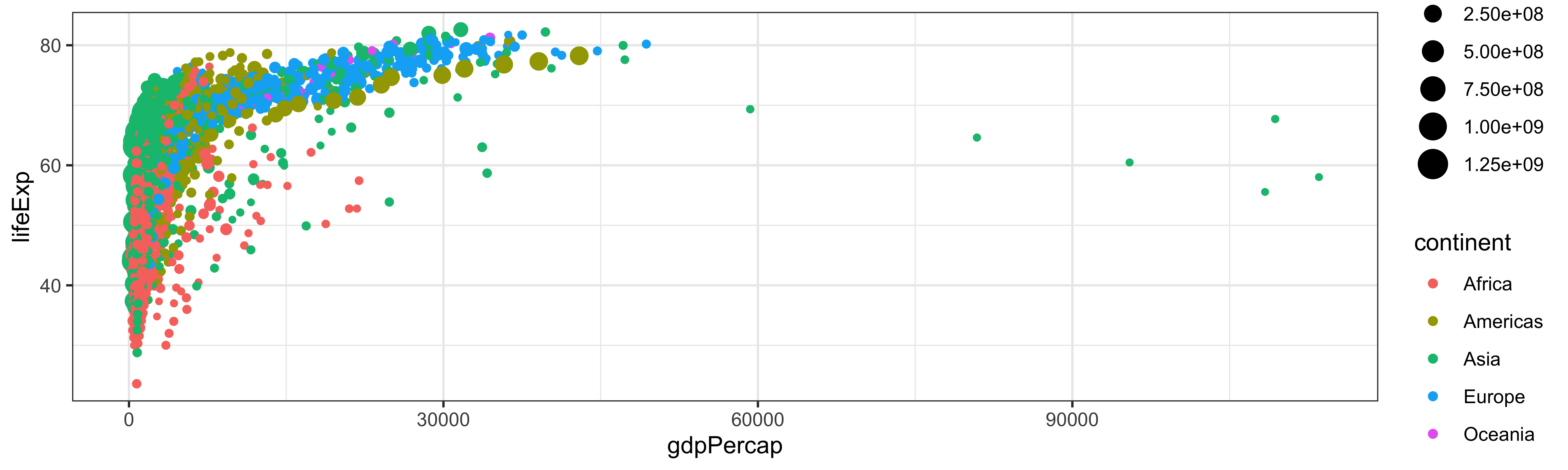
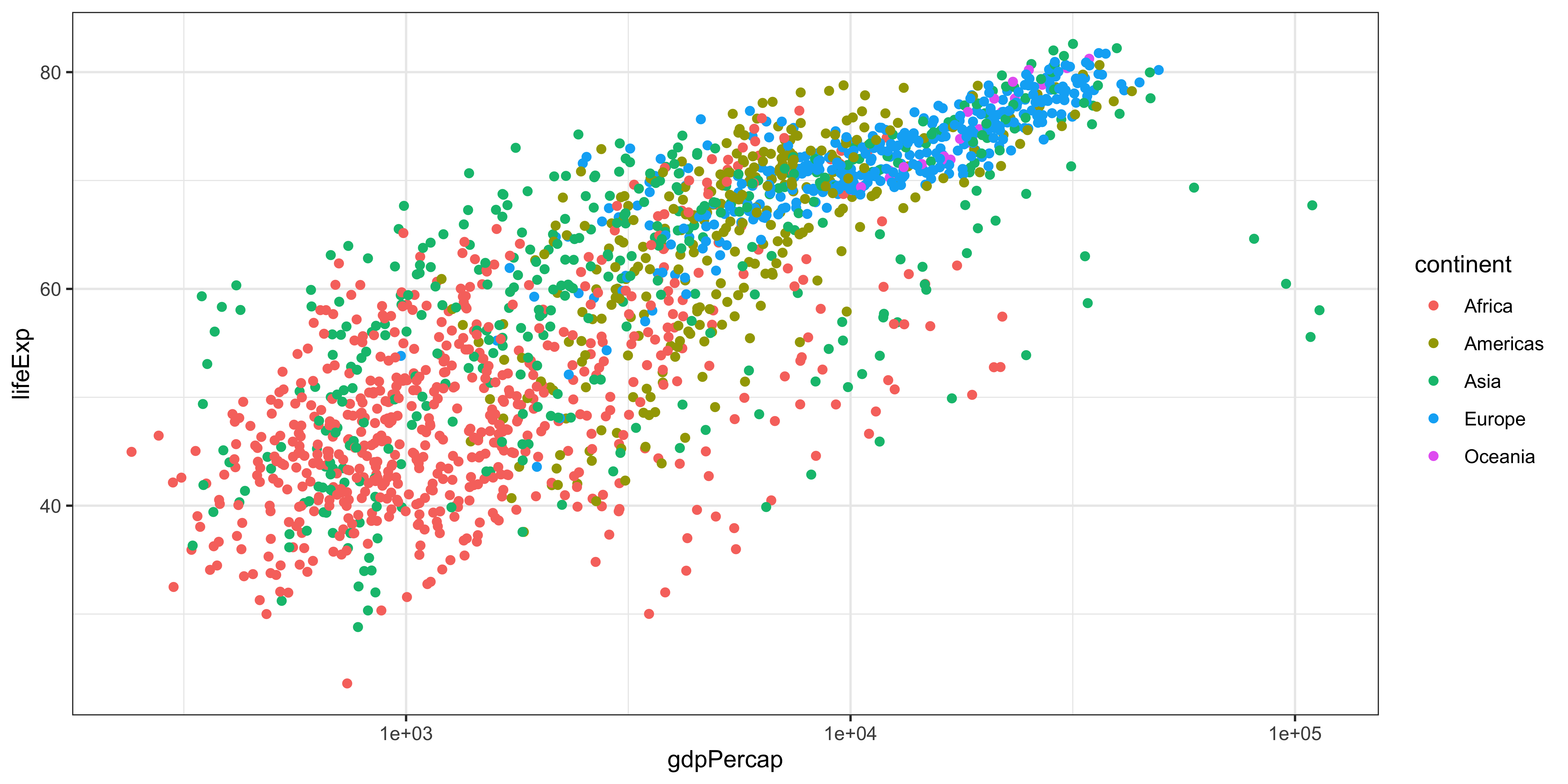
Scales
Linear scale (default):
Logarithmic scale:
Scales
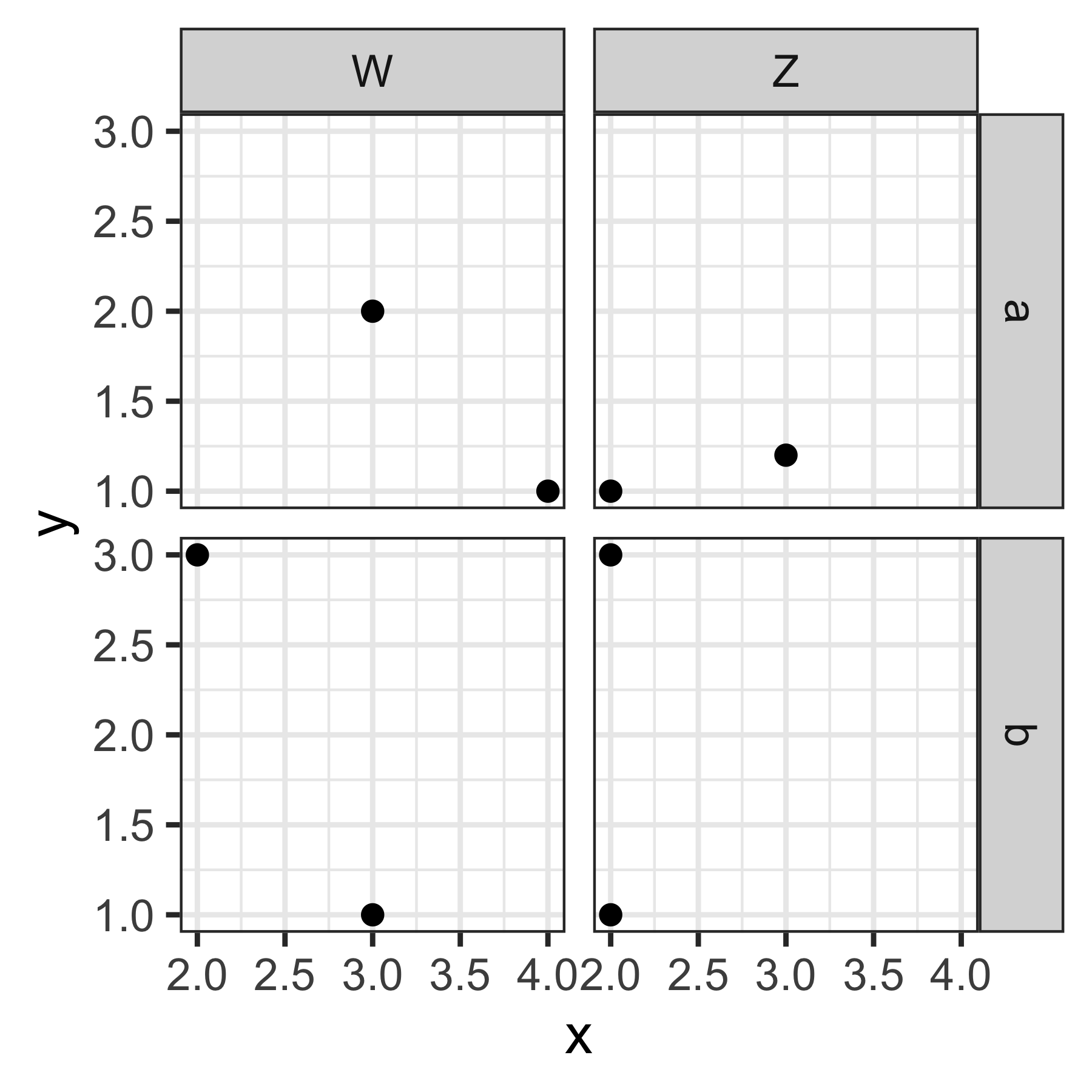
Faceting
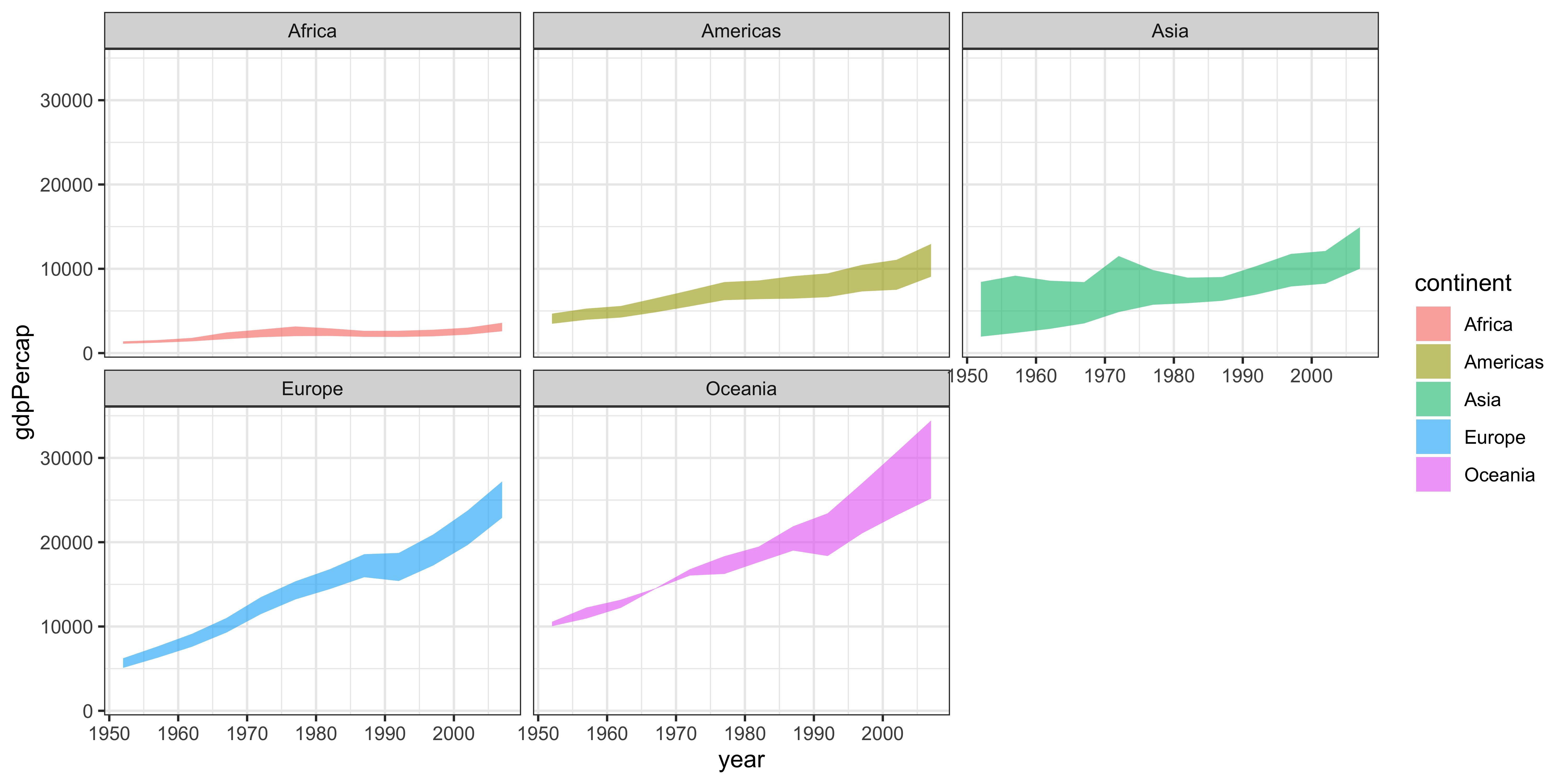
Faceting