Plotting basics
Data Visualization and Exploration
GGplot2
GGplot2 is a
tidyverselibrary for plotting.It builds on top of a “grammar of graphics”.
Makes building plots modular.
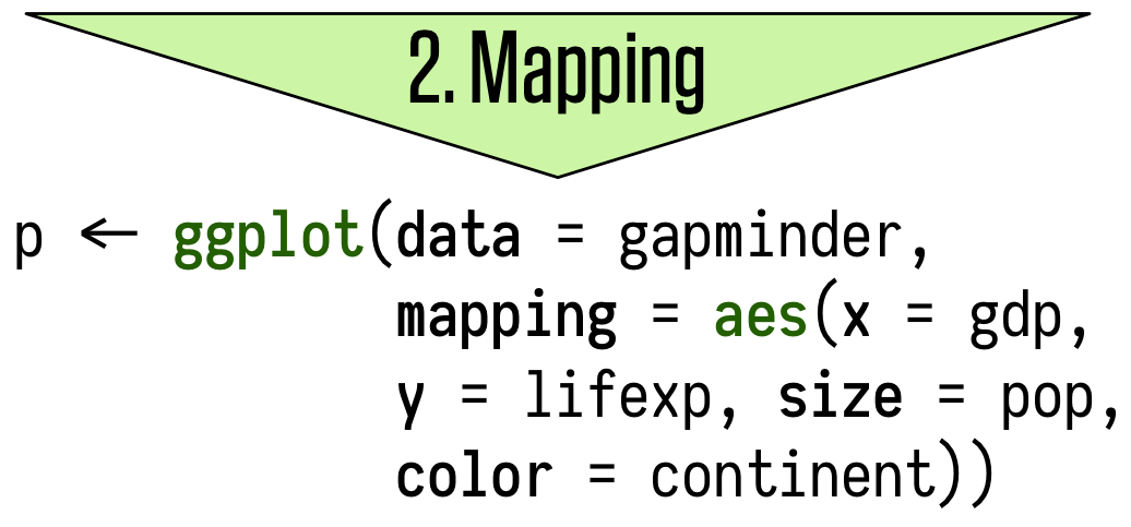
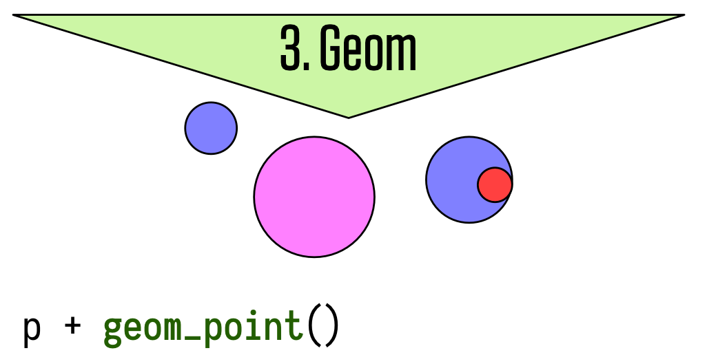
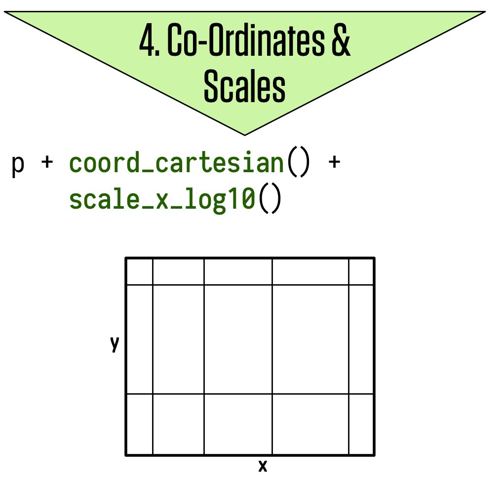
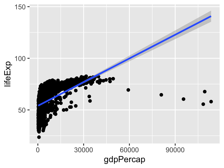
The ggplot workflow
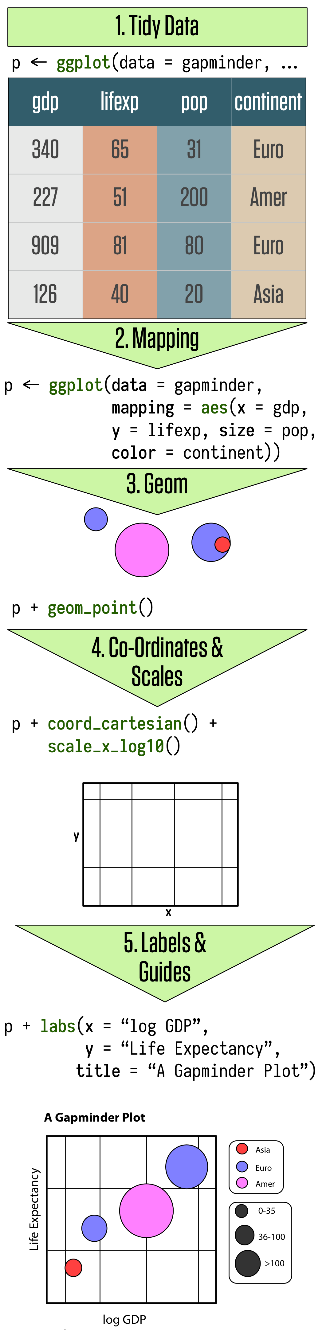
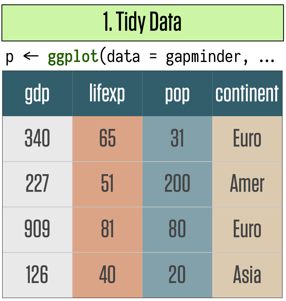
The ggplot workflow
The ggplot workflow
The ggplot workflow
The ggplot workflow
The ggplot workflow
Building plots incrementally

Building plots incrementally
Building plots incrementally
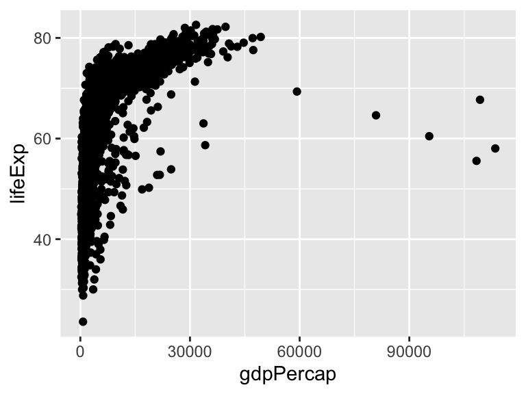
Building plots incrementally
Stacking geoms
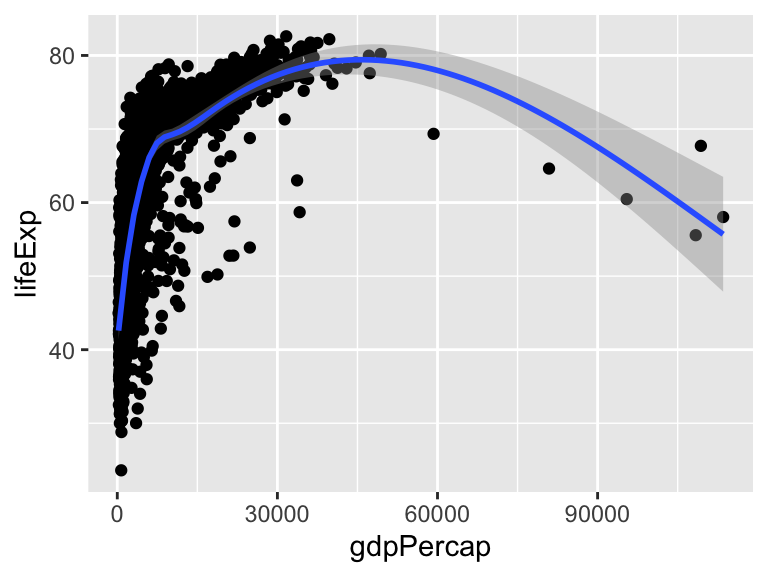
Stacking geoms
What happens if we swap the order of two geoms?

Beware of line breaks!
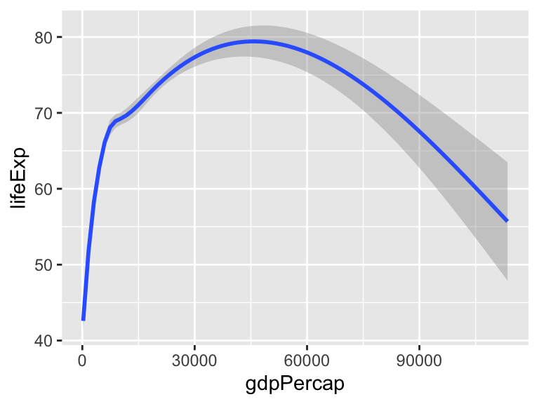
Building plots incrementally
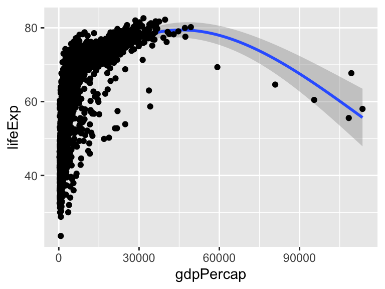
Playing with scales

Playing with scales

Playing with scales
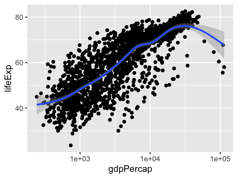
ggplot applies the scale transformations before fitting the model line.
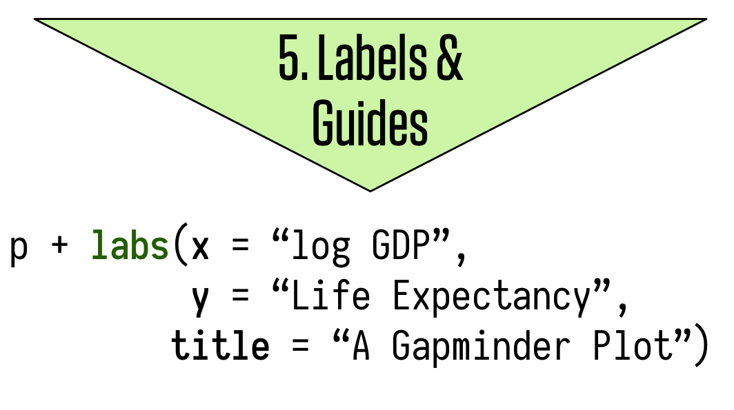
Changing labels

Setting labels
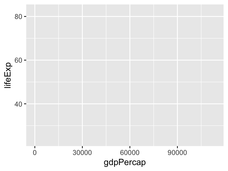
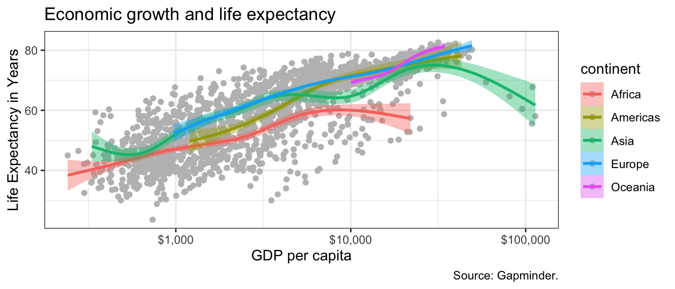
p <- ggplot(data = gapminder,
mapping = aes(x = gdpPercap,
y = lifeExp))
p + geom_point() +
geom_smooth(method = "gam") +
scale_x_log10(labels = scales::dollar) +
labs(
x = "GDP per capita",
y = "Life Expectancy in Years",
title = "Economic growth and life expectancy",
caption = "Source: Gapminder."
)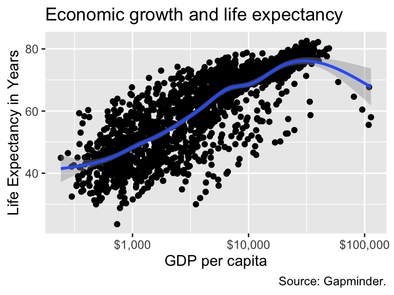
A finished plot?

Look again at this picture: can we do better?
Looking at the dataset, which information are we ignoring?
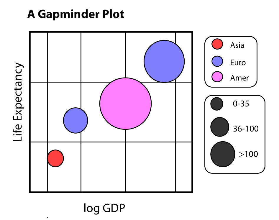
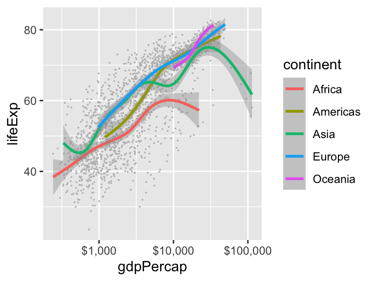
What about colors?
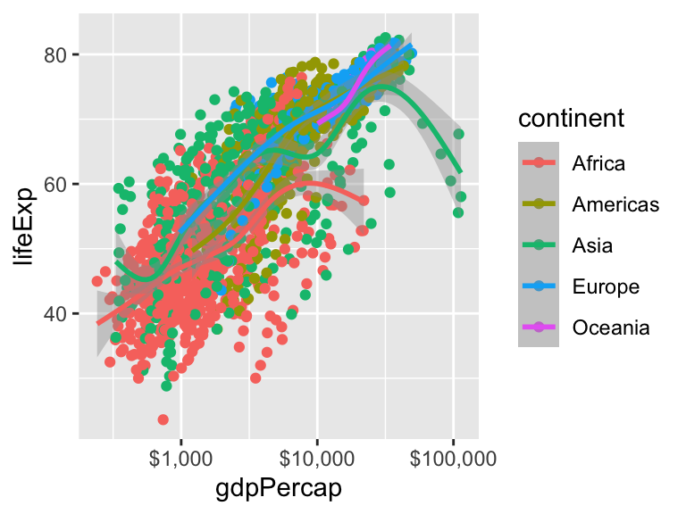
What about colors?
That’s quite a mess!

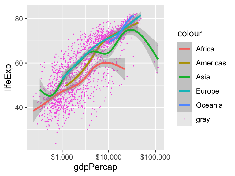
Changing aesthetics for single geoms
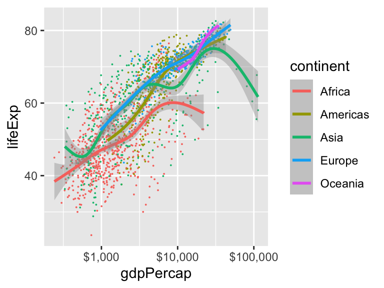
Changing aesthetics for single geoms
Changing aesthetics for single geoms
What is hapenning here?
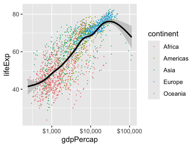
Changing aesthetics for different geoms
Maybe in this case it’s better to have a global smoothing line.
Combining with dplyr
Combining with dplyr

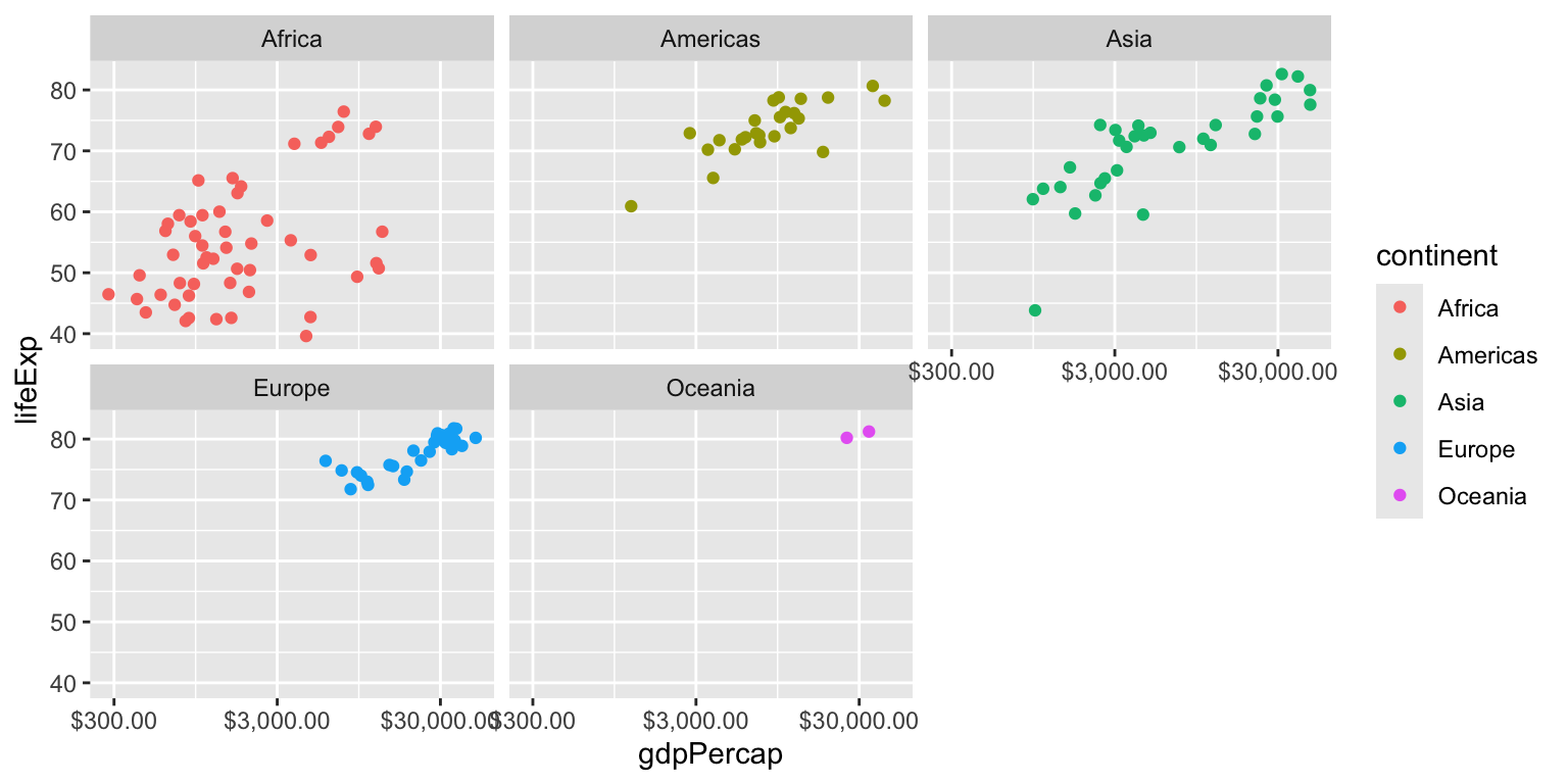
Faceting
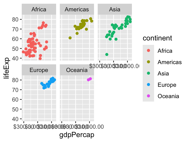
Faceting
Wrap up
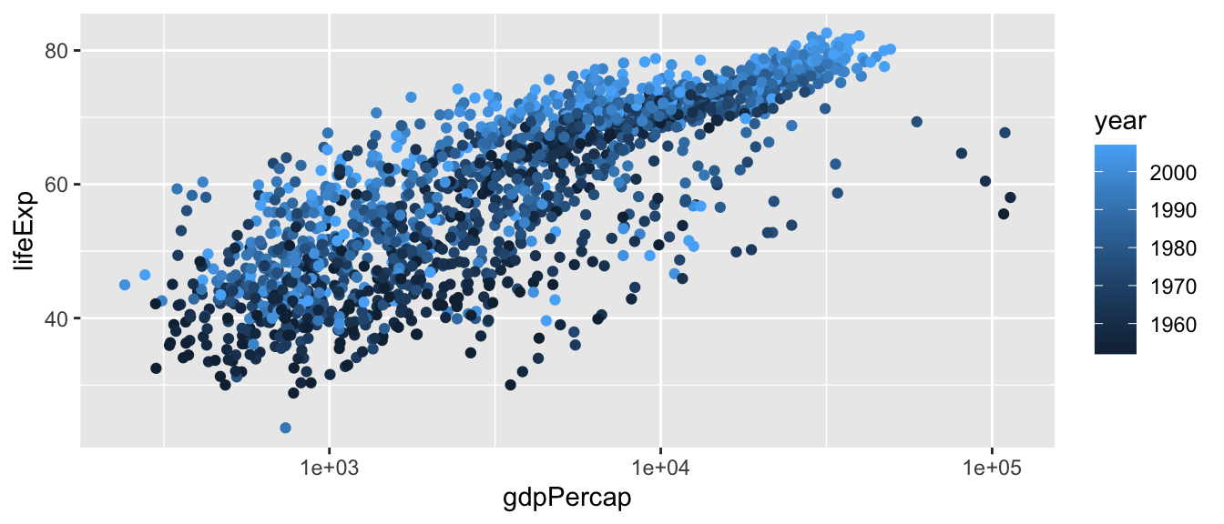
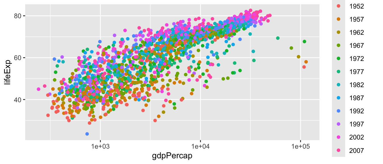
What happens if you map year to color?
Wrap up
Look closely at the legend. How is it related to the geoms you use?
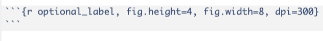
Including in Quarto documents
You can use the execution options to set some parameters.
See https://quarto.org/docs/computations/execution-options.html
globally:
or locally on the R chunks